Quantcast
Channel: Poke the Merch
Viewing all 46 articles
Browse latest View live

Nendoroid Petits (Tales of Series) - GSC

$
0
0
Hello dear readers! It’s been a long while, but I’m finally back with some figures!

It’s been a long while since I purchased any figures, but I knew my wallet sensed danger once I saw stock photos of some characters from the most recent Tales of games.  It was as though Good Smile Company knew some of my weak points: Adorable little figures plus the Tales of series.  After seeing stock photos of all the characters (Yuri, Estelle, Asbel, Sophie, Jude, and Milla), I knew I was going to immediately pre-order the Tales of series Nendoroid Petits. 

I had high expectations of Good Smile Company because the quality of their figures is generally high.  Jenn spoke well of them too, at least until recently.  I must admit I had mixed feelings about the set of figures I received. 

Packing

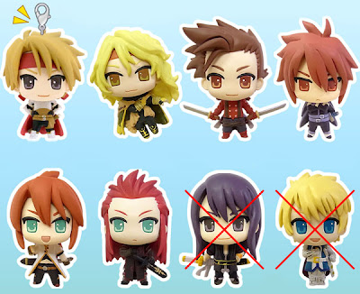
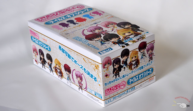
Each complete box set you purchase includes eight figures.  There are six characters, plus a secret character, so in the end you’ll have an extra of one of the characters.  In my case, I got an extra Sophie from Tales of Graces.  The box is nice and bright, but nothing special.


From I've seen in the past, most box sets have a silhouette of the secret character on the packaging, making it obvious who said secret character is.  This time, they didn't give us any hint of who the secret character was.  Good Smile Company kept a good secret all the way until the release date of these Nendoroid Petits.

Honestly, I expected Ludger Will Kresnik from Tales of Xillia 2 to get his own Nendoroid Petit since he was from the most recent Tales of game, but boy was I wrong.  I was actually disappointed because I didn’t get to pick up the Tales of Xillia 2 Kyun Chara pack, which included Ludger, so I was hoping to get a mini figure of him in the GSC pack.  I'm certain fans of the Tales of series were happy with the secret character though, but we'll look into that more later.


Each figure comes with a small transparent stand.  Thankfully it isn't large and filled with holes like the stands that come with some of the regular sized Nendoroids.  Otherwise it would really clash with something as small as a Nendoroid Petit!  The stick coming up from the back allows you to angle your Nendoroid Petits the way you like.  You can make anyone float or you can have them standing straight up!  The choice is yours!

Now let's take a look at these adorable little figures!

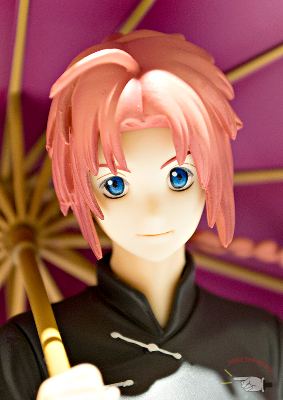
Jude (Tales of Xillia):


I’m biased towards Jude.  I loved his design before Tales of Xillia was even released, so when I learned that he was getting his own Nendoroid Petit, I was ecstatic.  Was I disappointed in his Nendoroid Petit design after receiving him?  Not at all!


He wears a nice, calm expression, which is very fitting because he isn’t exactly overflowing with confidence in the game itself.  Jude is rather young and immature in the first Xillia game, but his intentions are always good, and he always tries to be rational.  That’s why I feel the expression his Nendoroid Petit wears is perfect.  I’ve also always liked the colour scheme of his outfit because something about light blue pattern on that navy blue coat makes him look great.  It’s really eye-catching for me.

For those of you who could not afford the Kyun Chara pack for Tales of Xillia, Good Smile Company’s petit Jude is actually a fantastic substitution.  I put them side by side and immediately noticed that little Jude was much cuter, especially his face.  He’s got chubbier cheeks, which works excellently with the whole super-deformed look, and he has nicer eyes.  Kyun Chara Jude has nice, bright eyes, but I actually prefer the calm look GSC's Jude has.

Despite being smaller, the paint job is better on the Nendoroid Petit, which saddens me a bit because I paid so much more for the Kyun Chara figures.  So Tales/Jude fans, I recommend picking up GSC’s Petit Jude over Kyun Chara Jude, unless you can’t live without the school and butler uniforms that are included in the Kyun Chara Pack! 

GSC’s petit Jude is easy to put together as well, unlike some of the Nendoroid Petits.  The good thing about figures having short hair is that it really doesn’t get in your way when you're trying to piece them together.  Putting Jude together is just me literally pressing his head into his neck.  The rest is just the stand.

Little Jude definitely earns thumbs up from me.


Milla (Tales of Xillia):

Milla is incredibily adorable, and while her hair is really well done, it makes her head heavy.  If I don’t pose her correctly, she topples backwards, which I have to admit I find somewhat funny.  I laugh now, but one day I’ll regret it, I’m sure.


Milla’s sword is included and it fits into her hand nicely.  You simply have to slip the hilt between her fingers and thumb and the sword will stay in her grasp just fine.  Unlike the other swordsmen in this group, she doesn't look like she'll need to unsheathe her blade any time soon.  That's a shame.  But I suppose she could wipe out her enemies using magic anyway since she's the master of the four elemental spirits.

I personally find her costume horrifying and unfitting for someone as beautiful as Milla, but at least it doesn't look as bad on the Nendoroid Petit.  It might be because the outfit doesn't stand out as much.  Her head is naturally bigger in her super-deformed state, and her hair is just wild, so that might draw attention away from the outfit.  Speaking of hair, I felt that some of Milla's hair was messily sculpted, particularly around the bangs.  It has that newly sculpted look and feel.  Prickly pieces are sticking out just slightly, so the problem isn't noticeable from afar, but it would have been nice if GSC smoothed it down for me.


Milla is the only figure that has two holes for the stand.  You can either have the ball in her back or in her hair.  I chose back because there's just too much hair on the outside.  This fine lady has fallen backwards a few times because her head is too heavy, but it isn't something I would deem problematic.  She's currently standing my shelf just fine!
In comparison to Kyun Chara's Milla, GSC's Milla is smaller, cuter, and frankly designed better.  The straps around the Nendoroid Petit are smoother, and the pattern on her skirt is more colourful.  That detail actually stands out more because the costume is mostly white.

The Nendoroid Petit Milla's hair actually flows outward more, which gives the illusion that there's a little more movement in her compared to Kyun Chara Milla.  Her eyes are not only softer, but they're prettier as well.  Kyun Chara Milla's eyes and face appear glossy under certain lighting, which isn't very flattering.  Plus, how can you resist Nendoroid Petit Milla's chubby little face?  And look, she comes with a sword!  We like swords, right? I know I do!

I think the one thing I like about Kyun Chara Milla more is that her ahoge (that odd green strip in her hair) is prettier.  The deeper green just stands out more in my eyes.

Once again, I recommend purchasing the GSC version of these figures over the Kyun Chara ones.  They're more affordable, they're cuter, and their paint job is better.  If you can't live without Milla's school uniform and her maid outfit, then sure, I recommend you purchase the Kyun Chara pack through Yahoo Auctions.  If you're lucky, you'll find her and Jude on Mandarake as well.

Estelle (Tales of Vesperia):


Estelle's Nendoroid took me by surprise, but  in a wonderful way.  I always considered her original design okay at best, so I didn't think I was going to be in awe when I put her Nendoroid Petit together.The expression Estelle's Nendoroid Petit wears is very sweet and innocent, and with the pose she has, this little princess just looks adorable. It's funny how super-deformed characters can change your opinion so quickly.


Estelle's attire makes her look like a tiny flower, which makes her look incredibly adorable when she sits in the palm of my hand. There isn't too much to say about this particular Nendoroid Petit except maybe GSC could have given her a staff/wand/mace.  I only say that because everyone else in the set seems to be armed in some way.  Jude and Sophie count because they wear gauntlets.  Milla, Yuri, Asbel, and the secret figure all have their own swords.

On the other hand, I suppose it wouldn't be appropriate to give a peace lover like Estelle a weapon, even if it is a pretty little wand.

Estelle is also one of the easiest figures to piece together in this box set.  Much like Jude, all I have to do is attach her head to her body and everything goes together just fine.  Nothing feels like it's going to fall off and nothing feels unnaturally loose.  This lovely little lady is probably my third favourite Nendoroid Petit in this set.  It's also a nice bonus when I know she photographs well when she's near flowers!

Yuri (Tales of Vesperia) and Sophie (Tales of Graces):

Originally I encountered some issues with these two figures, such as broken and defective parts. Users on My Figure Collection shared some of the same issues as I did, so it seems defects aren’t actually uncommon with the Tales of series Nendoroid Petits, which is a big disappointment for me.  I didn’t expect perfection from the Nendoroid Petits, but I still expected quality figures from Good Smile Company.

Yuri


The Yuri figure was almost perfect, with the exception of a fragile and broken sword.  Even though I was gently handling Yuri’s sword, the hilt snapped off almost instantly after I touched it.  I was appalled; my jaw dropped in shock.  I couldn’t believe a part of Yuri broke before I could even put him together!  I’m well aware that the sword is smaller and frailer than all other parts of the figure, but I just couldn’t accept how quickly and easily it fell apart.  I found myself disappointed in GSC’s quality control.  On the bright side, I also learned that they send replacement parts internationally at no extra cost, so Yuri’s was properly armed a week later!  Good Smile Company responds quickly, so if anyone has any issues, send them an e-mail!!

Setting that issue aside, I felt Yuri’s figure was well done, especially his expression.  There’s always an air of confidence around this character, and he’s actually quite a badass.  A very…beautiful badass.  Of course, in his super-deformed state, it's hard to take him seriously as he's just as cute as the rest of the figures.  


I like that his hair sticks out every so slightly from the back.  It almost seems like he could run forward and unsheathe his sword at any moment.

Slipping the sword into his hand was no easy task, and I mention that because of what happened the first time I tried giving Yuri his sword.  The replacement sword was carefully inserted into his right hand, and now that it's in a secure spot, it will not be removed for a very long time!  Admittedly I get nervous whenever my fingers accidentally brush any part of the sword.  I wouldn't want to contact Good Smile Company for another replacement part after all.
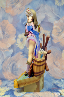
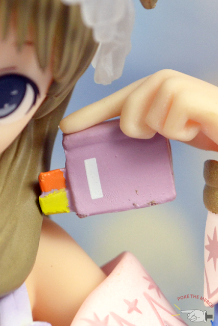
Sophie

I learned that my Sophie figure was defective soon after Yuri's first sword broke.  This poor little girl only had one of her pigtails attached to her head for a while.  The other one simply refused go in and that was because there is an odd bump at the end of its stub.  I was honestly afraid of trying to force it through because the stub seemed weak and could have snapped right off.


When I received her replacement pigtail, I was ecstatic.  She looks much cuter with two pigtails than she does with one pigtail.

I'd say Sophie's Nendoroid Petit is actually very accurate to her original design.  To be frank, Sophie is my least favourite Nendoroid petit figure out of the entire set.  Even before Tales of Graces was released I couldn't stand her costume as it looked, in my opinion, absolutely tacky.  Despite understanding why she looked the way she did later in the game, I couldn't change my opinion on it.  It almost looks like her Nendoroid Petit has a slight bulge in the lower region and that doesn't impress me at all.  Sophie's hideous jumpsuit is probably quite tight on her, making her resemble a wrestler of some sort.


One thing I really like about Sophie is her stance.  Sophie's a fist fighter, which is awesome for a heroine as it can be quite rare.  She's got an adorable hair style and her eyes are soft and very pretty.  I just don't like that she has her mouth open because it makes her look a little more lost than determined.  Perhaps that's just the charm, but I personally would have preferred her with her mouth closed like everyone else in the set.

If you purchase these figures (Yuri and/or Sophie), make sure you’re extra careful with them!

Should one of your figures arrive defective, you can most certainly contact Good Smile Company for replacement parts.  They usually respond within 1 - 2 business days.  

Asbel (Tales of Graces):


It's a shame the Tales of Graces characters (Asbel and Sophie) are the only characters in the box set that aren't smiling.  Granted, the expressions they wear are very appropriate to the theme of the game.  Asbel is a knight who is utterly determined to protect those who are dear to him, and that is well reflected in his Nendoroid Petit.  I also like that he's ready to draw his sword as well.  It suits his fighting style very well.


Asbel's paint job could have been better.  White spills over gray quite often, so you'll see blotches all over the edges of his coat.  That could just be my figure though.  Good Smile Company does state on their website: "The paintwork on our figures varies between each figure as a large amount is done by hand. Unfortunately, there are cases where we will unfortunately not be able to offer a replacement for small painting errors." So it's really something we just have to learn to accept, unfortunately.


Regardless of all the odd paint spills, I still like Asbel's overall design.  It's probably one of the few Inomata designs that grew on me over a short period of time.

I'm certain Tales of Graces fans would be happy owning this figure, and most likely Sophie's as well.  Tales of Graces doesn't have any 1/8 figures or even one coin figures like the other games in the Tales of series (Symphonia, Abyss, Vesperia, etc...). Fans like me will take what we can get!

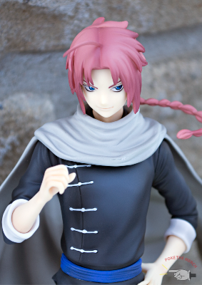
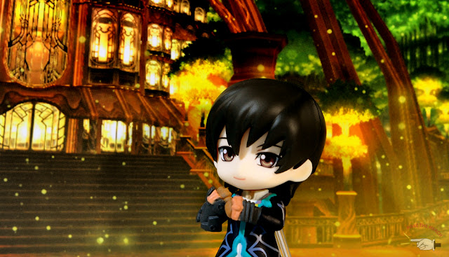
Secret Character: Leon Magnus (Also known as Lion Magnus)

I'm not surprised Leon got his own Nendoroid Petit since he's an extremely popular character in the Tales of series. I think I only expected Ludger to get his own Nendoroid Petit because all the other characters in the box set are from the latest Tales of games for the Playstation 3.

It's nice that Leon got his own Petit Nendoroid though.  His expression is perfect as he has a very stern personality.  His sword, Chaltier, has already been drawn, so it looks as though he's ready to fight.  Unlike the other characters with swords in this set, Leon's sword is pre-attached.  It cannot be removed.  I suppose it makes sense since Leon and Chaltier were very close (SPOILERS even until the very end)


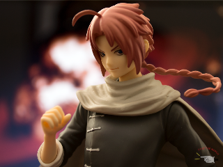
Leon was a bit troublesome to put together, mainly because his cape was not fitting into the stub slot properly.  I tried applying some pressure as I was inserting it, but that seemed to have warped the stub a little.


In fear of owning yet another damaged figure, I stopped forcing it in.  Instead, I let it hang loosely from his shoulders.  It's almost funny how Leon's head is actually keeping the cape in its place.  The cape becomes incredibly loose once I remove his head, though.  Sometimes it immediately falls off his shoulders, which is really sad when I think about it...

If you look closely at the image above, you'll notice that Leon's earring droops from his ear.  It's as though there isn't even a piercing there, which is actually quite amusing.  One may consider it a minor flaw, but I couldn't help but laugh because it looks silly on him.  I suppose with that expression he wears I'm meant to take him seriously.  Not with that earring though!

On a more serious note, Leon's Nendoroid Petit design matching his official artwork really well.  You wouldn't expect a smile from this little guy, that's for sure.

General
>
Overall, I felt this Nendoroid Petit collection was very well done.  Of course, for obvious reasons, I was not initially impressed by Sophie and Yuri’s figures.  After receiving my replacement parts, I quickly changed my opinions about them.  Now Sophie definitely looks cuter with her two pigtails and Yuri doesn't look like a fool for carrying a sheathe with no sword around.


Having compared the old Vocaloid Nendoroid Petits I bought a few years ago to the current Tales of series Nendoroid Petits, I can at least happily say that Good Smile Company has improved.  The paint job this time around is far superior to the paint job the old Nendoroid Petitss received.  I believe the Tales of series Nendoroid Petits are a tad smaller as well.  As you can see in the photo above, Len's head (figure to the left) is slightly bigger than Estelle's.


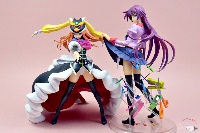
Fun fact: You can swap bodies and heads of all the Tales characters!  I had Milla wear Asbel's costume and Jude wear Leon's costume, and I must say they both look quite dashing.  Well, Milla's breasts have disappeared but that's a minor detail...sort of.  In all seriousness, Milla looks really nice in Asbel's knight costume.  I'm glad that costume was a first-print DLC bonus for the Tales of Xillia 2 game because I got to see how fabulous Milla looked in Asbel's outfit before I got these little figures.

You can be immature like me and give the boys some lady parts by swapping bodies.  It's really quite entertaining until you realize there are only three ladies in this collection.  Then again, there are many other ways you can entertain yourself.

I learned something very interesting when I received replacements parts for my Sophie figure. You can remove her hair.  In fact, you can remove everyone's hair!  It honestly struck me as peculiar when I saw extremely obvious seamlines on everyone's head, but then it hit me!  Good Smile Company did that on purpose so we could customize all the characters!  Swap their wigs and give them different costumes, I say!

I tested it out on Sophie and Leon the first time and got some amusing results.  Instead of having a confused Sophie, I had an angry Sophie.  Then I gave her Leon's body and she looked like an evil conqueror!  So you can definitely play around with all the Nendoroid Petit body parts!  Props to Good Smile Company these figures thoroughly enjoyable.

Should you buy a box of Nendoroid Petits?

I'm sure huge Tales of and Nendoroid Petit fans can't resist, but for those of you who are slightly interested, but aren't sure, here's what you might want to take into consideration.  The quality of Good Smile Company's figures have dropped a bit as of late because of some changes, so if you purchase a box of these figures, bear in mind there's a possibility (perhaps higher than usual) that you will find a defect or two like I did.  I know there are a lot of buyers who didn't have any problems with any of their Nendoroid Petits, but there is also a handful of people who have defective parts as well (check out My Figure Collection).

Fortunately, Good Smile Company will send you replacements parts should you have any issues.  You simply need to contact them.  On the other hand, buyers shouldn't really have to go through this process.  I was quite excited about these figures when they arrived.  I honestly wasn't expecting to have problems, but when I found defective parts I had to take photographs and exchange a few emails.  Granted, it was a very simple process.  I took photographs, saved them onto my computer, sent an e-mail to GSC's customer service stating my issues with the figures, and they made a request for my shipping information a few days later.

It's a straightforward process, but some people may consider it a hassle.

In the end, I have to say yes, it's worth purchasing a box of these figures.  If Good Smile Company wasn't going to compensate me for defective figures then I would have said no, but GSC really came through for me, so I'm happy with my Nendoroid Petits!

I wish you the best of luck if you decide to purchase a box of these Nendoroid Petits!

Summary:
Sculpt: 7/10 (I received two defective figures and one sword immediately broke.  Most of the figures are well done, but there are some parts that take some effort to piece together.)
Paint Quality: 7.5/10 (Good Smile Company has improved over the years but there are still some obvious spills here and there)
Design and Accuracy: 9/10 (They most certainly resemble their original designs)
Enjoyability 9/10 (You can swap bodies, heads, hair, and swords around, so you'll definitely have some fun with these Nendoroid Petits)

Manufacturer: Good Smile Company
Purchased from:Amiami
Price: 3210 yen

Thanks for reading!
~Suich

1/8 Stocking Anarchy (Alter)

$
0
0
"Seriously, go dry-hump something! I'm too hungry to deal with your shit!" -Stocking

Isn't she lovely? Here comes everyone's favourite sweet-loving, ghost-shaggin', big-breasted, gothic lolita angel sister. Now if you've been following, you'll know I prefer Panty to Stocking, but Stocking is just too damned beautiful to pass up. Besides, they're a pair. One without the other is like Sherlock without Watson, functional, but not nearly as entertaining.

Anyone who knows me already knows I love Panty and Stocking with Garterbelt. Nevermind their vulgar shenanigans, there's something attractive about their pastiche style. Besides, catching references makes me feel clever, and that fans my huge ego. It's astounding how many cultural nods they give. Makes me believe the producers weren't only drunk when they concieved the show, but drunk to the point of omniscience. Take a look at PSG's less-than-2-minute long music video. In that segment alone they reference Elvis Presley, KISS, The Beatles, Lady Gaga, Gorillaz, t.a.T.u, among others that I probably didn't catch. Nice.


Stocking is the much beloved, little Anarchy sister. Her quiet, badass attitude, punctured by episodes of scathing sarcasm, endear her to many. Sure, she's not as loud and memorable as Panty, but it's hard to say no to a girl who deflects bullets with her swords.

Let's dive right into the review.

Stocking comes in a wide-open box with a large viewing window. I usually don't have anything nice to say about boxes, but I rather like Stocking's. Most boxes with pastel colours look like a cotton candy cart accident (try saying that ten times fast), but Stocking's manages to pull it off, polka dots and all.


When Stocking's unpainted prototype first came out, I was shocked by her chunkiness, and I mean that in the best possible way. Stocking is stacked. She has all the TnA that Panty lacks, plus a little extra (look at those nice thighs). And Stocking is heavy. Little wonder too. She's 90% hair. Given her wee, delicate feet, I was nervous her ankles would snap. They didn't, obviously and thankfully, or this review would be filed under Oh Noes! On the bright side, she has none of the base problems that Panty does. All the pegs and holes fit right together.

Both Panty and Stocking have relatively uninspired poses, but I like Stocking's pose marginally better than Panty's. The slight cock of her hips and hands lend her a sense of delicate femininity that Panty lacks. And yes, she has hair-wings. High fashion, my friends, high fashion.

Similarly to Panty's base, I wish Alter had been more creative. Halo-base maybe? Disco lights? Ah well, I guess a blank circle with the PSG  logo isn't completely lacking in creativity. Oh wait, it is.


Stocking's sweet expression belies her gluttonous, snarky personality. Don't be taken in! She's just as callous as her sister! Alter did a decent job on her face, though she does takes on a rather simian appearance from some angles. It looks like they put her nose and mouth just a little too low. I want to take her jaw and shunt it up a couple of millimeters. Compress her face a little. Could help. Maybe.

Unlike Panty, Stocking has no eyeshadow! Just to be sure, I watched her transformation scene repeatedly (it was research, I swear), and waddaya know, no eyeshadow. Verisimilitude. Not laziness.


Stocking is the bustier of the two sisters, presumably because Panty burns substantial fat shagging Daten City while Stocking hangs around, padding out her bust with cake and candy. If I had fat distribution like Stocking, I'd stuff myself with sweets too. If only reality weren't so stingy.

Stocking's bust is so amazing I had to dedicate an entire paragraph to it. I have a few arbitrary rules when it comes to collection, one being "Don't get figure with boobs bigger than their face". Namely because they creep me out. I mean, turn down your headbeams, lady. Please. And Stocking's bust-to-head ratio comes pretty close. What size is she anyway? "F"? Actually, the better question is, how far does the alphabet stretch when it comes to bras? I saw a size "I" once and freaked out. The thing could have been a hammock for all I knew. Anyway.

Whatever her size, the sculpt around her breasts is super-duper. There's just enough buldge to make them look soft and pliable. They look cushy don't they? Her corset must be magical to hold up such substantial ladies. Or maybe the straps are metal. Either works. As an aside, I also love that Alter sculpted her collar bones. It's little details like that keep them in my good books.


Stocking seems to be designed with hardcore anime fans in mind. Just look at her "moe" points! Thigh-highs, lolita dress, corset, big breasts. Ah, I remember a time where I was big on gothic lolita. Now my heart belongs to steampunk, but gothic lolita will always ignite a small flame of nostalgia deep inside.


As with Panty, Alter did an amazing job on Stocking's skirt. It reminds me of a frilly souffle. I especially love the way her hand makes an indent. Unlike Panty's, Stocking's skirt is fully attached, with zero wriggle room.


Stocking wears underwear that matches her eyes! Strangely enough, she also appears to have a statistically significant buldge. Given the—oddness (and that's putting it lightly) of this show, I wouldn't be surprised if she turned out to be the trappiest of all traps.

Ignoring her questionable anatomy, take a gander at the way her panties bunch up around her glutteal cleft. Nice of Alter to give us some detail where the sun don't usually shine. Thanks, Alter!


Of course, as with all Alter figures, Stocking is not without detail. Unfortunately, not all the details are as crisp as I want them to be. The ruffles on her skirt are wonderful, and the cleanness of her nails and bracelets are well received. However, there is some paint bleed on her corset, and the area where her torso meets her skirt isn't completely clean. Makes it kind of obvious how she was assembled. Sort of looks like she was sliced through the waist and hastily stuck back together. Yipes.


Strangely enough, it's the small things that get me sometimes. As much as I love Stocking's giant hair and cutesy outfit, my favourite part of Stocking is actually her droopy socks. Droopy socks are adorable. Uncomfortable, but adorable.


I love Stocking's hair. Undertones all the way. Before I even watched the series, her unique hair caught my attention right away. It apparently resembles the hair of a certain Pony. Not that I watch My Little Pony or anything, ahem.

But after seeing the incredible detail in Panty's hair, it's a bit disappointing to see Stocking's hair resemble one big gumball. It's so plain and reflective it might as well be Lego. Her bow doesn't look like a bow at all. It looks like a piece of candy. I would have loved to see a few scrunches here and there. Maybe some pull lines around her bow. You know, something to show that it's hair rather than gum. It gets more interesting the lower we go, but not exactly better. By the time we reach the bottom, it's less gumball than laffy taffy. Seriously, staring at her hair makes me want to grab my piggy bank and run down to the nearest penny store for some good, old fashioned sweets (oh god, I just sounded really old, didn't I?).


The blandness of her hair could have been forgiveable had it actually been done to the high Alter standards I've come to expect. I'm a forgiving soul. I'll let some things slide, sometimes, especially if I understand it's a one-time thing. But besides being simple, the paintjob on Stocking's hair is also sloppy. Close inspection reveals paintbleed abound, especially where blue meets pink. It's like they used the wrong sized brush. The texture of her hair isn't the smoothest either. You can feel the grains. My Stocking even has a few scuffs.

But hey, no seam line across the bangs! That's always a plus!

It's difficult finding small brushes, huh?
So how does Stocking rate overall? For an Alter product, she's rougher than most figures I have. Her globby hair and paint mishaps drop her to a lower tier in terms of quality. On the bright side, Stocking still manages to catch the eye with her massive hair and beautiful costume. Put on the same shelf as Panty, Stocking easily takes the show, but close up, Panty's quality is clearly superior.


The lack of strip poles is a big disappointment in both figures. Fortunately, this can be remedied with the common, metal (chop)stick.


Ok, so maybe I'm being a little hard on Stocking. After years of collecting, I've seen way worse. Even doing subpar work, Alter manages to beat out contestants like Kotobukiya and Ques Q. It would be a lie to say I'm completely neutral when it comes to reviews. I'm disproportionately harsher with more expensive products, and less forgiving of well-established companies (Alter included). Some seam lines are ok if the figure is mad complex to begin with. Likewise, simplistic figures better be fucking darn amazing to earn a good score. My scoring system works much like a classroom. Anything around 7/10 is good. Anything above 8/10 is spectacular. 5/10 is passable, but anything under is fail. I'm not sure I've ever given a figure an overall failing grade before, namely since I try to get figures I know I'll appreciate, but hey, maybe one day...

Anyhow, I digress. Back to beautiful, busty Stocking. Her bow looks a bit like cat ears, huh?
 

The Anarchy sisters together! Side-by-side, the difference in their skin tones becomes obvious. Panty is warm where Stocking is cold. At first glance it seems Stocking has less shading than Panty, but I think it's just a matter of tone. I want to say something cliche, like "Oh look, they're like the sun and moon!" but decided not to, except that I just totally did (damnit).


Ever wonder how glorious these figures would be if they didn't dink around with cute cartoon wings and gave them full-scaled angel wings? Yeah, so did I.


Oh my, now I'm feeling a hankering for angel wings. Let's try another one! (Forgive the terrible lighting. Photos taken on whim are mostly crap, with some exceptions. This one is, unfortunately, not an exception).

No, I didn't butcher Gwendolyn. It's the magic of PS!
Final verdict? She's nice. Not spectacular. Just nice. She's certainly not up to Alter standards. The paint bleed in her hair is sloppy. She's also not as detailed or polished as some of their other figures. Still, she's lovely on her own, and all things considered, she's not bad at all.

Stocking's been tossed in the bargain bin at AmiAmi, if anyone's interested. Apparently her widely known bang bleed problem turned most people off this beauty. Would I pass on her given her flaws? Not at a bargain price, no.

Still on the fence? Visit Wiselhead for some kick-ass photos. That ought to convince ya.

The Run-Down
Box: 7/10 (I quite like this one)
Base: 5/10 (talk about Plain Jane)
Pose: 7.5/10 (Cute and girly)
Sculpt: 8/10 (Slightly too-long face, some roughness in hair)
Paint: 7/10 (Sloppy hair, some roughness)
Overall: 7.5/10 (She has presence, but isn't Alter quality)

Manufacturer: Alter
Price: 8800 yen
Purchased from: AmiAmi

Much love,
Jenn

Fuji Choko's "Fuji Shiki 2012" (Doujinshi)

$
0
0
How long as it been since we last threw up a doujinshi review? Too long, way too long. Shame on us! 

But art isn't dead on Poke the Merch, not yet anyway! It's been a while since we last reviewed a doujinshi, so forgive me for my artistic rustiness. Here I go:

If I were to describe this doujinshi in one sentence, it would be, "Can you paint with all the colors of the wind?" and yes, Fuji Choko can.

I spent a long time hunting for Fuji Choko's work. Ever since I happened to stumble upon one of their pieces while surfing the ever-expanding realm of the interwebs, I've been obsessed with possessing one of their collections. With good reason. I mean, just look at it! There is art, then there's Art, and then there's ART.

Fuji Shiki 2012 is substantial for a doujinshi. At 88 pages, it's one of the longest self-published collections I have. The paper is glossy, but not overly so.

I find art inherently interesting, but a surefire way to catch my attention is to overwhelm my optical senses with colour, and Fuji Choko's work screams, look at me. Look at the cover. Just look at it. All the glorious blue! That punctuating splash of magenta. That dizzying angle. Visual. Cortex. Overload.


There are no chapters in Fuji Choko. It's just straightforward, mind-numbing, delicious art. In many ways, Fuji Choko's work reminds me of Nao Tsukiji's. It doesn't quite go into the same level of detail, but both have the same bold rainbow-indulgence that I love.


Not only is Fuji Shiki 2012 stuffed with gorgeous character designs and bright colours, it's also filled with incredibly detailed backgrounds. Yeah, way to hit both of my weaknesses at once. Colour and detail. It's super effective. Excuse me while I keel over and foam at the mouth.


You'd think with a doujinshi so polished, I'd have nothing to critique, but you'd be wrong. Jenn will always have suggestions for improvement, even when no real improvement is needed!

I'm nitpicky about page optimalization in self-published books. After all, when I'm paying about a dollar per page, that page better be brimming with pure, aesthetic energy. Nothing sears my corneas like gratuitous white/black space, and unfortunately, Fuji Shiki 2012 is guilty of just that. After a few pages of glorious eye candy, it hits us with pages of unfulfilled space. Look at the size of those borders. Empty space, with one small piece of art plopped in the middle, like some lonesome island in a sea of desolate sea of white ash. It goes on like this for 12 pages. Surely the two pictures below could have been shunted onto one page. Surely the pictures could have been turned 180 degrees and displayed horizontally. The fact that they didn't jump on the opportunity to fully actualize these pages is a big disappointment to me.


So it's not all bad. The neat picture, cubic picture of the house below is nicely stylized and works well with a white background. But the girl? Oh no, she could have an entire art studio behind her. What's she doing fluanting a pencil crayon in empty space? I would never call a work of art a waste of space (that requires a dismissive, philistine attitude beyond my current sensibilities), but the girl with the pencil crayon feels unfinished to a certain extent. It's like the artist really needed something to throw on the page, reached into their sketch folder, and whipped out whatever they could find.


But you know what gets me? Redemption. Fuji Shiki 2012 quickly recoverys by thrusting rainbow sheets of aesthetic prowess in our faces. Take that, visual cortex! I'm particularly fond of the flat, patterned style of the two pictures below.


When Fuji Choko goes for it, they really go for it (I'm sorry, Fuji Choko, I don't know you're gender, so I'm referring to you as "they"). The amount of detail they put in their backgrounds is nothing short of spectacular. Imagine how long it takes to sketch, let alone colour all the little, refined bits? Way more dedication and love than I could ever muster, I suspect, and that alone is enough to warrant my admiration.


Of course, no doujin is complete without some Vocaloid love. I'm super happy Fuji Choko included the lesser known/newer Vocaloids. Like Kiyoteru (rock-star math sensei? Lemme at him).


Given my mini-lecture on page optimalization before, you'd think I damn all white space, but I don't. I damn wasted space Take the two pictures below. There's ample white space, but there is nothing about them that feel unfinished to me. Sure, the girl in the swirling globe of computer screen goodness could be floating through a matrix of program coding, but it's nobig loss that she isn't. She can stand alone. Waste not, want not, I guess, is the adage I was going for.


Most of Fuji Choko's art is to be commended for its full, vibrant backgrounds, usually with incredible depths. The risk with such all-enompassing backgrounds is losing your characters, but Fuji Choko manages it just fine.


It's clear Fuji Choko's had art training, or spends a lot of time staring into the distance. Their perspectives are spot on.

And that stag looks a bit like James Potter. Patronus form. Don't tell me it ain't so.


In longer collections, there is a chance of getting bored after a certain number of pictures (call it burnout, see Huke's BLK). After all, it takes variety to hold attention. Variety is to art as action is to film. No one wants to see the same image over and over again.

On the bright side, Fuji Shiki 2012 never becomes boring. Although the style never really changes, there is enough diversity to keep me interested. Take the two pictures below, for instance. The girl with the paper stands out to me. In the entire collection, it's the only one that uses mainly one colour (blue). Move one step to the right and we're assaulted with a dramatic, rainbow burst. Sweet.


Some Touhou fanart. Again, with the steep borders. Maybe the pictures would have been stretched had they tried to scale it to the page, but I would have loved to see both these pictures a little larger. Maybe the spine would eat too much of it. Maybe it won't be as visually appealing, in terms of arrangement and spacing. What do I know? Book binding works in mysterious ways.

Fuji Shiki 2012 has both original and fanart, although there is much more original than fan. Besides Touhou, there is also fanart of Fate/Zero somewhere in the mix.


I said earlier that this collection doesn't have chapters, but I was wrong (to a certain extent). There are 15 pages of manga near the end. Fully-coloured and vibrant, they almost feel like pieces of art rather than story. Take a look for yourself. There is at least two pages that look more like full spreads than scenes from a story.

If anyone is fluent in Japanese, I'd much appreciate a quick translation. I'd love to get a glimpse of the storyline.


There are scarcely any black and white pictures in this collection. This is one of them. Smooth, shaded, very nice. Looks like the smudge tool had a grand old time zipping all over the pages (if smudge tool wasn't used at all, forgive me, I know almost nothing about Photoshop except that it's supposed to shop photos, whatever that means). It's soft, and pleasant to the eyes. I almost wish there were more full-page black and white spreads than the 12 pages of mostly-border earlier in the doujin.


I've only shown you a tiny fraction of the incredible art in this collection. As I flip through it now, I'm still astounded by how many gems Fuji Shiki 2012 contains. All of Fuji Choko's collections are filled with heart-stopping gorgeous art. Nothing explicit. Only beauty. Getting your hands on any of Fuji Choko's collections is worth it.

That being said, Fuji Choko's works are difficult to find. I managed to snag this collection after months of stalking Yahoo Auctions, and it didn't come cheap either. If you're lucky, proxies will find some for you. If you're really lucky, you'll manage to catch their releases on doujinshi shops that ship internationally, like Alice Books. If you're unlucky, well, my condolences, but don't give up. I believe in you.

Title: Fuji Shiki 2012
Author: Fuji Choko (藤ちょこ)
Circle: Retro Choko (>ちょこれとろ)
Size: A4 (8.3 x 11.7 in)
Pages: 88
Price: 1500 yen
Purchased From: Yahoo Auctions Japan

Cheerio,
Jenn

Kingdom Hearts - Final Mix (Platinum Edition)

$
0
0
Ah, Kingdom Hearts.  I can't help but adore this series no matter how many games are released, or how ridiculous the story gets.  I remember loving the original Kingdom Hearts back in the old days.  Once the second game came out I developed an obsession with collecting merch from the series.  I even managed to pick up the Kingdom Hearts – Final Mix Platinum Edition while I was in Japan visiting my sister, and that’s what we’ll be looking at in this review.  Since Kingdom Hearts HD 1.5 Remix just came out, I figured why don’t we take a look at the first Kingdom Hearts special edition?


I picked this lovely box set up before I discovered reasonably priced proxies over the internet.  Many years ago, I knew this set existed and, at the time, sellers were charging approximately 100.00 on eBay for it.  So when I saw it in a used game shop in Japan for 4900 yen, I picked it off the shelf, grinned, and purchased it while my sister just smiled and shook her head.


The box itself is glossy and has a nice silvery shine to it when it's in sitting under good lighting.  The illustration Square Enix printed on the box makes Sora look really mature and much older than his fourteen-year-old self in Kingdom Hearts I.  It’s actually very fitting when you consider the heavy responsibilities placed on Sora’s shoulders.  He needs to save his friends, save all the broken worlds, fight countless Heartless creatures, and then some.   Plus, let’s face it, the series gradually becomes darker and more depressing.  Seven titles have been released so far, minus the final mix editions, and the storyline is just outrageous at this point. So yes, taking all that into consideration, the illustration is very fitting for the Kingdom Hearts series.


The box is quite thick and sturdy, and it comes with a nice plastic sleeve to prevent the contents from falling out.  The sleeve also prevents the usual wear and tear boxes get when they're left on a shelf for a long period of time. There are also a couple of nice quotes printed on top.

For those of you who are interested, the quotes are:
"I've come to see the door to this world."
"This world has been connected."
"You do not know what lies beyond the door."


Inside the box you’ll find your copy of Kingdom Hearts – Final Mix and another box housing all your bonus items.  The boxart is black and white for the Kingdom Hearts – Final Mix Platinum Edition, while the regular edition is in full colour.  My guess is that it’s meant to match the outer Final Mix Platinum Edition box since it also has a silvery shine to it.  Both are equally beautiful and shiny in my opinion. The colours are warm and soft on the regular cover while the monochromatic scheme of the other just looks beautiful as a whole.  It also helps the coloured logo stand out more.


The bonus box includes a small handful of items which fans may or may not find appealing or worth their money.  I for one don’t really care all that much for calendars unless they have never-before-seen illustrations.  Calendars only last a year anyway, so they’re rather pointless in my opinion.  Heck, I bought this special edition set years after it was released in Japan.  I suppose the nice thing about it is that it is packed in a clear crystal case, which also doubles as a stand to display your pictures, assuming you want to show off a 2003 calendar in the year 2013.  Some fans may also like the fact that the calendar cards also work as postcards.  They literally have “postcard” printed on the back, so once you’re done with the calendar or you feel you don’t want them anymore, you can send them to your friends.


A single sheet of stickers is also included in the box set.  There’s nothing particularly special about any of the stickers as they’re just cut-out busts of the main characters’ concept art from the original Kingdom Hearts game. I'm not too impressed with the stickers showing off the title "Kingdom Hearts Final Mix" either.  Two of the three look Photoshopped, but I suppose I can appreciate the one at the bottom right corner.  I certainly like the style of it.  Plus, it stands out from the other two.


Next we have these neat buttons that scream The World Ends with You / Subarashiki Kono Sekai.   They've got that neat graffiti look to them which gives them a nice edge. I for one love that game so the style really appealed to me.  They're nice to have on bags, I suppose, or in my friend's case, curtains.  But they're really just simple buttons in the end. 


The best item inside this box is the Sora mini figure.  You won’t find this little guy anywhere else and you can't exactly make him from scratch!  He’s surprisingly flexible which allows you to pose him the way you want.


If you tilt his head a little too much, he looks like a bit of a creeper, but I blame that grin of his.  It looks like he might do something evil rather than good, but hey, I guess Sora needs that sometimes.  Saving numerous worlds can be pretty damn stressful after all.  Frankly I'm surprised he hasn't cracked yet.

As great as this Sora figure is, he's cursed with a shoddy paint job, especially around the hands.  He's a bit flimsy as well, but that's to be expected of a product of Square Enix.  If you ever get your hands on him, don't grow frantic when his limbs suddenly fall off.  That's actually normal.  It's quite easy to piece him back together, and I'm incredibly grateful for that.  If any of you have ever read any of my Kingdom Hearts Formation Arts reviews, you would understand just how bad Square Enix's figures can be. Unlike the Sora mini figure here, if pieces of the Formation Arts figures fall off, it's quite difficult to put them back together.  They bring back bitter memories of me hurting my fingers while forcing the pieces to fit together.

I don't recommend holding high expectations for this little Sora figure though, because Square Enix generally produces poor quality merch.  We’re in the year 2013 and I still believe their Formation Arts figures can draw blood.

Despite the flaws, I still have a soft spot for this figure.  Perhaps it's because I absolutely loved playing with Legos, Duplos, and figures when I was a kid.  This Sora figure just reminds me of the good times.  I would have hours of fun just building houses out of blocks.  Maybe if I still had my Lego pieces on me I'd build Sora a little castle.  This kid deserves one.


As for the game itself, I must say there are a lot of nice features that weren't included in the original Kingdom Hearts game.  Unfortunately, some of those features were also missing in the English version.  We've got bonus scenes, extra boss battles, and more abilities.  I mean, it's a shame Square couldn't fit it all in time for the initial release, but at least you're getting more for buying the Platinum edition, right?


The best part about Kingdom Hearts – Final Mix, in my opinion, is the secret movie at the end after you’ve completed Jiminy’s journal and sealed all the Keyholes.  What a fabulous reward it is!  I personally never finished the game but I have seen the movie and it is beautiful.  Once I acquire my copy of Kingdom Hearts HD 1.5 Remix I am so gunning for that ending.  All for that glorious HD ending.  I’ll probably suffer a lot on the way, what with the watered down attacks and abilities, but hey, it’s worth it for Kingdom Hearts!  It’s a wonder how much Square Enix has improved on the controls in the HD version.  In the original Kingdom Hearts game there were very few commands.  It was quite challenging at times, especially with the wonky camera we had.

As a big fan of the Kingdom Hearts series, I’m happy I have this lovely box set in my collection.  Some fans may find that it isn’t worth shelling out extra money for a sticker sheet, an outdated calendar/postcard set, some buttons, and a little Sora figure, but some may enjoy those bonuses as well.  I expect Kingdom Hearts fans to want this in their collection.


It's a shame Square Enix hasn't made any nice Kingdom Hearts collector's editions ever since this one.  I mean, Kingdom Hearts II - Final Mix came with a sleeve and a nice pre-order bonus (a hard cover book), but that's not really a special edition.  I don't count the Kingdom Hearts PSP, DSi, and 3DS editions because there aren't any extra items that come with the systems.  For the next Kingdom Hearts Final Mix release I truly hope they include some nice items.

If anyone is interested in picking up a copy of the Kingdom Hearts - Final Mix Platinum Edition, the prices are quite reasonable on Yahoo Auctions. There were only a few available last time I checked.  I recommend using a proxy that doesn’t charge too much.

So are you guys ready to play Kingdom Hearts HD 1.5 Remix?  I sure am!

Summary:
Box: 9/10 (Love the shiny silver and the illustration of Sora)
Bonus items: 6/10 (It’s really only worth purchasing for the Sora mini figure, but I also like the buttons)
Game: 8.5/10 (It’s a classic game to me and I absolutely love the secret ending and bonus scenes in Final Mix)

Produced by: Square Enix
Price: 4900 yen

Thanks for reading!

~Suich

1/6 Velvet (Yamato)

$
0
0
Velvet, why hasn't Alter picked you up yet? Is it because your beauty surpasses their imaginations? Or because Mercedes didn't do as well as they expected? Either way, it's a bummer. I, for one, would have preordered her at the speed of light.

Velvet is from the PS2 game, Odin Sphere (you can also find it on PSN for a ridiculously low price). It advertises itself as an RPG, but is really more of a side-scrolling beat 'em up with a satisfying apocalypse story. Oh, and it's tres delicious eyecandy. I doth recommend it most avidly.

I have a long history of spontaneous buys. On a Likert scale of 1-7, with 1 being zero restraint, I'm a -3. Happily, Yamato's Velvet wasn't a spontaneous buy. I've been waiting for her for years!

I spent Odin Sphere waiting to get Velvet because of her beauty. That she ended up being a great character was icing on the cake. Velvet's animation is smooth, elegant, and all-'round exquisite. I had so much fun whipping her enemies into submission I accidentally overleveled, making the final boss battle a joke. Not that I minded. Nothing feels better than pulverizing the final boss in less than two minutes. Watching her fight is like watching a ballerina-gymnast. Plus she jiggles in all the right places. Such sweet eye-ambroisa just can't be denied (go to 6:10 to watch Velvet beat up a small, fairy child).


I was so sure Velvet would get the Alter treatment that I skipped Yamato Velvet's when she first released. Even after Alter jumped ship from Odin Sphere to Muramasa, I hung onto a sliver of hope. It took me years for to admit Yamato's Velvet was probably going to be the only Velvet available. So when her re-release was announced, I hit the pre-order with enough vigour to sprain something.

The bright side of snagging re-releases is the abundance of existing product reviews in which I can scrutinize my purchase beforehand. I didn't need any persuasion to pick up Velvetthe completionist in me would not stand for having two of the three Odin Sphere girlsbut the plethora of gorgeous pictures online assured me of her high quality. No nasty surprises for Jenn this time. I knew exactly what I was getting into.

Velvet's box does what it sets out to do, but it's not a work of art. The arabesque border is nice, but it's othervise not very interesting. Velvet's box is actually bit flimsy (see the warping on top), but it's light and gets the job done.


I am in love with Velvet's base. It's deliciously chic. Look at that wonderful floral weave, and that delicious simulation marble! I can't remember where the six-point star comes into play during the game, but it sure beats a circle in terms of creativity.


Yamato's Velvet has a bright, Little-Red-Riding-Hood/gypsy costume. She's peeks over her shoulder while drawing attention to her substantial backside. I'm not usually a fan of rear-facing figurse, but Velvet has a "follow me" vibe that I find infinitely attractive.


When it comes to characters, I like my guys all laid-back-puppydog and my girls cutthroat professional. Granted, there are aspects I find attractive in all characters, namely, intelligence and a strong independent drive. As the old saying goes, "I don't want no scrub, a scrub is a guy that can't get no love from me."

Velvet's mature, self-reliant personality warmed me to her immediately, and Yamato did a superb job capturing her character. Velvet's gaze is serene, cool, a little sad, and above all, ambiguous. It's emotionless, but not blank. You can tell she's got a million neurons blazing under her controlled gaze. It has dimensionality.


It's almost inconceivable that Velvet would spent all her time summersaulting through trees without decent support for her breasts, but most girls aren't 2D renders of gorgeous cartoon characters either, so some leeway is in order. Unfortunately, I'm not wholly satisfied with the sculpt of Velvet's breasts. Being oddly stiff and spherical, they look more like two grapefruits stuffed into her shirt than actual breasts (like they're tied at the base rather than "free falling"). And her nipples are so sharp I fear they might poke right through her top. Still, I'm usually too busy admiring the rest of her to really notice, so this is a minor hiccup at best.

Oh hey, a beautiful yellow ruff.


Moving down, Velvet has a simple, wrap-around skirt with beautiful folds. Nothing too complicated. Nothing too modest. You think a girl that traverses through vast sections of swamp, snow, and death would wear pants, but hey, fashion demands sacrifice. Besides, if anything gets too icky, she can conveniently spiderman her way through the landscape using her chains. Velvet's skirt made of soft plastic, and easily malleable in your hand, which brings me to my next paragraph...


Velvet is a cast off! She sheds her skirt to reveal deliciously risque, semitransparent undergarnments. That if, if you can actually get it off her.

Velvet separates at her bosom rather than her waist, so the skirt needs to be shimmied up her torso before coming off. Unfortunately, the contours of her body makes it impossible to remove the skirt without rubbing it against her skin, which puts her at risk for paint transfers. The softness of her skirt doesn't help. I was terrified I would accidentally tear her skirt. Then I would cry and cry...(then I would get up and fetch my superglue, but it wouldn't diminish my heartbreak).


Velvet has wonderful body sculpt, and looks spectacular as a cast off. Yamato did an excellent job bringing her body to life. She's a little thin, espcecially from the side, but she has a wonderfully defined ribcage, belly, back, and butt. What a super butt! I also love the meaty squeeze of her leggings around her thighs.


Overall, Yamato did a good job on Velvet's shading. Her skin is peachy and realistic. If you look real close, you'll notice a birthmark on her right side. Yup, despite having cast her off once for the photo shoot, my Velvet already has a couple of smudges on her skin. It's nothing a good Magic Eraser scrub won't fix, but scrubbing her every time I want to take a recreational gander at her yummy rump does get annoying. Being the only Yamato figure I own, I'm not sure whether paint transfer is a common problem, but I hope not.


I love that Velvet's underwear looks like a little butterfly at the right angles. You'd think a dispossessed, bastard princess from a fallen kingdom would be more impovrished, but nope, lace and pomp all the way.A girl's got to keep her memories of the good ol' times alive somehow, and what better way than to have them plastered to your privvies? Literally. Her underwear seems engrained in her skin. Oddbut who doesn't have a few idiosyncracies of their own?


Moving further down, Velvet has a bitchin' fine set of legs. Yamato gave her a sexy pair of semi-transparent leggings, and the shading around her knees is excellent. I don't say this often, but, dem calves.


Yamato does a tres bien on Velvet's particularities. She has nice nails, nice textures, and neat little lines in the stars of her hood.I'm not too big on the yellow paint they used for the wrinkles in her fingers, but they really only show up on photographs.

In case anyone is wondering how Velvet's chains stay on, she comes with a couple of transparent arm clasps that help keep the chains from slipping. The chains are plastic, not metal, by the way, which is good. It keeps them light and manageable, and less likely to cause warping in the future.


It's not often I consider buying Yamato figures (rumour has it that they're now called Arcadia), but Velvet speaks well of their quality. There are a few small scuffs, but nothing spectacular. Getting real close to her forehead, you can see slight imperfections on her paint, but it's nothing to write home about.

As an interesting note, Yamato also puts some neat textures into her attire. I'd love to see someone work a PVC, fuzzy sweater one day, or some genuine denim texture into a figure's jeans.


I love that they actually detailed Velvet's eyebrows. Who does that these days? Yamato does. Her eyes are glossy and sharp, and her lips are wonderfully shaped.


At 25 cm tall, Velvet is listed as 1/6. Here she is chilling with Samurai and Luka (both listed as 1/7), as well towering over the other Odin Sphere girls. She's clearly on a different scale than Luka but compared to Samurai, I can't be too sure. Scales these days. They're an enigma.


I'm well known for picking up figures on the whim, and appreciating them on aesthetics alone, but I can't deny the extra rush I get from knowing the character. Plus it gives me more to talk about then just the technicalities.

Velvet isn't my favourite character to play (that's Mercedes, with her overpowered machine-gun-crossbow), or my favourite character overall (Ingway, because Liam O'Brien rocks my socks), but I have a swell appreciation of her anyhow. With her pleasing design and elegant battle style, it's little wonder Velvet's the last playable character in the cast. Think of her as encouragement to make it through all six storylines. In many ways she reminds me of Fate Testarossa, with the blondness, the tragic family story, the serious demeanour, which can only be a good thing. Oh, and she's voiced by Miyuki Sawashiro in the Japanese audio, which gives her auto-awesome status.


Object photography is still relatively new to me. I am most comfortable photographing landscapes, because much of the work is already done. Not much surpasses the majesty of nature. I pace around a bit, maybe adjust my aperture, click, and maybe play with some contrasts. Object photography is more work. After so many reviews, repetition becomes an issue. How do I mix up my shots so that I don't flood this blog with waves after wave of flower pictures? Do I journey to faraway places with my figures? Do I throw more money at props? There isn't a day I walk through a store without picking up a neat bauble and thinking, this would be great for a photo shoot, or walk through a park without wishing I had my figures with me. With a finite inventory, it's inevitable I will eventually run out of set-ups, and although that moment is still far away, the need for novelty never strays far from my mind. Fortunately, some photo opportunities appear serendipitously. Like flipping through television channels at 4 a.m. and stumbling upon the Sunset Channel.

So what strategies do you use when taking figure photos? Any favourite techniques, favourite set-ups, favourite props? Personally, I love silhouettes. It's the contrast. Contrast gets me.


Enough photography talk. Back to Velvet.

Velvet's a lovely figure overall. She's elegant, beautiful, mysterious, and sexy without being smutty. Her pose is both delicate and confident. There's a sense of restraint in her character that draws the eye. I groused a bit over not having a more action-oriented Velvet figure, but she works just as well with a subdued atmosphere, especially given Yamato's excellent job on her expression. At 1/6 she's one of the larger figures in my collection. Her size and bright colours give her an impressive status on my shelf.

   If you're a fan of Odin Sphere, or just a fan of good looking girls, Velvet is a must get. Yamato really came through on her quality. I can't recommend her enough!If you missed out on her, she's available in the aftermarket for about retail price, but act quickly! Given her quality, I can see her price rising in the future. 

The Run-Down
Box: 5/10 (Box is box)
Base: 10/10(Fancier than the figure itself!)
Pose: 9/10 (Sexy)
Paint: 8/10 (Small scratches. Points lost for paint transfer)
Sculpt: 8.5/10 (Bits of roughnesss, odd boobs, supersoft skirt)
Overall: 9/10 (Her huge size gives her an extra boost)

Manufacturer: Yamato
Price: 9800 yen
Purchased from: AmiAmi 
 

Cheerio,
Jenn

1/8 Kamui - G.E.M. Series (MegaHouse)

$
0
0
I suppose some introductions are in order. I’m Ash, a figure collector and good friend of Suich and Jenn’s whom I call ‘Mom’ and ‘Deadbeat mom’ respectively. Like them, I too have an obsession with importing lots of sweet and expensive crap from Japan and so they invited me to do some reviews for the site!

Unlike Deadbeat mom and her harem of moe, PVC goddesses, my humble collection consists primarily of dudes in all their sinewy and strategically placed, bulge-y glory. My mission here on Poke the Merch will be to cover male figure reviews and do my part to increase attention for the tragically neglected, penis-having side of the scaled figure world. Good times. Now, let’s get to the actual review.


Kamui is from a beautiful comedy series called Gintama. Without being needlessly verbose about it, Gintama is brilliant. It is the greatest series ever. If you're feeling curious, I highly encourage you to check it out.


There's pure chaos lurking behind those
 angelic blue eyes.
Kamui is an adorable, gluttonous, space pirate captain-brawler, who hails from an insanely powerful alien warrior race. He loves nothing more than to adventure through unknown galaxies in search of worthy foes and yummy food. This baby-faced young man has all of the trappings befitting a true shounen hero!

Except that he isn't one.


Kamui is completely unhinged, not to mention beset with LITERAL bloodthirstiness. He’s actually the psychotic older brother of the heroine, Kagura and one of the series’ main antagonists. In true Gintama fashion, the lofty tropes of old are crowned with lampshades, the sacred cows are wantonly tipped over and this patch-worked quilt of retro shounen idiosyncrasies can become the nastiest little fucker this side of the universe!


So how does his plastic likeness hold up against scrutiny? Let’s start with his box.


It’s not so much a box as it is an unwieldy monument to cardboard and plastic excess. It’s so titanic that I couldn't even get a decent picture of it. There are quite a few graphics of the figure itself and there are windows on the top, front and sides of the box. The windows on the side are small and reveal nothing. I suspect that their bewildering presence owes to some lumberjack's compassion towards a single tree left behind after its forest was cleared to provide the cardboard for this one box. The colour scheme brings to mind that of bathroom tiles. I get that MegaHouse was in a bind. Kamui is a guy and a dastardly one at that. They can’t exactly bust out the pastels and sparkles (such a shame too). They also couldn't make the windows too large because of the numerous and fragile accessories that come with the figure. Apparently they came to the conclusion that dark blue was the perfect hue to convey boyish villainy and that when it came to packaging Kamui with his numerous extras, it was better to play it safe and go big. So here we are. It does its job, but it does not look good doing it.


There’s nothing too special about Kamui’s base. It’s a plastic circle painted with a harsh red-black gradient. It does what it’s supposed to do and taking Kamui’s cape, parasol and pose into consideration, it is the only thing keeping him upright. It’s not unusual for bases to bear the name of the figure but there is something about the way Kamui poses on his marked base that strikes me as hilariously territorial. It is as if he’s saying, ‘Bitch, this is MY base’. I do like that Kamui’s name is written in embossed calligraphic kanji. Coupled with the coloration, it really exudes an old school samurai/kung-fu film vibe that I totally dig. Pertinent!


Kamui’s pose is fairly unimaginative which is unfortunately, typical of male figures. However, he is enveloped by a dynamic, grungy mantle and theatrically framed by his vibrant umbrella. The combination lends him an undeniably dramatic presence. Is it cheating? Absolutely, but I can’t help but fall for it anyway. He absolutely vogues when he's viewed from the side and there is something in his stance that strikes me as smugly provocative. Isn't that precious?


Kamui is an enigmatic character. With his hair-trigger responses and willing descent into instinctual oblivion, he's the sort of guy who can wear an expression of vacant contentedness in one moment and a cruel, sadistic sneer in the next. It's difficult to know whether these expressions are sincere or some sort of affectation. Instead of probing into the nebulous depths of character speculation, MegaHouse wisely avoided fan ire and provided collectors with two extra heads so that they can display Kamui sporting whatever expression they think is best.


I think the faces MegaHouse provided are wonderfully representative of Kamui's complex character. I personally favour displaying Kamui with his evil smirk but I do find his wide-eyed face disarmingly adorable. I also love his foxy expression. It's clearly the most ominous face of the three but since it lacks the pop of colour that the other two provide, I prefer to display him without it. The sculpt of the faces are aesthetically pleasing and true to Kamui's appearance in the anime. His eyes, when you can see them, are shiny with a glossy finish and a vibrant shade of blue. The definition of his lips and chin are particularly note-worthy. I also love the subtle differences in the way MegaHouse painted and positioned the eyebrows and sculpted the mouth on each face.


Kamui comes with three heads but only a single set of hair which comes in two parts and can be detached and re-attached to his each of his faces. (Gintama fans can insert a joke here about how this somehow relates to the fact that male pattern baldness is hereditary). Kamui's hair is a mixed bag. I love his exuberant, two-dimensional, little ahoge and certain clumps and strands of hair appear to be well-sculpted, shaded and suitably detailed. Contrary to the washed-out and bland photos, (Picasa's doing a weird thing right now but they should look fine if you click on them) his hair is a dark, rockin' vermilion as nature intended. His braid, while woefully flimsy, is also acceptably sculpted. However, on the back of his hair there are a forest of seam lines and clumps of hair that are strangely lumpy and completely lacking in sculpt or definition. The bangs on the front part of his hair are well done for the most part but there are a few seams and spotty paint jobs hidden throughout the hair piece. The giant fissure running across his head is somewhat forgivable because that's where the hair pieces separate. I suppose this was done in consideration for his cute little ears but because it runs horizontally relative to his head, it creates a bizarre parting. 


You'll notice that Kamui has an impressive set of shounen 'canopy bangs'. It's cute and nostalgic but their presence makes getting a proper picture of his face a complete pain in the ass. Ah well, such is the nature of equivalent exchange.


Did I mention that Kamui is a CASTOFF? No?


That's because he isn't one, but you do have the option of removing his large mantle which is useful if you'd like to study the refined contours of his backside.


Without his cape, Kamui loses his volume and most of his whoosh. The wild undulations of his changshan provide a tamer but still rather lovely alternative to his billowing mantle and I do appreciate MegaHouse's attempt to give me a reason to display him cape-less. Sans umbrella, Kamui appears as though he's gesturing to himself whilst performing a shounen-esque grandstand. With his puffed-out chest, his pose still comes off as adorably arrogant.


I initially thought that his changshan seemed a bit too long but after consulting the source material, I discovered that it actually extends all the way to his ankles and the sculpt is therefore completely within the realms of authenticity. You've won this round, MegaHouse, but I'll get you next time.


Kamui is lithe as opposed to muscular which is appropriate considering that he's both a martial artist and a pretty boy. However, he is also a young man passing out of his adolescence. MegaHouse did an admirable job in sculpting his body as judiciously as possible in this regard. His body appears masculine despite his lack of throbbing pectorals. His slender hips give rise to a lovely pair of broad shoulders that are particularly scrumptious when viewed from the back. The inconspicuous dip between his shoulder blades is a splendid touch.


The white clasps on his top are cleanly applied with little to no visible paint spillage. Their somewhat uneven placement on his top is a very subtle touch of quirky realism. The changshan itself has fantastic definition despite its black colouring. The pull lines around his shoulders, sleeves, and waistband are marvelous and successfully convey the tension in his clothes as though he carelessly pulled them on without adjusting them properly. I think of it as an implicit allusion to Kamui's warrior-like disregard for ornamentation. The white cuffs of his sleeve are nicely shaded and the left cuff even has small folds sculpted into it.


The combination of glue and PVC skin grafts that often plague the empty spaces between figures and their clothing is a complete turn-off so I am very pleased that MegaHouse created space and shadow where Kamui's arms disappear into his sleeves, thus successfully creating the illusion of depth.


I love Kamui's adorable, puffy pants. The paint is smooth, the shading is impeccable and the draping is a masterstroke. MegaHouse lays down some sweet congruity by sculpting the folds of the pants so that they appear to be buffeted by a strong wind.


Now, I know what you're thinking, "Who cares about all that, where are the ass shots?" Sorry it took so long.


Kamui isn't the most colourful figure on the market and there is an abundance of grey due to the presence of his mantle. It makes it so that the teasing flashes of colour from his fluttering changshan are made that much more delectable. After all,  it's when you’re looking at a rippling wasteland that the calculated pops of colour are really able to candy the retinas. The dirty, startling shalt blues, the grungy, well-shaded greys and stark blacks create a striking combination. His accouterments may be eastern in style but his colours are gorgeously industrial. Yummy!


Kamui's ghost white skin tone is actually completely canon and a common trait among Gintama's dreaded Yato clan. The sun is actually their greatest weakness and prolonged exposure can be deadly to them which is why they are almost never seen without their parasols. Kamui is even known to parade around mummy-style in an attempt to stave off the sun's deadly UV, Yato-killin' rays. So it's not a painting error or negligence on the part of MegaHouse. That doll-like, anemic skin colour is completely legit.


Kamui's pale, delicate limbs are sculpted wonderfully for the most part. MegaHouse successfully depicts the subtle bone structures of Kamui's wrists and ankles as well as his thin, practically translucent skin. You'd swear you could see his veins. His hands are nuanced and I'm partial to the little tweaks of his fingers. The problem with Kamui's left hand is that his palm doesn't completely touch his side. Rather than placing a hand on his hip, it just hovers right above it. This is pretty commonplace for a lot of figures but just because something is conventional doesn't make it acceptable. The placement of the hand is unnatural but it is easy to ignore.


Kamui’s umbrella is a flower blooming in my heart. It's delicious, it's heady, it's purple in both colour and mode. The handle is actually made of metal, which makes sense considering how heavy it is. PVC would have snapped long ago under its tremendous weight. It's also totally canon! The Yato use their umbrellas as weapons which function both as clubs and firearms and naturally, they are made of metal. Kamui's parasol is the resultant offspring of the lovely marriage between structural necessity and verisimilitude!


Is Kamui as flawless as the series from which he hails? Nope. MegaHouse is not the almighty Alter. Sometimes even Alter can't be the almighty Alter, so it's prone to pitfalls. There are a myriad of seams and rough patches most of which MegaHouse localized on Kamui's mantle. To be honest, seam lines don't bother me as much as sloppy painting and sculpting errors do. If I can ignore them then I do just that. But this is still a review so I'll do my best to highlight every fault I can find.


I do, however, draw the line at painfully large and obvious seams like the one found on the back of Kamui's mantle. It's as though the sculptor cut along the cape with an utility knife. There is also a seam on the left side of Kamui's black collar as well as two Barbie-esque seams running vertically along the sides of the neck of his wide-eyed face (the other two faces are thankfully bereft of seam lines). The paint on Kamui's mantle has some grazing on the front where the fabric bunches around his shoulders and the quality of the paint itself is suspect. It is much rougher than the paint used on the rest of the figure and feels more porous. There is a strange gap between his left cuff of his otherwise lovely pants, and it looks as though it hasn't been properly slotted into place.


The handle of Kamui's parasol is a mystery. It is not attached to the umbrella by any means except through gravity. At first, I thought this was a flaw and endeavored to reattach it with superglue but I found that removing the umbrella from Kamui's grip without damaging the umbrella and mantle was much easier if I removed the umbrella without the handle and pried the handle out of Kamui's grip afterwards so I've left it as is. Is this detachable handle the result of negligence or the result of deliberate ergonomic considerations? I'll let you be the judge.


Despite the numerous faults in his cape, I still love it. It's presence is too theatrical to pass up. Just look at that light play. The cape is so substantial and alive, it feels like Kamui should be buckling under its massive presence. Instead, he arrogantly swaggers like the smarmy little bastard he (literally) is. I can even forgive the roughness of the sculpt and paint when I remember that it's supposed to be dingy. Kamui's a space pirate wading his way through the seediest parts of the cosmos with this heavy thing dragging all manner of tatterdemalion crap behind him. I'm not charitable enough to call it deliberate but my love of Gintama is so encompassing that even happy accidents relating to the canon can melt the ice from my heart.


Taking pretty pictures of guys like Kamui is a tricky feat. In Kamui's case, floral pictures are doomed to capture an awkward co-existence where things are bunched together by happenstance but are never truly artistically meshed. Kamui just isn't the sort of guy who frolics through posies. He won't fight them because flowers can't fight back and he can't eat them because they probably taste awful and thereat I hit the extent of his interaction with the external world. However, I found that Canadian winters can yield the perfect, bluish, horror movie lighting that really highlights the evil in Kamui's cheeks.


Villainy Pallor: Approaching Voldemort levels.
Let's also not forget that Kamui is from outer space. With a little resourcefulness, Photoshop and the godsend known as monitor pictures, I was able to cobble together some suitably sci-fi-looking nonsense. Someday, I'll take glorious monitor photos using my television and now that the weather has started to warm up a bit, I can finally take more outdoor photos as well. For now, please enjoy the blurry space explosions.


See that explosion? All me.
Overall, Kamui is a representative example of most of MegaHouse's work: there are flaws but it's still generally quite good. In terms of quality, Kamui is passable. Although his faults are somewhat numerous, they can be ignored and I like that he comes with a plethora of display options. His pose, while plain, is enhanced by his mantle and umbrella which allows him to hold his own on a shelf and though I personally like his coloration, those who prefer their figures with a little more pep might consider Kamui's colour scheme inadequately variegated. Nevertheless, MegaHouse did an admirable job replicating Kamui's appearance in the source material as faithfully as possible.


Realistically, Kamui probably won't appeal to many collectors outside of the Gintama fanbase, but if you are a fan of Gintama and Kamui, then I recommend him. MegaHouse is also going to release Kamui's sister, Kagura, in July so if you'd like to display the Yato siblings together then I suggest you snap up your Kamui figure soon as I suspect he will gain some renewed interest at that time. He's currently sold out at AmiAmi but you can probably nab him from Mandarake if you're interested. 

The Wind Up:

Box: 4/10 (The Hummer of boxy boxes.)
Base: 6/10 (Good, not great.)
Pose: 6-7.5/10 (Without the mantle and umbrella, it's rather plain. With the mantle and umbrella, it's deceptively whoosh-y.)
Paint: 8/10 (Clean for the most part and wonderfully grunge.)
Sculpt: 7/10 (Lovely, mostly, but there are seams galore.)
Resolved: 8/10 (Well, I like him.)

Manufacturer: MegaHouse

Price: ¥6760
Purchased From: AmiAmi

Livin' the loupe life in a monocle world,

Ash


Sinbad's Treasure! (Giveaway!)

$
0
0

Hello there, everyone!  Anime North 2013 is just around the corner and we have decided to do a giveaway at the event! (Post updated: May 21, 2013)


You must find us at the convention first of course!  I'll be cosplaying as Ja'far from Magi - the Labyrinth of Magic.  As Ja'far I'll be hanging onto Sinbad's Treasure box because let's face it, he would lose it anyway, being the laid back, irresponsible king he is.  It turns out we have some extra treasure we're willing to part with, so be sure to find us on SATURDAY, MAY 25, 2013 to claim a piece!  We have Magi Chara Fortune Series charms by Mega House (x4), "Tales of" Series B Trading Mascot Box Set by Movic (x7) and Hetalia one-coin figures by Kotobukiya (x18).

How will you find me?

As I mentioned above, I'll be dressed as Ja'far from Magi - The Labyrinth of Magic.  I'll be wearing glasses (can't see without them), I'll be travelling with Yamraiha, twins Aladdin and Judar, and I'll have my king Sinbad by my side as well.  Let's not forget I'll be carrying the treasure box around!  It's gold and totally pimpin'!  We made it ourselves so be on the lookout for it!

To acquire a treasure from the box, you have to do one thing:
  • Tell us the name of our blog.
And that is all you have to do!  Once you find me and tell me that one thing, you'll get to pick a prize from Sinbad's Treasure Box!  It will be first come first served!  You will get to pick out any one item that's available in the box.  We hope to see you there. =]

Remember, Saturday, May 25, 2013 only! Please note that if I am no longer holding a treasure box it that means all the items have been given away.

BUT WAIT! THERE'S MORE!

Find us and we'll enter you into a draw for a Strength Nendoroid!

To be eligible for the draw:
  • Approach our Sinbad and call him an "Aho-King"!  We prefer if you shout it out and point and laugh.
Note: Please don't harass all the Sinbads out there!  Find the one with the awesome twin Magi.

Figure Notes: All figures will include original boxes upon request.  The Tales of figures have been taken out just for photographs.  The Hetalia figures have been displayed but are in mint condition.  The Magi charms are new.  The Strength Nendoroid has been taken out of its package but it has been resealed.

Post it on Tumblr, Facebook, Twitter, or where ever else and share the love!  Tell your friends about this giveaway!

Speaking of Twitter, we will be tweeting about our whereabouts during the giveaway! See if you can try and hunt us down! Follow us today!

*One item per person.  In the event of any inappropriate conduct, we reserve the right to withhold prizes.*

~Suich


List of items available:

Ali Baba, Aladdin, Judar, Morgiana


Cless, Dhaos, Lloyd, Kratos, Luke, Asch, Jude


Hetalia One Coin Set A:
France, Russia, Germany, China, Britain,  Italy, America, Japan, Romano (South Italy)

Hetalia One Coin Set B:
Finland, Sweden, Canada, Greece, Spain, Prussia, Austria, Hungary, Chibitalia + Holy Roman Empire


Strength Nendoroid for our draw!


Anime North 2013!

$
0
0

Anime North 2013 has come and gone, and now we're filled with all the melancoly associated with coming off a caffeine high. We can't stress enough how much FUN we had this year. Amazing events, amazing people, and amazing cosplays every single day. It was an added pleasure to meet fellow blogger and dashing character, Chag of Hobby Hovel, who snapped a buttload of awesome photos for us. This year we went as a Magi group with our friends. Did you see us? Did you catch some pictures of us? (In which case, send 'em over, we love to stare at ourselves.)


Group cosplaying was a new experience for us. We've been going to Anime North since the beginning of time (for about 5 years), but this is the first time we decided to attempt a group cosplay. Con is a very different creature when you're in a group cosplay. Here's what we learned.

1. Travelling always takes longer than expected. Because you will get stopped for photos. On Saturday, moving from the Dealer's Room to a nearby Harveys, a trip that would normally take about 3 minutes, took over half an hour. But when you have all that love, who needs food? No one! That's who.

2. Mundanes are lifesavers. Mundane is a word we use fondly for people not in cosplay, and we love them with the fire of a thousand suns. They'll watch your bags when you're busy posing. Big thanks to our various friends for acting as our pack mules over the weekend, and sacrificing their own comforts for the sake of making our lives a little easier. A thousands kisses to every single one of you beautiful people.

3. Sometimes, you channel a character a little too hard. Jenn began unconsciously winking at passing ladies on Sunday, and didn't even realize it. Easy there, ladykiller. Are you Jenn, or are you Sinbad? (Jenn: I-I don't KNOW!) This rule however, does not apply to Suich because let's face it, Ja'far channels her, not the other way around.

Saturday we hosted our giveaway, and it was a resounding success! Huge, huge, huge shout outs to everyone who hunted us down! It was a blast meeting our readers, and we can't thank you enough for supporting us. Congratulations to Michael, who won our draw for a Strength Nendoroid!

Congrats, man. Congrats hard.
Though the giveaway was the highlight of Saturday, it was also a day of amazing events.

Anime Idol this year blew our minds. We have attended Anime Idol every year since it's conception, and this year was by far the best of them all. Damn, these people can sing.

Of course, then there was Totally Lame Anime After Dark, which never fails to deliver. Coupled with amazingly sarcastic commentary, we sat through clip after clip of devestatingly bad anime. They were so bad, they could only be hilarious. Which they were. We all dropped about 3 pounds laughing. It's even better if you bring a friend who has never seen nor heard of this event before. Their expressions of giddy horror give the occasional repeat/classic clip fresh hilarity. If you think any anime is bad these days, just watch one episode of Chargeman Ken. It'll throw your standards for a loop.


Then there are these depressing commercials for Suntory Beer.


Holy crap, that's some heavy stuff! What were they even trying to say about the beer? Life is hard, and nothing will make it better, so you might as well have a beer? Is that the fatalistic message they're sending? Does the penguin shed a single, world-weary tear in every commercial? Well, no. Sometimes it's his girlfriend instead.


...Deep.

Moving on. We can't go to Anime North without scoring some great deals! We paid to get in, so we might as well go home with some souvenirs. Unfortunately, it was disheartening to see some dealers trying to push fake figures. We found a booth selling an obviously fake Goddess Madoka (we didn't manage to get a picture, but here's a picture of the exact fake they had). Jenn was badly tempted to start some shit with the seller, but settled for warning potential buyers away whenever she had the chance. Always be careful at conventions, folks. Not all that glitters is gold.


But don't let a few bad apples scare you off. Sometimes, gold really is gold, and Jenn cheered up substantially after snagging herself Trunk Girl from one of the legit sellers there. Ash also managed to grab Kotobukiya's Shiki for an excellent price. Nevermind the buttons and prints and bookmarks available from all the brilliant artists in attendance.


We finished off the weekend by attending a Anime North Music Video Competition replay. A great event to end our Anime North 2013 adventures. One of our personal favourite videos? BaBOOM!!!! by LoneNinja11, because it reminds us of the first law in life: Everything explodes (and also because it was hilarious, etc).


And, of course, given our cosplays, how can we ignore this amazing AMV, "A Friend like Ugo" by nicolio1313?


As Anime North wound down, and members of our group cosplay retired, the Poke crew took some time to be our silly selves and recorded it on our economic point-and-shoot camera. Maybe you spotted us?

Sinbad, the Monkey King.
No, Ja'far, don't feed the troll!
Plush Sinbad stealing actual Sinbad's thunder.
Ja'far and Judar going at each other behind Sinbad's back.
Then pretending it never happened...
BAD SINBAD.
Judar: "LOVE ME, BAKA!" Sinbad: "N-NO!"
This year, we saw some amazing cosplays. We had our eyes open for the "big cosplay" that we seemed to get every year, but didn't spot anything quite as crazy as the Meowth Balloon cosplay from a few years ago, or Blue Eyes White Dragon from 2012. This year, it was all about Baby Avatar. Yes, Baby Avatar wins con. Because nothing beats baby cosplay.

We didn't take as many pictures of awesome cosplays this year, but Jenn did get to spend some time with Castiel from Supernatural and Kazuaki Nanaki from Hatoful Boyfriend (if you haven't played Hatoful, you must play Hatoful). Only her two favourite characters anywhere. She only spazzed a little bit, but we all know she had exploded inside. We could tell by the way the light left her eyes that a part of her soul stayed with both of them.

Pictured: Inner explosion in progress.
The fun thing about conventions, and any large gatherings of fans anywhere, is the potential for spontaneous moments of pure awesome. What were our favourite moments at Anime North that were purely fan-driven?

Jenn: On Friday night, while walking one of our darling mundane friends to the bus stop, a girl leaned out of a car (torso and all) and screamed "SINBAD" as she zipped by. That she recognized my character in the dark, and that she blatantly disregarded her own health by leaning out of a speeding vehicle, earns her a special place in my heart. I'm sorry my pathetic "WHOOO" paled in comparison to her loving serenade. It was all I could muster given our brief encounter. Kudos to you, random girl. Know that Sinbad would fall into depravity for you.

Suich: Seeing a couple of Hatoful Boyfriend cosplayers while standing in line to grab some burgers from Harvey's was a real treat for me.  A cosplayer with long, brown hair tied into a pony tail with a red ribbon came out the door.  I stared for a moment, wondering if it was Shuu from Hatoful Boyfriend.  She did have glasses on, but I was still a tad sceptical.  Then I saw a blond cosplayer (Nanaki) come out and I literally screamed, "HATOFUL!! You're cosplaying as characters from Hatoful, right?!" I kind of felt bad for screaming when they were practically in front of me but I was incredibly excited that Hatoful was getting some love at Anime North this year! I only got to see them for a moment on Saturday, but they were awesome! You Hatoful cosplayers were fabulous!

By the way, Jenn moping about not seeing them was an added bonus for me!
(Jenn: Good to know some good came out of my heartbreak. Hatoful is only my one true love, after all.)

Ash: During idol, a girl sitting in the row in front of us noticed my TEAM KOUEN jersey and my twin sister's TEAM ALI BABA jersey (we were cosplaying as Judar and Aladdin respectively). The jerseys were my sister's brilliant solution to the inevitable ass freezing we experienced at this year's colder-than-usual AN. She burst out laughing upon spotting our attire (which happens to be my favourite reaction to just about anything) and then said that she's aligned with Ali Baba's team to which my sister enthusiastically exclaimed, "One more for the underdog!" and I responded with, "I'll claim your soul for the dark side someday, just you wait!". In true Canadian fashion, I just couldn't help adding a 'please' when I asked people to fall into depravity. I'm evil, not rude. Playing the villain was a lot of fun!

And that was how our Anime North went down. Sure, we don't get the big name celebrities, but there's a certain easygoing atmosphere at Anime North that sets it apart from larger, more well known conventions. Nevermind that it has an adorable, Canadian flair. Everyone asks politely to take your picture, then thanks you after. There was no shoving, no attitude, and a thousand apologies for accidentally whacking others with props. And there was hugging. Lots of hugging.

Sinbad's feeling the love. And the weight.
And the love.
That concludes our Anime North 2013 adventures. It was too much fun. So much fun it hurt. Between our group cosplay and the success of the giveaway, we're already looking forward to next year. Look for us in our Magi/Hatoful cosplays (disclaimer: probably).

Suich is already planning next year, because that's just how she rolls.
Thank you, and goodbye (for now),
Jenn, Suich, and Ash
Poke the Merch

1/8 Alvis E. Hamilton & Lavie Head (Alter)

$
0
0
Has it really been almost a decade since Last Exile aired? Where did all that time go? I'm not sure I remember much from the show except that I marathoned it one weekend and enjoyed it.

When Alter announced their new Alvis and Lavie figures, my frugal senses went wild. Sure, they're tiny, and sure, they're not that fancy, but they're still two figures in one box, and that was enough to warrent a pre-order. Plus it's Range Murata and Alter. Team of champions. READ ON.


If there's one thing I love about Alter, it's their ability to surprise. Rather than rely on old faithfuls, Alter sometimes whips a figure straight out of the left field. Like Buddy. Where did she come from? Why did she get a re-release? Methinks there be a private fan within the Altersphere, but that's either here nor there. Naturally, there's risk involved when engaging older lines, but I respect a company that's willing to test the waters. Toss a bone and see who jumps. Do it out of curiosity, if nothing else. After all, it's not like Alter's reputation could go down for humouring a few oldies like me. If they ever release a Deedlit figure, I'd buy the hell out of it.

Alvis and Lavie get neat new designs in Fam: The Silver Wing, but as someone who grew attached to their child incarnations, I'm glad Alter decided to stick to their younger forms. It's nostalgic.

The two girls are tiny, and come in an appropriately tiny box. The cardboard is slightly metallic, with a bright orange backdrop that contrasts nicely with the grey. The sides are stippled, and free of redundant figure shots.


(**Click to enlarge photos**)


Late last year, I surprised myself by buying several seated/reclined figures in quick succession. (Alter's Menma, Orchid Seed's Blanc Neige, GSC's Mayoi Hachikuji, and these two). Earlier, I had a distinct dislike for seated figures. Their positions leveled out their butts, they were boring, they took up too much horizontal space, my complaints went on and on.

But predilections have an odd way of working, and 'lo and behold, seated figures won me over with their deployability. Their ability to sit in any environment is, for the lack of better words, totes bitchin'. As an added plus, they also tend to come with miniature furniture, and miniature anything is automatically adorable.

Alvis and Lavie come with a wonderfully detailed, metal bench. Alter also provides a polished, black slab with the Last Exile logo, but it attracts fingerprints and doesn't do much for me, so I tend to go without. The bench looks cold and inhospitable on its own...


...but it's nothing two adorable girls can't solve!

Alvis and Lavie are based off the cover illustration for Prismtone: Range Murata Anime Works 1998-2006 Art Book. Both characters are displayed in adorable, casual outfits. I hesitate to call them pajamas, but that's what first comes to mind. Lavie's appears to be a babydoll version of her tomboyish tang-and-shorts, while Alvis shows off her legs in a short summer dress.


Since Alvis and Lavie are essentially two separate figures, I'll look at them each on their own.

Lavie comes first. Perched on a tiny, cylindrical, superglue case, she kind of looks like she's squatting on the can levitating. Of the two characters, Lavie was the more memorable character. Her spunky, genki-girl attitude, mechanical aptitude, and cute 1920s bob cut ingrained her in my hippocampus. Alter did a great job capturing her amiable personality.

I sort of wish she had a wrench dangling from her left hand though. That would have elevated her to a whole new level of perfect.


For the longest time, I promised I would pick up one of Range Murata's art books. Alas, that promise has yet to be realized. Range Murata's art is so prolific you probably recognize his pieces, if not his name. His baby-faced, almond-eyed characters are easily recognizable. As usual, Alter translates his style into 3D with ease.

Many attempts at sculpting tongues end up looking like pokey piece of pink PVC protruding from a facial hole, but Lavie's tongue actually works well with her carefree pose. She's not forcing a funny face, or photobombing, or posing. It's like the camera just happened to capture her in a moment of natural goofiness. Awesome.

By the way, look at her cute little fingers. Fantastic.


I'm not really one for short haired girls. Sure, a cutthroat bob works well on the professional businesswoman types, or a Roaring Twenties flapper, but I've never been a huge fan of the style. I, for one, was forced to have an adorable bob cut as a child, which made me look like a rotund mushroom stuck gracelesssly onto a pair of human shoulders. Not exactly flattering. On an aesthetic level, shorter hair just doesn't have the whoosh factor of longer hair. Lavie is actually the only "true" short-haired girl I have in my collection.

Thankfully, Alter did such a spot-on job on Lavie's 'do that I think of her as a trailblazer for future short-haired girls rather than an amusing oddity in my collection. Unlike GSC's Misaka Mikoto, Lavie's hair is full to her nape. She does have an unfortunate seam line that I think could have been better hidden under her goggles, but so many figures have this seam I've almost become blind to it.


I love illusions. I love octopi that look like coral, leafy seadragons that look like weeds, and fuzzy ptarmigans that look like snowballs. I love fooling my occipital lobes, thereby sticking it to millions of years of evolution (take that, nature!). Along the same tangent, I love when PVC imitates fabric. Over the years, companies have improved tenfold with their representation of clothes. Take any 2008 Alter figure and stand it next to a 2012 one. You'll be lucky to get one or two folds in the 2008 figure. As for 2012...

Folds abound! Look at that intense, rectitude to physical law. Delicious-max. As though that's not impressive enough, Lavie's dress is also well shaded. It's difficult to see on camera, but each fold is adorned by a pale, purple hue. 


Of course, I never talk Alter without talking about detail. Lavie may seem plain, but her sculpt and paint are top notch. Her goggles have a lovely metallic sheen. And her boots have equally lovely treads. I do wish her goggle lenses had more transparency though. More like Shinobu's.


Moving onto Alvis: The cute one. Ok, they're both cute, but she's certified cute. By certified cute, I mean "cute" is her defining characteristic. She was the closest thing to a mascot Last Exile had—a mascot that powers up while answering riddles, the capacity of which saved her from being a total moeblob.

Alvis is a shy character, at least compared to Lavie, and her pose reflects thusly (oh la la, "thusly", pinkies up, folks). Her arms are drawn around her plush, and she doesn't have Lavie's slouch. Her expression is more reserved. Without Lavie to lean on, she looks a bit stiff, like a loud noise might scare her away.


Alvis' face isn't quite as spot on as Lavie's. She's a little thinner in the face than her promo pictures show. Nevertheless, she's still awesome cute. I'm glad they went with twin tails rather than buns. A girl's gotta let her hair sort of down sometimes, y'know?


Like with Lavie, Alter put work into Alvis' hair. I especially like pompons in her headband. The texture is delish. They look like charred meatballs. And I mean that in the most complimentary fashion possible.

Unfortunately, her hair's not perfect. There is some roughness towards the tips that brings down its overall quality. It doesn't bring down the quality by a lot, no sir, but it does put a bump in an otherwise smooth ride.


Once again, like with Lavie, Alter paid close attention to Alvis' dress. The flower print is clear, all the folds are in the right places. I also love the way her bloomers peek from underneath her dress. Details, my friends.


Speaking of details. The paint job on Alvis' flower pattern is rutally kosher. The flowers are tiny and perfect. Tiny. And. Perfect. Thanks to their puniness, they don't even look like flowers from the get-go, which makes the feat even more delightful.

Clearly, a stencil of some sort was used to achieve this bright and massive outcome, which only leads me to my next question: How did they stencil so finely on a wrinkled surface? Surely the pattern isn't painted on before the PVC is wrinkled, and stencils aren't known for being excellent at rounding corners. Maybe they're using some sort of soft stencil that adheres to crinkled surfaces, but even then, Alvis is so tiny, I can't imagine them getting the stencil to seal tightly enough for such clean lines. Maybe they use tiny stamps instead. Or magic.

Of course, there's still the chance that each flower is hand-painted (their yellow middles are done by hand, since some of them are off-center), but I can't imagine the patience it would take.

But enough fixation! No need to clog this blog with my personal obsessions. ONWARD, to the next section!


Goat are cute, yeah? When they're not headbutting you to death in Eternal Sonata, yeah? Alvis' plush almost makes hearty baas upon physical punishment. Not in the figure, though that would be awesome. In the show.


Hey, hey, did you notice something?

Alvis and Lavie are wearing boots that match each another. Alvis has orange soles to match Lavie's  hair, and Lavie has green soles to match Alvis' dress. Oh snap! Cute factor just jumped through the roof!


As I mentioned, sitting figures usually have flattened out butts, which looks hilarious when they're not seated properly. It's still one gripe I have with seated figures, but I guess the alternative would be equally hilarious butt-prints in their base.


Here in Canada, we finally got two weeks of decent-like weather. I stuffed Alvis and Lavie in my pockets and rushed into the largest lightbox known to man, a.k.a. outside. If anything, the great outdoors was too effective of a lightbox, and many of my photos ended up overexposed. Thanks, great outdoors! On the bright side (no pun intended), I managed to land a few decent shots before the hail swept in and killed both my flowers and my spring-specific sense of renewal. Canada: Where you can experiene sunburn and frostbite in the same day, eh? EH?


As with all sitting figures, I had a ball mixing and matching. Sometimes, I'm tempted to buy a figure just for the base. It's not financially intelligent, but it sure is fun. Here they are comadeering Menma's and Totori's bases respectively.


And Tsubasa Hanekawa's.

NERDS. NEEEEERRRRRRDDDDSSSSSSS.
And doing what they do best, sitting on more stuff.


And watching the sunset over the mist of an industrialized fantasy world.


You'll remember Alvis and Lavie made it to my top releases of 2012 in my yearly review. Knowing my general preference for dynamic, windswept girls, it was a surprise to find them lodged so firmly in my heart. I searched long and deep for answers, and came up with this: They're just the right combination of atmosphere, technical achievement, and nostalgia. They give off a relaxed, summertime feel, they're high quality, and I just so happen to have some attachment to their characters. GSC's Triela wriggled her way into a high score for the exact same reasons.

Which is why it hurts so much to see them lounging in AmiAmi's bargain bin (granted, they're not on sale by a lot, which soothes my outraged heart). Seriously, folks, they're a beautiful, adorable pair. What's up? Maybe Last Exile really is too old to re-engage. Or maybe, despite what I see in them, they're just not that interesting. Or maybe they lack proper panty shots. Or maybe they're just plumb tiny.Whatever it is, they're a real grab for fans of the show, old or new.

(Did I mention you're getting two figures in one? If that's not a good deal I don't know what is.)

Their cuteness compels you.
The Run-Down
Box: 7/10 (Small, with nice stipple)
Base: 9/10 (Detailed bench , but the black square fingerprints too easily)
Pose: 10/10 (Two girls chillin' like girls ought to do)
Paint: 9.5/10 (The smallest of slips here and there)
Sculpt: 8/10 (Funny, flat butts, some roughness, otherwise really cute)
Overall: 9/10 (Outstanding)

Manufacturer: Alter
Price: 8800 yen
Purchased From:AmiAmi

Hoot, birdies,
Jenn

Shadow Heartless (Square Enix)

$
0
0
Heartless.  They’re incredibly adorable until they slash or backhand Sora across the face, causing him to lose heath.  Then it’s all about beating them and then (maybe) feeling bad later.  I mean, they don’t know any better!  Personally, I can’t help but feel bad every now and then for beating one of these little guys in battle even if they attack me first.  They’re really cute for enemies, which is why I ended up purchasing this plush.  Let’s take a look at Square Enix’s latest plush toy!

Much like the Wonder Nyan / Meowow Plush I reviewed a long while back, the Shadow Heartless is big, squishy, and sewn really well.  I guess you can’t really go wrong with making a plush that’s 95% black fabric and cotton.  If Square managed to screw that up then I wouldn’t have any hope left for their products.  It’s bad enough their figures are poorly made.  Honestly, if they were to have a third party manufacture their figures they would sell far more than they do now.  It’s not just about design, Square.  Quality matters too!


In any case, Square's Heartless is approximately 25cm tall when it is sitting upright, antennae included.  35cm if you hold it up and add its dangling legs to the height.  This little guy is made of polyester, just like the Wonder Nyan / Meowow plush, so both of Square Enix's official plush toys are relatively soft.  It would be much easier hugging the Heartless than the Wonder Nyan / Meowow plush simply because it’s not stuffed to the brim. I remember trying to hug the Wonder Nyan plush before and it was pretty stiff.  Jenn and I even made jokes about that cat being punt-able.

The fun (and sad) thing about my Heartless plush is that it’s remarkably listless.  Seeing how broken this creature actually makes me feel bad about ever attacking the Shadow Heartless in the Kingdom Hearts games.  Good job, Square.  Good job. 


When I held it up in the air for the first time, its arms and legs just dangled like there were no joints—which there aren’t in the plush, but it certainly makes this poor thing appear defenceless. Its arms and legs are stringy making it look incredibly weak and vulnerable.  While I do like the Heartless plush the way it is, I’m just concerned that a simple tug or two could result in me tearing its arm off.  The stringiness, in a way, cheapens the product, but at least the rest of the plush is solid.  

As a huge Kingdom Hearts fan I can dismiss its little flaws.  If I can excuse Square's Formation Arts figures, I can most certainly excuse some weak limbs on a Heartless plush.  It’s not like I’m going to tug on its arms or legs like a sadistic monster anyway, but for those of you with pets or younger siblings who are curious, you guys best be careful!  Also, keep in mind you shouldn't hold the Heartless by its arms or legs.  It's best if you're cautious.

In any case, I'm rather impressed by the overall quality of this plush.  The eyes definitely don't feel as though they'll fall out any time soon.  They're really stuck in that Heartless's head! The antennae are really stable, much firmer than the limbs.  Its head is securely sewn to its body so no one needs to feel worried about it tilting in any direction.

I'm really content with the fact that cotton isn't spilling from any of the seams.  Clearly there's the right amount of stuffing in its head and body.  


There is, however, one small flaw with my plush.  This may not apply to all the Heartless plushes out there.  After placing the Heartless on my shelf I noticed it likes keeping one of its legs twisted.  I tell you, this one's a peculiar little guy...He has one leg facing forward and one completed twisted the other way.  I often try to adjust it, but it insists on looking even more deformed than it already is.   Every so often it submits to me and keeps its legs facing the right direction though, but that requires a bit of effort. 

Its head is slightly bigger than its body, but because there are beans packed in its bum, it’s able to sit up against a vertical surface without toppling over.  Seriously, if you grope its bum, you’ll notice there are lots of beans inside!  Huzzah for groping weird creatures!  But on a serious note, I’m glad Square put those in.  Otherwise my plush would be stuck face planting for life, and that’s just unimpressive, even for a lowly Shadow creature! 

 Sometimes it can sit up on its own too and I must say it looks adorable!  


I was impressed with how well my photos came out. I didn't have to struggle to keep my Heartless in a sitting position, which saved me a lot of time and effort.

I noticed that most of my photos make the Heartless look incredibly sad, as though tears should be streaming down its face while its expression remains...well, blank.  It's like a broken-soul cry.  The tears could tell all the tales...if it could cry.  There are times when its eyes can just rip through your soul, but that depends on how sad a story you give it.


Every now and then, when I stare at the Heartless on my shelf, I want to give it a hug, especially since mine insists on keeping its leg twisted. Heartless already lack proper bodies, brains (probably), and hearts, but this plush almost pushes it to the edge.  Maybe it just needs to feel something since it's already missing so much in its hopeless little life.  This Heartless can look sad and broken from all angles.  One glance at the preview icon I put up says it all!  It's leaning against a wall looking dejected, like it's mulling over its horrible day!  Or maybe it's mentally preparing itself for a beating.  Once Sora finds it, that's it man.  Game Over.   I finished off a Heartless by stabbing it in the bum with Sora's Keyblade in Re: Chain of Memories one time.  Jenn won't let me forget it even though it was an accident.  I can't help but feel guilty and my only excuse is, "It attacked me first!" Not a very good excuse mind you, but it is one nonetheless.


Seriously, I feel the urge to hug it because it's just so sad! If you look at its eye in the picture above, it's slightly narrowed, making it seem as though it's about to choke out a sob or two.  Angles can really change your perspective on things... 

I think from now on I'll be wincing a little every time I beat a little Heartless in battle.  Playing Kingdom Hearts is going to get rough from here on out...  Once again, thanks a lot, Square for making this cute but depressing little plush.  It's making me feel things!

World-wary Heartless just needs some love.
And some alcohol.
There’s not much else to say except good job on another decent product, Square Enix! Keep it up! 

The Shadow Heartless is a wonderful addition to my Kingdom Hearts and weird plush collection.  Poor Flynn is just surrounded by strange creatures.  Are they friend or foe?  Who knows!  But I suppose he has a good reason to look unhappy now.


In any case, I recommend Kingdom Hearts fans pick this cute little guy up.  He looks great on my shelf and let’s face it, there were lots of us waiting for an official Heartless plush for a long time.  I hope people don't purchase the counterfeit ones anymore because this little guy is simply adorable!

Supposedly Square is going to release a Dusk (KH2) and Flood (BBS) in the future.  Let's look forward to those as well!

Manufacturer: Square Enix
Price: 2490 yen
Purchased from: Amiami

Thanks for reading!

~Suich

1/8 Tenshi exclusive ver. (GSC)

$
0
0
Behold! Tenshi descends from heaven to grace the earth with cuteness and charm—

Wait, wait, wait, didn't I already do a Tenshi review? Well, yes I did, and kudos to you for being so clever. But it's common knowledge that everyone could use an extra angel, so the when GSC announced they were releasing an exclusive Tenshi, complete with glorious, sweeping wings, I freaked like balls.


See, my flighty nature prevents me from committing to any one character for long, and my urge to buy repeats of any given character is actually quite low. Unlike more dedicated collectors out there, I have never mastered, or even understood, the art of shrining. Tenshi, however, has a quiet badassery I wouldn't mind indulging.

Tenshi hails from Angel Beats!, a series developed by Jun Maeda, creator such dramas as Clannad, Kanon, and Air. Unlike it's predecessors, however, Angel Beats! hits hard with the comedy, and falls flat on everything else. Such aimless meanderings I've yet to see in South American tributaries. The plot was a mess, the pacing, hackneyed, and the gaping plot holes made me wonder whether the writers were shot. Tenshi's was the sole reason I saw it through. She was, to put it lamely, the wind beneath my wings.

Lately, GSC seems to be going down the road of fully covered boxes (see Racing Miku 2011), and I'm not sure I like the idea. I enjoy peeking through windows. Makes me feel all through the looking glass. Fortunately, Tenshi's box is relatively pleasant, with a lavender gradient wash and copies of Tenshi's promo pics on all four sides. For an exclusive figure, I would have preferred a plain white box with silvery words, and elegant, shining wings (as opposed to Lacia's sleek black box), but hey, as long as it does it's job.

(**Click to enlarge photos**)


Like the previous Tenshi, this version can be displayed with or without wings, though once you've seen her with wings, it's difficult to see her "streamlined" version as somewhat lacking.


Without wings, Tenshi looks like any old anime girl, casually flipping her hair in that enticing way girls do but don't realize. In fact, she looks so relaxed I almost want to plop a bag of groceries in her left hand. You can almost see her taking an afternoon walk on a street of solid cheese.


Wait? What cheese? No, I'm not making schizotypal associations. I'm talking about her joke of a base. I could write an entire essay on why her base drops the ball. I have high expectations of exclusive figures, if not for anything other than their higher price tags. If I'm going to pay extra, I want it all. I want ball-busting detail, glorious paint jobs, dynamic poses, and decent bases.

But what disappoints me about Tenshi's base isn't that it's simply round, plain, and otherwise unadorned. Plenty of exclusive figures have plain, round, unadorned bases, so that alone isn't enough to rile my ire. It's when a base detracts from a figure that I begin to bristle. Tenshi's base looks unfinished, like GSC went for imitation sand and failed to pull off the texture. Is it hard to imitate sand? Not really. So what happened, GSC? Caught a bout of halfassery, did we? If you didn't want to bother with a nice base, just use a clear, circular piece of plastic (like they did in promo pics). It would have looked better than a half-baked, half-decent, non-aesthetic chunk of semi-ripe cheddar.


Breathe deep. Calming down. Moving on.

Tenshi isn't one for strong emotions. Till the last few episodes of the show, she operated with the unreadable professionalism of a practiced poker player. It surprised me that GSC decided to go with a smile on both her figures, considering she smiled only about once in the entire series. Nevertheless, her shy smile and slight blush are too sweet too criticize.


I've been bothered by the appearance of Tenshi's bangs, but couldn't put my finger on it till recently. Then, as I was taking photos, it suddenly clicked. Tenshi's bangs are a little wide and squashed, which makes her head look a bit flat.


Naturally, Tenshi also has a seam line between her bangs and her hair, but it's a feature so common it might as well be tradition. Still, I look forward to the day manufacturers get around this minor nuisance. Alter made a good attempt at hiding Stocking's seam line, after all.


Neither her slightly misshaped bangs or bang seam are a big deal given the generous sweep of her remaining locks. There's some nice whoosh in there, and the tug lines around her hairband are a plus.


There was a hubub about Tenshi's dress a little while back when GSC teased a shot of her (nsfw) cast-off. There was an even bigger hubub when consumers realized that GSC trolled everyone, and that Tenshi is not a cast-off. You could, of course, cut her dress off. It's not attached to her body in any fashion, and there's a convenient seam line you can use as a guide, but the entire procedure has a do-it-yourself, IKEA vibe that doesn't sit well with me (much in the same way GSC's nendoroid-sticker-faces don't sit well with me).

Either way, a cast-off option would have been wasted on me. There are girls I would like to undress, and girls I wouldn't, and Tenshi falls into the latter. Rather, I enjoy the summery flair her dress provides. Its semi-transparency is significant enough to provide an ephemeral feeling to her overall character, but opaque enough to censure her lady bits.


Tenshi is not very heavily shaded, a prudent decision on GSC's part given her angelic atmosphere. Her buttons and ribbons provide all the spice she needs. The sculpt on Tenshi's dress is pleasant and detailed, though I find it strange that her ribbons so not have holes through their loops, though clever placement of her ribbon ends actually negates the need for holes.


Tenshi has thin, girly legs. Look at how tiny her calves are! Careful on those sticks, girl. Angels with broken wings are acceptable. Angels with broken fibulas are just silly.

On first inspection, Tenshi seems like a chaste girl. But a closer inspection reveals she wears an enticingly short dress. One naughty gust of wind and she'd be flashing her panties at the world.


And since we're going there anyway—

Tenshi wears safe, white panties. Did you really expect anything else? 


Getting down to the nitty gritty. I've said before I like my exclusives to have ball-busting detail, but not all characters are as ornate as I want them to be. Tenshi is a keep-it-simple girl, but that doesn't mean GSC can slack on her detail. Rather, whatever scant detail she does possess needs to be crisp to the umpteenth degree. After all, it's easier to forgive folly when you're bogged down by a million nano-lines than when you just have one ribbon to paint.

Tenshi's details are all right. She has fingernail definition, but they're not too neat, and her toes seem a bit stiff.


I have too many fetishes to count when it comes to character design. They include large weapons, glasses, striped leggings, red-black colour schemes, snazzy uniforms, futuristic latex suits, anything steampunk, and wings, namely, avian wings. Birds are my home boys, guys. I love them with all the might of my wee, villainous heart. So I'm glad to report Tenshi's wings are exaclty as beautiful as I expected. GSC went all out in creating a set of believable, relatively anatomically correct flight apparatuses. Look at all those glorious, individual feathers.


Now, to the real nitty gritty. Tenshi has a couple of paint problems. Her hair comes with several small scrapes straight from the box, and the paint on her wings transfers very easily. You risk rubbing paint off her wings just by popping her head on, since the action beings her hair and marginal coverts into contact. Her wings are also dreadfully fragile. During assembly, one of her wing pegs snapped off. Superglue (binder of the universe) fixed the problem, but it was disconcerting nevertheless. Take extra caution!

Tenshi also has a couple of seams in her hair that could have been smoothed over, but they're generally well hidden. Without her wings, Tenshi also sports two gaping back gouges, which I will neither count for or against her given their necessity.

Pictured: Sadness
Finally, it's hard to have two versions of Tenshi without comparing them. Looking back, it shocks me that I only gave GSC's previous Tenshi a 6.5/10. I must have had a bad day when I reviewed her. It must have been raining. I was probably splashed by a bus on the way home. I probably had my mouth open. Something or the other. Looking back, I was unfairly harsh. She's not a bad figure at all. I feel like I should re-evaluate her one day.

Comparing the two Tenshis might be like comparing apples to oranges. Her alternate outfit makes it difficult to compare them directly, but there are certain qualities that I can still work with.

Side by side, you can see Tenshi's previous incarnation has a slightly pinker skin tone. Her eyes are darker, and her face a little rounder. Her bangs are also more detailed. In terms of face, there's something sweet and alert about previous Tenshi's wide eyes that exclusive Tenshi lacks.


Exclusive Tenshi has grown out her hair! Previous Tenshi has more lavender in her hair, while exclusive Tenshi has more blue. Exclusive Tenshi also has fewer gradients in her hair, giving it a more matte appearance overall.


Both Tenshi are light and breezy in their own way. Previous Tenshi has an airborne pose, while exlusive Tenshi has a lighter colour scheme and breezier dress.


When I first laid eyes on exclusive Tenshi's prototype I thought she would blow the previous Tenshi out of the water. But when they're side by side, it's actually rather difficult to chose one over the other. On one hand, GSC's previous Tenshi has excellent quality (again, I'm not sure why I rated her so low). Her sharpness and spot-on face are difficult to beat. On the other, GSC's exclusive Tenshi has beautiful, pursuasive wings, and a lovely, angelic atmosphere.

Which would you choose?


One interesting side effect of being a figure collector is that you get very good at stacking boxes. Seriously, I can Tetris that shit snazz in half a minute flat. Unlike more steel-souled individuals out there, I can't bear the thought of throwing out, or even flattening my boxes to save space. On the bright side, having lots of boxes also means having lots of backdrops, many of which I employ in moments of photographic-desperation.


I wish I were a photographic genius, but my process can only be described as trial and error. As I once explained to a piano salesperson, "I like to take a bite out of every sample, then when I find a sample I like, I eat a whole bunch." I don't think she quite knew what I was talking about. In retrospect, I'm not even sure what I was talking about, or why I was conversing with a piano salesperson about food samples. What I think I was trying to convey was my need to experiment. In photography, as in life, I get uncomfortable relying on old patterns. What works works, and that's totally cool, but there's nothing quite like the rush of trying new things.

For the longest time I avoided taking low-lighting pictures. One, because my camera can't handle high ISO settings without spitting out grain, two, because I don't have a strong tripod, and three, because I'm plumb lazy. But a few weeks ago I kicked myself and did what I do best: winged it. Here's what I learned.
  1. Soft lighting is a real bitch bother to get right.
  2. Having a heartbeat is really inconvenient. I could be my own tripod if I didn't have such pulsating muscular spasms.
  3. You can kind of imitate an off-camera flash by flicking a lamp on and off (I call this frugal-flashing)
  4. Piles of textbooks make excellent, albeit heavy, tripods. Ha! If that's not frugal living I don't know what is....Though if I sold all those textbooks, I could probably afford a very nice tripod. Damn it, Jenn. Start thinking things through!

While I see Tenshi as more cute than sexy, the silhouette of her body through her dress is oddly erotic. Mmm, oh yeah, look at that kinky shadow play.


As much as I like Tenshi, and as much as I like this figure in general, I have to say I'm a little underwhelmed overall. Maybe my expectations were too high. I saw her prototype and clapped like a broken toy monkey. I was so excited. When her actual figure came into being, she wasn't quite as spectacular in person as my mind imagined her to be. At the risk of sounding douchy, let me reference Wordsworth, who once wrote, in his embellished, roundabout way, that the physical world could never live up to the spectacles wrought by the mind's eye (to which I jumped up in class and shouted "OBJECTION", but that's a whole other story). While I bite my thumb at most Romanticism, I admit Wordy might be partially correct this time. Nothing makes a disappointment of reality quite as effectively as high expectations.

Besides her wings, which are glorious, though not the best I've ever seen (best goes to Alter's Gwendolyn), Tenshi is really standard-run quality. My real beef is aimed at her lazy-ass lazy-butt base, but her small slipups also detract from my enjoyment of her overall. Sure, I sometimes put her on a windowsill, recline on the floor, watch the glorious sun rise over her head, and smile, but other times, I mingle her with my other figures and think, "She's nice, but she's not that nice."

As a GSC exclusive, it may be more difficult to get your hands on Tenshi in the future, butshe'll show up on Mandarake eventually. As I always say, believe in the Rulers of Time and you shall reap. Would I recommend her to others? It depends. For Tenshi fans, yes, and moreso if you're a suck for angel wings, but otherwise, you might want to think twice. Her price tag of 8000 yen isn't hefty for an exclusive figure, but neither is it cheap. She easily goes for 10k+ on proxy sites. Despite her beautiful wings, I would argue that there are better, more interesting, exclusive figures you can get for about the same price.

Though as usual, it's all about preference.

The Run-Down
 Box 5/10 Pleasant colours, but no windows...?
 Base 4/10 Unimpressive, lazy, would have preferred a clear base instead
 Pose 7.5/10  Breezy, feminine, with a good sense of movement
 Sculpt 8.5/10 Seam in dress, bangs are a wee bit funky, otherwise splendid
 Paint 7/10 A bit flat overall, paint rubs off wings very easily
 Overall   7.5/10 Not perfect, but nice nevertheless

Manufacturer: Good Smile Company
Price: 8000 yen
Purchased from: Anime Island


It's over 9000!
Jenn

1/8 Totori Helmold (Phat Company)

$
0
0
Occasionally, there is a figure that appeals to Poke as a whole rather than Poke as a half. Suich has extensive experience with Atelier Totori, but also the common sense not to get sucked into this messy "figure" business. On the other hand, Jenn's is Atelier-ignorant, but bought her figure anyway. That's just how she rolls. 

Given our respective expertise, this only makes sense. This is the only way. You can even call it fate. Time for a joint review.

Jenn: Let's come clean straight off the top. I bought Totori for her base and girly pastel colours. I have no idea who she is, or what her character is like. Guide me, Suich. Enlighten this lowly ignoramous.

Suich: Totori's a sweet and optimistic little lady who's trying to find her long-lost mother in the second title of the Atelier Arland trilogy.  In order to travel around the land she earns a license from Arland to become an "Adventurer".  It's mostly because the world's dangerous, so she needs to gather items and synthesis bombs and healing items.  Speaking of synthesizing, little Totori is also an alchemist!  But enough about the basic stuff.  Let it be known that Totori's just one of the best characters in the Atelier series simply because she's just so darn cute!  Even when she accidentally creates an explosion in her atelier she's adorable.

Jenn: Moe moe kyun~

(**Click to enlarge photos**)


Jenn: With a plain white backdrop and no real colour (other than some promo pics), Totori's box is one of the less inspired boxes I have. You think it would be fitting to give it a pastel wash.

Suich: Agreed.  Phat should have taken inspiration from Mel Kishida's artwork.  That box could have been covered in glorious pastel colours, and it could have stood out more, but instead they just stuck with plain white.  What a waste.

Jenn: At least the floral border is kind of pretty?


Jenn: Some people are unsatisfied with Totori's face. As someone who has never played the game, I think she's cute. Her dimpled smile, round eyes, and tilted head remind me of a little turtle.

Suich: Her expression is decent at best in my opinion.  Something about it really throws me off.  I'm thinking it might be the nose because it makes her look a tad strange on some angles.

Jenn: Looking closer, it looks like she has a bit of an overbite? Maybe it's just me.


Jenn: Totori is my first figure from Phat, and despite my sympathy for new companies attempting to make a dent in the figure business (how cute), I must say I expected more.

Suich: Totori's hair is so clumped together it looks cheap, like Phat wasn't even going to try and shape it into something prettier.  I understand that her hair is meant to be a bit wavy, but the execution was poor.

Jenn: I think it looks wet, like she just stepped out of the shower (oh, good mental image). Pictures of Totori show her with longer, fluttery hair, but Phat fails to capture its levity. On a more technical level, she also has several small seams, all of which could have been smoothed out.


Jenn: Totori wears a dollish dress complete with semi-transparent tutu-esque skirt and wide-collared vest. She wears a delicious, opalescent, semi-transparent bow in the back. I use "delicious" as a descriptor because it reminds me of a gummy.

Suich: The bow is coloured in nicely but it falls down in a really strange manner,.  It's possibly due to the fact that Totori is a really flat figure, so she gets a flatter ribbon as well.


Jenn: Totori isn't exemplar in the detail department, but she does have a few clean lines going for her. The decoration on her sleeve and collar are relatively precise. Makes me question under what conditions sculptors whip out stencils versus wing-it by hand.

Suich: It's one of the very few good qualities about this figure...


Jenn: Unfortunately, the rest of Totori isn't nearly as attractive. First, let's talk seams. Totori is plagued with small, weedling seams that muddy her quality. You can find them on her coat, in her hair, and along her knees. Yes, Totori has knobby knees to the utmost degree. A visible line runs from her knees and through her boots.

Suich: I'm used to seeing seams in the hair when it comes to figures, but damn, Totori has seams everywhere. Looking at her up close isn't exactly pleasant.


Jenn: Despite Phat's attempt at detail, Totori's "details" are more damning than impressive. There are a dozen places where she could have blown my mind, but falls far short. For one, she's holding a darn ratty notebook. In fact, it doesn't even look like a notebook. It looks more like a pastel cigarette case. Is Totori tapping out cigs that look like litmus paper? Arland is a darker place than I first imagined.

Suich: I agree with Jenn on the details.  I'm severely disappointed in them since Phat had such a lovely design to work with. Perhaps Phat was going for a tethered look for that book of hers, like they were trying to show that Totori used her book every day to the point where it looks ragged. Ah, who am I kidding.  It really just looks like a cheap sculpt and paint job.

Jenn: Did you also notice? No fingernail distinction. Her fingers might as well be rolls of dough. It doesn't speak well of Phat, considering most manufacturers have made fingernail distinction a commonality.


Jenn: There's something else about Totori that bothers me. Look at her sleeves. I mean, into them. Do you espy with thine little eye what I doth espy with mine? Her sleeve is filled!

Suich: I'm severely disappointed in this detail. Phat could have put more effort into making it look better, and frankly more realistic, and really, it isn't as though they're making space for any particular detail.  It's just arm space!

Jenn: Phat could maybe get away with it if both her arms were lowered, but this just looks like they were too lazy to carve out a proper arm.

Suich: It definitely stands out since her arm's raised.  People would definitely want to check out the whole sleeve in this case, but Phat probably didn't take that into consideration.

Jenn: Overall, Totori's paint job is wracked with roughness. It's almost as though Phat using a lower quality paint than companies like GSC and Alter.

Suich: Their paint is...kind of shitty.


Jenn: Whoa there, you mean "shoddy". Think of the children! The only figure I can really compare her to, paint-wise, is Kotobukiya's Kureha.

Suich: Ouch.


Jenn: You know what the worst part of Totori is for me?

Suich: What?

Jenn: How flat she is.

Suich: Jenn, are you checking out a 14-year-old gurl?

Jenn: Yes, and no. Totori's lack of rack might be a subject of humour in the games, but I'm taking "flat" on a more technical level. Take a look at her sideways. She's like Paper Mario.

Suich: We had this conversation before. What did we compare her to?

Jenn: A Stunfisk.

Suich: Right. It could have been beautiful, but then someone stepped on it.

Jenn: Is there a reason her skirt and ribbon and barrel are so horizontally challenged? No? Then why, Phat, why?

Suich: There's no excuse for that really...


Jenn: I feel like we've grumbled enough. There's one great thing about Totori I want to get out there.

Suich: Shoot.

Jenn: Her staff-head. Sure, the actual staff is a tube of plastic (I would have really liked to see some metal in there, for stability's sake), but the cute, heart-shaped staff-head is pretty darn clean. Nevermind the red gem shines like a beacon in the right lighting. Actually, I'm big on Totori's semi-transparency in general. It softens her up.


Suich: Speaking of good things, let's look at her decorative little base!  Each item represents something in the game.  The barrel is a reference to all Atelier games, I tell you.  Every time you get a character to walk up to a barrel and interact with it, all they say is, "Barrel" and that's it.  It's an ongoing inside joke, but a very strange one, yet all the fans of the Atelier series will know what it is.

The sign in front of the barrel on the base actually hangs on the door outside Totori's Atelier in the game.

I don't recall a wheel being in her room, but Totori does end up owning a ship later, so that may represent the adventurer in her, which is cute because she's working so hard just to find her missing mother.  What a great daughter!

The flask and beakers are items she uses for alchemy.  It's too bad they didn't include her cauldron but it would probably overwhelm the figure...though Phat could have flattened it quite a bit if they wanted to.

Jenn: Wow, thanks, professor. That was quite a detailed summary. Considering Totori's base is the sole reason I bought her, it pleases me that it's at least as substantial as her promo pics promised.


Suich: I love the bunny plush the most out of all the props.  It's one of the only items on this figure that actually has some texture, and it actually looks really cute.  I'm a sucker for bunnies though, so I'm being quite biased towards that plush, but who can resist that face?  It's got cute little eyes and an "X" for a mouth!

Jenn: My favourite part of Totori's base are those sexy test tubes. They appeal to the latent scientist in me.


Jenn: I'm also fond of the frumpy curtain. It's gross ochre presentation is endearing in its ugliness.

Suich: So it's so ugly it's cute?

Jenn: Yes, like a pug.

Suich: You have strange tastes.

Jenn: You got it, bra. But before we continue, allow me one more grump. Totori doesn't fit properly on her base. Sure, she sticks to it, but her right foot is too loose around the peg and her left foot is too tight. If others hadn't reported experiencing the same phenomenon, I would have written it off as a defect unique to my Totori, but seeing as they have, we can conclude it's a result of a less-than-ideal design.


Jenn: Oh wait, did I say one more grump? I lied. I have more grumps. I would love to end here and say Totori's base is her salvation, but not all is right in paradise. Oh, the flatness! Such persistent flatness, not only in sculpt, but also in paint. Those bricks are so flat they might as well be chunks of cheese. Her steering wheel looks like milk chocolate rather than wood (it needs grain). Then there are additional paint defects. Look at that crumbling sign. Is it supposed to be so rugged?

Suich: Don't think so.


Jenn: Well, guess we should move on. Never have I wished for a tallship of my own so acutely till I got my hands on Totori. Then I could snap all sorts of seafaring photos with her.

Suich: Would you really spend 30 grand for a fancy prop?

Jenn: I think tallships cost more actually. Much, much more.


Jenn: Sunset channel is my home boi, yo.


Jenn: Analogy time. Any sadomasochistic, high-achieving student understands it takes more work to achieve the final 10% than the previous 90%. As such, I am happy to pay good money for that smidgeon of extra quality control that levvies an "A" figure into an "A+". Call it a perfectionist mentality. As such, the knowledge that a mistake exists hurts me more than any aesthetic impact it might have. Some people can forgive seams, rough paint, and strange sculpt. Not I. I roll and roll in agony.


Suich: Where are you going with this?

Jenn: Hmm, I wonder.... Oh, right. Paying extra for the icing on top. Unlike some companies, who will work their fingers bloody to achieve perfection, Phat gave up early and went to bed. Totori is passable, in terms of having shelf presence, but she isn't the smoothest, cleanest, or the most 3D figure out there. Nor can she compete with the high quality output of companies like Alter, Max Factory, or GSC. Instead of working a few extra hours to make sure she's spotless, Phat threw up their hands and settled for passable. Totori's an A. Not an A+. Actually, she might be more like a C+.

Suich: For people that have played the game, Totori's figure doesn't completely capture Totori's character. Phat hasn't managed to get all her cuteness. Her face is a bit...long, maybe? I don't know, but it doesn't look right. Her hair is too short. It's not exactly the right colour either. Totori in the game has greyish hair, but her figure's is more brown. She doesn't look exactly like Totori from the game. For people who go in blind, she's passable, even if her quality isn't all that high. Fans of Totori might not be too pleased with how she looks though.

Jenn: Good enough, right?

Suich: Er, not really.

Jenn: Right, I think we've made it clear how we feel about her. All we have to do is apply the finishing blow. So, my love, what's our final conclusion?

The Run-Down

JennSuich
 Box5/10 (Box is box)5/10 (Disappointing and boring, but at least she got a box)
 Base7.5/10 (Lovely, but could use more depth in both sculpt and paint)7.5/10 (Good references to the game itself, which is nice. It's also pretty cute, but I hate the flatness.)

 Pose6.5/10 (Cute head tilt, but otherwise unremarkable)7/10 (I think it's cute. I like how her hip's pushed out a little)
 Sculpt6/10 (Why so flat? Many small seams) 6/10 (Totori and her base are flat!)
 Paint6.5/10 (General roughness, lack of shading, lost opportunities on the base)6.5/10 (Too many spills. She could definitely use shading as well)
 Overall  6.5/10 (Decent, but not resplendent)6.5/10 (I'm disappointed in the treatment Totori got from Phat)

Manufacturer: Phat Company (Dat company so phat, yo)
Price: 9000 yen
Purchased from:AmiAmi

Poke it good,
Jenn and Suich

1/8 Leviathan (Amakuni) NSFW

$
0
0
Did I not tell you I was as shallow as a hastily assembled grave? Half the figures I have are of characters I have no knowledge about, and Leviathan is yet another notch on my stick. According to my research, the Seven Deadly Sins aren't anything. Not a show. Not a manga. Not a game. Not yet anyway. An anime production is in the works, but so far, only two episodes have been confirmed. Nevertheless, figure companies weren't going to let these busty beauties slip through their fingers, not when there was a chance to capitalize.


But going in blind with Leviathan has a bright side. It means I can impose a personality on her. Tabula rasa, and whatnot. Have some fun. Remember a time when you gave all your stuffies debilitating mental shortfalls and set them loose in an all-out battle royale of epic proportions? No? Was that just me? Anyhow. Given Leviathan's cornucopia of incongruent body languagethe frustrated expression mixed with her slight blush, her in-turned toes despite her aggressively forward chest, her awkward, unbalanced postureI propose that she is tsundere, thereby childish, abusive, contrary, peevish, stuttering, and perpetually in a state of denial. I will eat a metaphoric shoe if I'm wrong.

But less speculation, more review! Leviathan hasn't a confirmed personality yet, so any energy spent disparaging her "character" is energy wasted. Leviathan comes in a sturdy, corrugated box decorated with attractive, pentagram windows. As usual, pictures of Leviathan grace its sides, but they're discreet, and don't distract from the box's attractive burnt-bronze texture.

(**Click to enlarge photos**)


There are two options with Leviathan's base: a huge pedestal, and a simple circle. Herpedestal comes with faniciful patterns and delicious horny sculpt (and by horny I mean horn-like, gosh). With a base so substantial, I can only find one complaint. Unlike her sister, Asmodeus, who has a matte base, Leviathan's base is glossy, and looks rather plasticky.


Leviathan is a small girl, and doesn't completely fill it out her pedestal, which could, on a certain level, account for her uncomfortable expression. I prefer Leviathan on her smaller base as a result. The top of her pedestal can be popped out to provide a less intimidating circle.


Leviathan's base has an interesting pattern. I call it smoky-blue marble.


Leviathan has a punk-rock costume, and excellent sex appeal, both of which I enjoy. Her pose is tailored to show off both her bust and butt. I also like that she's a bit chubby for an anime girl. It's cute.


Amakuni has given Leviathan an expression that's both flustered and curious, like she's seeing you for the first time and doesn't know if she can trust you. In a sea of happy smiles, and serene stares, it's refreshing to see a grumpy face. This is my first figure from Amakuni, and there's much to admire. From the slight blush on her cheeks, to the crease above her upper eyelid, to the smooth slope of her jawline, Amakuni spared no effort making her photogenic. Her eyes are wide and ringed (reminescent of Huke's characters).

She also has a little fang, but it's so tiny it could be mistaken for a cold sore. I kind of wish it were a lip ring instead. Because how awesome would that be?


The back of Leviathan's head looks just about as good as her face. I'm always disappointed when figures end up with bowling ball head (I'm looking at you, Stocking), but happily, Leviathan's hair has all the right physics. Her right side is especially interesting, with a mini side-tail and lightning-bolt sideburn.

 
I remember a time when I rocked Leviathan's t-shirt-over-sleeves look. It was way back in middle school, when I roughed and rebelled with the rest of 'em. It's a look I fondly associate with the fiery throhs of youth and ignorance.

Overall, Leviathan's outfit is well rendered. The folds along her t-shirt are realistically sculpted, and the lines are, for the most part, clean. Her ENVY symbol is clear and obviously stenciled, and the knot in her t-shirt adds individuality to her design.

But Leviathan's outfit has two bright and massive weaknesses: Terrible seam lines along her side.

Leviathan's cast-off is one of the clumsiest I've ever seen. It's as though Amakuni didn't bother to check that she could be properly cast-on before releasing her. The pegs don't always match up with the holes, and more often than not, pushing one peg in means another will pop out. To make matters worse, some pegs are too large for their corresponding holes, and require some manual intervention to push in. With some patience, a blowdryer, and some needles (for precision), you can get her properly clothed, but there will still be substantial gaps in her shirt.

At times like this, I'm reminded of why I look upon cast-offs with some trepidation. There are clever, convenient ones, like the majority of Orchid Seed's. Then there are Leviathans. There's no telling how successful cast-offs will be until you have them in your hand. Given Leviathan's price, Amakuni should have considered including an exchangeable bust. Though on second though, that would mean seam problems lower down on her body...

I wonder if anyone's ever attempted a magnetic cast-off. That would be neat.


Moving south. Leviathan's belt is detailed, metallic, and, most importantly, stays out of the way of her super butt. As to not encroach on Native's territory, Amakuni has provided Leviathan with a bandage to cover her nether-regions. If you're naughty, you can peel it back, but it's a futile endeavor. Leviathan has Barbie crotch, smooth as butter and just as undefined. Since I lack the dexterity to perform such surgical manouvers myself, I learned this by stalking Leviathan photos online. Orchid Seed even provided a packet of extra bandages. Just in case.

 
We need more punk rock girls in our lives. Look at the mischievous grin on Leviathan's boots! I love it! There are slight paint slips on the buckles, and a thin seam down the middle, but her boots are so spankin' I really don't mind.


Leivathan comes with a pet bat-thing with a gas mask to obscure it's undoubtedly wide smile. Who doesn't want to be plastered against cushions so fine?


Unfortunately, Leviathan isn't without faults. I've already mentioned her clumsy cast-off. At closer glance, both her sculpt and paint job is not as strict as I would have liked for an exclusive figure.


Leviathan also has a few smaller inconsistencies that make her feel unpolished up close. There are mistakes that could have been smoothed over if the sculptor only spent five more minutes ensuring quality.

Her horn could be pressed closer to her head so that it's not floating above her hair, and the fingerprints along her stockings could have been remedied with a quick swab. It's the small things, my friends. It's always the small things.


But enough grump, let's get to the important part: Taking off her shirt.

Leviathan comes with an extra set of arms to compliment her nudity. Without her clothes, her pose is a little strange. She's either angry you stole her shirt, or trying to seduce you with a huffy chicken dance. But really, when you have measurements like hers, it doesn't matter what you do. It's all good.


Leviathan has wide, child-bearing hips, and subtle muscle lines around her stomach. I wish she had a modest stomach pouch, for a little extra chub in her midregion, but there's no love lost with what she has. She also has great sculpt on her back.

Leviathan cups her glutteal maximus in a manner most pleasing to the eye.


Tthat butt's working so hard it should clock overtime.


Of course, while Leviathan's generous rear end needs an equally generous topside. She's busty, but not overly so. Her boobs are gravitationally regular, and enjoy all the hang and perk of real boobies. Her nipples are pink and detailed. Amakuni even included the wrinkle in their center that lead into her lactiferous ducts. Yep. Biology. The more you know.


The one thing I enjoy about cast-offs is the ability to control just how naked a girl gets. I'm not a huge fan of all out nudity. I find it boring. Semi-nudity, however, is a whole other beast.

You can also switch in Leviathan's original arms for some extra coverage, but Levi-tan looks awkward flailing about (though I like to imagine she's about to spank herself), so it's best to include her bat friend. I'm sure the it's happy to partake of her generous curvature. Leviathan's smooth, unadorned butt doesn't have the best traction, so a belt is necessary to keep her pet in place.


The only trouble with using her striped arms is that they don't fit as snuggly as her unstriped ones. While her t-shirt usually obscures this, the gaps between her flesh and buckle become apparent when Leviathan is cast-off.


I wish Leviathan came with a guitar. Everyone looks good with a guitar.


I was late ordering Leviathan, and couldn't get her without her exclusive item. Therefore, instead of just having a figure, I also have a sexy handkerchief. Is the handkerchief worth the extra ten dollars? Well, that depends. Would you like to rub your face against a picture of a boobalicious anime girl?

Wait, don't answer that.

Illustrated by NIΘ, well known designer of the Hyakka Ryouran girls, the hankie depicts Leviathan in all her busty glory, propping up her ample bosom, and wearing nothing but buckles and a quizzical expression. Both sides are definitely not safe for work, though one side is slightly more censored than the other. What I would give for a figure of her with only blue nipple cups. What I would give...


Leviathan is one of the few exclusive figures I have. I don't pander in exclusives often because, let's face it, figure collecting is already financially punishing with standard runs. It's difficult to convince myself to buy exclusives unless they're cheap in the resale market (ha, good one), or I absolutely need them in my life. That being said, Leviathan is a character I know nothing about. She's not that fancy, or large, or well-known. Pass, right?


Nope. Something about her sucked me in. Incredible, considering I managed to talk myself out of more impressive exclusives, such as Alter's Hyakka Ryouran line and Amakuni's Noel Vermillion (a decision I now mildly regret). I can't say exactly what got me in the end. Maybe it's her punk outfit. Maybe it's her strong sense of character. Maybe it's her mix of youthful awkwardness and carnal allure, like she's just stumbled upon her own sexuality and doesn't quite know how to wield it yet.

Or maybe it's just that she's not wearing pants. Who can deny the call of supple, protruding buttcheeks? It is about the simple things, after all.


Amakuni must be confident The Seven Deadly Sins franchise will do well to release figures so early on in its development. Sure, the Seven Deadly Sins has been done to death, and wacky harems has also been done to death, but when have busty girls ever let a franchise down? Never underestimate the power of a good jiggle.

And while I'm not big on shows that shove ladybits down your wazoo, I have to admit I respect franchises that know exactly what they're doing, and advertise themselves shamelessly. After all, if you're going to do anything, you might as well own it.


Every time I do a photo shoot, I notice something new about the figure.

In my adventures with Levi-tan, I found she isn't all that versatile on angles. While she isn't exactly lacking from any side, it's clear she's sculpted with a specific presentation angle in mind. The shape of her face, as well as the sweep of her hair, all work best straight on. As much as I tried diversifying, I kept coming back to her front. After some contemplation, I figured it out. Leviathan's stare needs a target. Having a more serene figure stare blankly into the distance makes them seem contemplative, but Leviathan has a confrontational expression, and having her glare at thin air is just awkward.


Exclusives, exclusives, exclusives, you poor, scrutinized spectacle. I tend to judge exclusives with a severity I reserve for literature and employee performance reviews. I can tell myself that as long as I enjoy the product, I have made a good purchase, but my judgemental mind rejects such wish-washy rationalizations. To say the price of something has zero effect on my appreciation of it is tomfoolery. I can't deny my critique of a product is partially swayed by the amount I shell out. In a sense, I judge figures like I judge food. If I grab a coffee off the street, I don't mind if it's mediocre, but if I'm paying a hundred bucks for a gourmet cuppa, it better be a numinous orgy of flavourful ambrosia on my tongue. I better be crying by the time I finish it. Crying diamonds.

As with all exclusive figures, I ordered Leviathan with a healthy dose of doubt. Do I really want to pay that much? Will she turn out as nice as her promo pics advertise? Should I instead save for other figures? Is she worth the fifteen used books, or six sushi buffets, or 1/133 of a master's degree I could get for the same price?


Well, is she?

That's a hard one. Happily, I'm quite fond of Leviathan. Sure, she has her troubles, and her awkward cast-off is unfortunate at best, but her unique outfit, well rendered face, and excellent measurements overwhelm her minor disappointments. However, she's expensive for her size and quality. As an exclusive, she's still not as impressive as some of the standard run figures I possess, both in terms of quality and shelf presence. Mingle her into my collection, and she disappears against heavyweights like Alter's Dizzy, GSC's Ultimate Madoka, and Max Factory's Aoba. Sure, her base is fancy, but it can't really compete with the equally heavy, more atmospheric bases of GSC's Black Rock Shooter line. Other exclusives I have, such as Alpha x Omega's Alice, have cleaner details and cleaner cast-offs.

Even after this review, I'm ambivalent about her purchase. I like her, but she's expensive. Perhaps a part of me likes her because she's expensive. While I don't regret paying a hefty sum for Leviathan, the fact that her price was hefty will always be in the back of my mind. Then again, that's just how exclusives roll. If I ever feel bad, I can always just take a look at her resale values and preen.

For more pics of Levithan, visit more prompt and masterful blogs, Wieselhead, and Figyura.

The Run-Down
 Box 7/10Sturdy, nice windows, great grunge
 Base   7/10Choice between two bases, but big version looks too plastic
 Pose  8/10 Aggressive, full of personality, great proportions
 Sculpt  7/10 Fail cast-off, some seam and roughness issues
 Paint  8.5/10  Minor roughnes, but nothing damning
 Overall   8/10 Sexy and cute overall

Manufacturer: Amakuni
Price: 8381 yen (Upwards of 11-12k by proxy)
Purchased from:Big in Japan


Circle, circle, dot, dot,
Jenn

Oh Noes!: Hacker's Amputation

$
0
0
Ah, it's been a while since we last had an Oh Noes! How nostalgic!

Sadly, the longer you collect, the higher your chances of having a mishap.  Nevermind fault or folly, accidents happen. Stuff breaks. Things fall. We have naught to do but take to the Internet, vent our frustrations, and mope. If anything, they at least make interesting stories. Oh life, you and your villainous trials!


I like to think Hacker's mishap infused with purity. That is, no one was directly culpable, and there was no deception or malice intended. A pure and radiant accident. Like getting caught in a hailstorm in the middle of July. It's hard to get angry because there's no one to blame. Responsibility, if any, is spread so thin that emoting strongly seems childish and wasteful. As the British say, Keep Calm and Carry On Drinking.

I have learned many things in my collecting careerthings that I can store for future consultation, or better yet, use for anecdotes. One thing I picked up early, is that rattling noises are bad, especially with scaled figures. Rattling means something has come loose, and nothing should ever come loose when you're dealing with fragile pieces of PVC.

So when I picked up Hacker's box to hear the distinct bicker of loose  parts, I heaved a sigh and steeled my soul. Let it be a joint dislocation rather than a straight-out fracture, I thought, as I gazed skyward towards some presumed figure diety, so I can at least attempt to repair her without leaving scars.

As I popped open Hacker's box to ascertain the damage, the source of her rattle became clear. Hacker was missing an arm. Well, not missing, per se, just misplaced. Her amputated limb was getting snug with one of her twin tails in the blister box. To vindicate the good people at AmiAmi, her box was well padded with an exccess of packing paper. There was no sign of physical damage on her box.

Beautiful, I thoughtwith some trepidation, but hey, accidents happen. In a batch of hundreds (maybe thousands), it's expected to get a few bad apples. Both humans and machines make ocassional mistakes.

I snapped a few pictures, and opened her blister box for further examination. Not surprisingly, all that PVC on PVC action lead to some nasty paint transfers. The navy of her sleeve had rubbed dark streaks into her hair.


And vice versa, though the yellow wasn't nearly as obvious. I've highlighted the yellow smudge on her arm.


In vain, I poked her arm back into her shoulder, only to have it tumble back out. I repeated this action three times, for reliability's sake, then I mulled. I considered my options. What to do? Do I glue her arm back in, ignore the stains, and carry on? No, such inertness didn't sit right with me. After all, a factory defect is a factory defect, and figures aren't cheap. Besides, I had heard of GSC's legendary customer support when it comes to broken figures, and thought it the perfect opportunity to try it out myself. So I snapped more shots, and sent a polite email explaining my situation.

(For those that are wondering whey I would email GSC about a Max Factory figure, the two companies have a long-standing relationship, and GSC distributes all of Max Factory's figures, so they fall under the same umbrella.)

Then, I brewed myself a cuppa, and waited.

Three days later, I got a straight-froward reply.


Ah, I thought as I performed a brief, undulating dance, so, this story has a happy ending. And, more importantly, Good Smile Company's customer support is as legendary as rumoured.

Three weeks later, a package arrived in the mail. Huzzah! I love that they priced the package at 1 yen, so even if customs decides to be an ass to do their jobs, I could hardly be charged anything at all.


Replacement Hacker's arm is exactly where it should be. Happy times.

Also, notice that replacement Hacker does not come with a box or a base. I'm guessing some finanacially motivated people out there attempt to procure extra figures off GSC's customer support just to make a profit, and such measures are taken to (rightfully) make their lives harder.

Pictured: Awesome customer service.
All in all, I could have called it a day, but I'm not one to abandon one Hacker just because she hadn't an arm and couldn't stand. She looked sad being horizontal and incapacitated, so I got to work. I bought some Superglue and stuck her arm back in, careful to ensure none of the glue squished out of her shouler socket. After a few minutes of of setting, I gave it a few good flicks to make sure it stayed in place (it did).

Satisfied, I went matchmaking. I pulled out my boxed figures and examined their bases. I sifted through them until I found one that fit HackerFate Testarossa's base, plain clothes version. One of her pegs slips snuggly into Hacker's foot. The base is a little small, and Hacker's a little wobbly, but until I can create a more suitable base, it'll do.

Water proved futile when tackling her hair stains. Instead, I grabbed my rubbing alcohol and swabbed the stains with a Q-tip. If anything, the alcohol worked too well, and lifted off both stain and paint. I went from darker lines, to faded patches, which was only a slight improvement. Anyone looking close enough will still see the damage, but it's less obvious than before.

When I was done, I was left with two upright Hackers, looking equally beautiful and unimpressed.

Apathy twins will apathize.
On an interesting note, I have never gotten two versions of the exact same figure before, so this was my first opportunity for a direct compare and contrast. It shouldn't have surprised me that the two Hackers have differences, especially in shading. My original, broken Hacker had darker shading overall than my replacement Hacker. Even in the picture above, you can see the different shades in her twin tails. In fact, replacement Hacker seems a midge paler when it comes to colour. Neat.

Overall, Hacker's amputation was a pleasant experience, as far as accidents go. So, wide world, have you ever recieved a broken figure? Have you ever contacte GSC for replacement parts? I'm a lucky duck, in that many of my mishaps were easily remedied. My worst experience with a "new" figure goes to Max Factory's swimsuit Clalaclan. My worst experience with an used item was when one of my figures came snapped in half (Superglue fixed that one too, but it was unpleasant). Have you had an especially hair-tearing experience?

I feel like I have to dedicate a paragraph to lauding GSC's famous customer support. In all honesty, they could have easily blamed the post office and left it at that. "Not our problem after it ships" is a popular excuse to dodge responsibility, but GSC rises above such petty defenses. If I've learned anything about running a business (which I don't know how to do in the slightest), it's that healthy customer service is positively correlated with long-term profitability. So, GSC, good on you, for understanding that taking care of your audience means taking care of yourselves. Respect, birdies.

Cheerio,
Jenn

1/8 Princess of the Crystal (GSC)

$
0
0
"Let's initiate the survival strategy!"—Princess of the Crystal

Once in a while, I pick up a figure that doesn't have guns a-blazin', booty a-bouncin', or bases a-stounding. Once in a while, I pick up figures because I like the character (shocking, I know). Princess of the Crystal had a slew of  memorable moments in Mawaru Penguin Drum. She's flamboyant, blunt, dominating, and able to deliver a deadpan seiron senryaku. She made me laugh, and laughter is a surefire way to my heart.


Mawaru Penguindrum was an—interesting show. It has the special distinction of making me legit cry without fully understanding why. The only other entity to do that was the last paragraph of Cormac McCarthy's The Road (trout, guys, trout). With heavy symbolism, numerous cross-references, a nonlinear narrative, and a preoccupation on theme, Mawaru Penguindrum exactly the sort of show I usually dismiss as pretentious, except that I actually enjoyed it, damn it. It's artistic direction, beautiful soundtrack, well-rounded characters, and incredible atmospheric development made up for whatever downfalls it might have had. Sure, it got ambiguous and poetic at times, but it also refused to hold my hand, and dared me to engage.

I could happily write essays about this show, but that's not what we're here for. We're here for plastic goodness.

Princess of the Crystal's box is heavy, corrugated, and made to catch your eye. Nevermind grace or coordination. This box is all about blam. It has symbols abound, bold text, and glaring red circles. I love it. GSC nailed her backdrop. It's a beautiful, brazen pink. Promo pics of the Princess are made to stand out. It's in no way an elegant box. It just wants to be noticed.


(**Click to enlarge photos**)
 

Princess of the Crystal has an enormous base. It's the size and weight of a frisbee. This is no wafer-thin piece of plastic we're talking about. We're talking about dinner-plate-style mass. I could eat off this appletini slab, it's so sizeable. Thankfully, its semi-trasparency is rather attractive, and as you'll see below, her highness doesn't actuallyneed a stand at all.


Princess of the Crystal has an unique sense of fashion. If I were to describe it in one word, it would be: Ringmaster. Her theatrical clash of colours, leotard, and nonsensical penguin hat give her a strong, circus flair. This ain't your mother's school uniform, sir. The Princess sets her own trends. Her thigh-highs and high cut panties add a sense of fetishism to her figure.

Posed with one hand outstretched and heels firmly planted, Princess of the Crystal gives off an aura of dominance and assurance. What do you think she's saying? Probably, "Listen, you lowlifes who will never amount to anything. Obtain the Penguin Drum." While I'm a little disappointed she doesn't have this pose:

IMAGINE!
I'm still relatively satisfied with the pose we got. Now that I think about it, her dynamic pose would require a more dynamic face (otherwise it would seem forced and silly), and figure companies are, for whatever reason, reluctant to sculpt shouting expressions.


Princess of the Crystal wins my award for Most Delayed Figure (though some of Alter's 2013 figures will surely surpass her). Slated for release November of 2012, she was finally released June 2013. See, I'm a patient person, but half a year, GSC, half a year. Sit down, and reflect upon your actions!

Thank goodness she's near perfect. With the last few GSC figures being either a bit of a flop (Racing Miku 2011, and Inori) or less impressive than I imagined (Tenshi), GSC was overdue for a good one. Princess of the Crystal looks just like her promo pictures, maybe even a little better. I love her eyes. She has very distinct, laser magenta eyes, and GSC doesn't disappoint.


Princess of the Crystal's hat isn't removeable, and covers many of the nasty hair seams we're so used to seeing on figures. The back of her hair could have been a bit less, clumpy, and more layered, but it's not enough for me to list it as a fault.


Princess of the Crystal's hat is an interesting entity. On one hand, it's a hat. On the other, it's one half of a small girl's soul. Never you mind who. I speaketh no spoilers. The sculpt of her hat is clean, and the paint is sharp. The penguin hat even has little nostrils, which I find eternally endearing.


In the past few months, GSC has tumbled from my second favourite manufacturer to my fourth. Much of their descent is thanks to the questionable quality of their more recent figures, but Princess of the Crystal infuses them with a much needed dose of esteem.

Princess of the Crystal is one part girl, two parts dress, and GSC pulls through mightily with her outfit. Look at the cleaniness of her lines, the excellent gloss, the discreet wrinkles of her coat, the glorious indents in her skirt! The variation between gloss and matte gives her costume a mixed-materials appearance. Her top, sleeves, and heels looks like vinyl, while her skirt and hat appear softer. Oh my, material verisimilitude!  I do enjoy material verisimilitude.


Princess of the Crystal gets naked frequently, and it's little wonder why. Her dress is enormous! If I had to drag around half a hot air balloon, I'd want to get rid of it too.

Princess of the Crystal was auto-EMS thanks to her enormous skirt. It easily increases her size twice (maybe even thrice), which, if I have learned anything from zoology, establishes her as a dominent member of her species. There are no real sculpt or paint issues to grump about. I assume the white bits were wriggled on after the black and red sections are painted to prevent paint bleed from occuring. Clever.

There are a couple of what appear to be oil stains on the black regions of her dress, but they're not noticeable at most angles.


Princess of the Crystal has some fabulous boots. Having tried 7-inchers maybe twice in my life, I can attest to the skill it takes to stand, let alone strut, in heels. The added height gives a satisfying sense of dominance, but the extra ankle-twisting wasn't worth it. Thus was born my immense respect for women (and men) who can work these babies on an everyday basis.

The wrinkles along the back of her ankle are gorgeous, and the sheen, oh my, the sheen. Look at the light reflect off her calves. Not a single fingerprint or blemish in sight. It's positively orgasmic!


GSC is a Big Name when it comes to figures, but they aren't renouned for producing the most detailed work. As I always assert, Alter is the true champion of Byzantine frou-frou, set on a pedestal so lofty that other companies can only keen for scraps from below. (Ok, maybe that was a slight exaggeration. Please don't break my limbss, other companies. I need those to pick up Alter figures.) This time though, GSC almost nailed it.

Princess of the Crystal has wonderful distinction on her buttons and hat. The tassels on her penguin hat end in attractive pearl adornments that are both finished and clean. Her fingernails are glossed. Her folds are crisp, especially around her sleeves. The only imperfection I can spot is the slight smidge where her forearm meets her sleeve. I suppose her ribbon could be a little less laffy-taffy too.


Yes, the Princess is a cast off. With a bottom so substantial, was there really any doubt it would come off? Nevermind that Princess of the Crystal has a certain proclivity for disappearing her garments anyhow, making her cast-off 100% cannon. She comes apart easily at the waist to release her jumbo dress.

Despite the skirt not covering much in the first place, Princess of the Crystal seems much more exposed without it.


I'm not sure I dig the Princess's high-riding leotard. Sure, it lengthens her legs, but it also looks like it would chafe. When her promo pics first emerged, I worried for her crotch region. From a distance, her panties seemed to cut into her crotch zone, giving her two seams in a very delicate place. In addition, it seemed plain and unrealistically smooth. Thankfully, no seams are to be found on her figure, though the plainess remains.

Fortunately, GSC makes up for it with a frilly rump. The ruffles add a bit of spice to her rear, and, as an additional perk, distracts from her pancake butt. Yup, the Princess is a flat as a Stunfisk. You can bet she's not one for squats and lunges. She's the opposite of asstastic. She's got no junk in the trunk. There ain't no cushin for the pushin'. On a scale of one to badonkadonk, she's a badonkadon't. Someone stop me. Please.


Sure, she's technically 14 (who knows how old the Princess is in her soul), but let's not forget most girls begin puberty at age 10, which means by age 14, what you see is mostly what you get.

Thankfully, everyone knows a girl's true appeal doesn't lie in her measurements, but how she wears them, and the Princess certainly does not give a single fuck damn what anyone thinks.

Besides, she has a nice back. MOVING ON.

There's only one place where GSC messed up with Princess of the Crystal, and it has nothing with what's already present. Let's consider.
1.  Princess of the Crystal can stand without her base while cast-on.
2.  Princess of the Crystal can't stand without her base while cast-off.

Is it more important to provide a proper base for her cast-on, or cast-off? Right, it makes more sense to give a proper base to her cast-off option, considering she can't stand without one. However, GSC decided to give her a base best suited for her cast-on option, leaving those who want to display her cast-off with an awkwardly enormous frisbee.

Now, I have nothing against her huge base, but GSC should have foreseen the possibility that some people would want to display her without her skirt, and included a second, smaller base. After all, lack of space is a collector's Dire Enemy, and maximizing space is a necessary skillset in this hobby. As is, the cast-off Princess looks silly hogging a base that could plausibly hold four of her.


Princess of the Crystal is sculpted by Iwanaga Sakurako, who happens to be one of my favourite sculptors in the figure business. His slender female forms are a breath of fresh air amid the juicy bazongas that are so prevalent in this hobby. Having knockout figures like Love is War Miku under his belt only helps. Unfortunately, Sakurako's sculpts all seem to lean towards the small side, and Princess of the Crystal is no exception. She looks closer to 1/8.5 or 1/9 than 1/8. Here she is next to two other Sakurako figure, looking proportionate.


Here she is next to Senjougahara (my go-to figure for 1/8 comparisons, for no particular reason), where her smaller size becomes obvious. At 19 cm tall, Princess of the Crystal would only be 152 cm in life, which actually seems plausible given the petite size of her character. Still, I would have liked to see her a mite taller. She gets dwarfed by most 1/8 figures.


Her small size is especially apparent when she's cast-off, but her dress partially compensates for her puniness. She's like a bird. Mostly puff.


If there's anything that can make or break a figure, it's the face, and Princess of the Crystal has an amazing face. She smiles with her eyes. If that's not an example of sculpting finesse, I don't know what is.


I had some difficulty thinking up backgrounds for Princess of the Crystal. After all, what could be more perfect than the backdrop GSC already provides? Unlike many girls, who I can plunk amidst some flowers and snap away, Princess of the Crystal demands special attention. She resides in an entirely different dimension, filled with rocket ships, teddy bears, and all sorts of flashy pizzazz. It's not like I could just snap shots of her in any old flora. And I was not willing to take her onto a crowded subway. I feel like I could have some fun with glo-sticks and precious gems, but alas, I have neither at this moment.


Another challenge in my photo journey with the Princess, was her colossal dress. Carrying that thing around was like carrying another DSLR. No dainty poses for the Princess, no sir, her skirt demanded the presence of solid ground at all times. No placing her on tree limbs, or whimsically hanging her off my old skool clock. I could brain someone with that fluttering clam. No joke.


I hoped that after a 6 month delay, that GSC would give her a trio of penguins. After all, what is Princess of the Crystal without her avian minions? How awesome would it have been to have her standing on them (perhaps too awesome for the universe to handle)? That she lacked penguins was a missed opportunity in my books. They could have been the extra little detail that elevated the Princess to a whole new level of perfection. Sure, she's still gorgeous in every possible way, but she's missing that little extra oomph. Now, I'm tempted to buy her nendoriod just for the penguins.


Recently, I found myself grappling with an unsettling phenomenon. Figures haven't been able to take my breath away like they used to, or, at least, they haven't been able to take my breath away with the same intensity or frequency as when I first began collecting. When I recieved Alter's Gwendolyn, I spent hours turning her around in my hands in reverence. Now, even with dynamic, high-quality, objectively stunning figures, I rarely get the same level of, for lack of a better word, YEEOWZA. Blame it on burn-out, or the recent delays in production, or increased financial pressures, but my figure intake in the last half year has declined dramatically. I was beginning to wonder whether my passion for the hobby had waned.
 
Clam.
Thankfully, Princess of the Crystal managed to inject me with a good ol' dose of excitement. You would think a six month delay would put a damper on my mood, but the Princess's allure proved too powerful to diminish. While she doesn't crack my top 10 list (which only speaks of the quality of those top 10 figures), she's definitely up there in terms of quality. Her gorgeous face, excellent paint job, and overall cleaniness gives GSC a good reputation boost in my books. You could even say she redeems GSC's for their recent faceplants. Plus, I find Princess of the Crystal's design ridiculously magical.
 
So, would I recommend GSC's Princess of the Crystal? Yes, with the passion of a thousand pasadobles! Several other companies offer their own Princess of the Crystal, though none have quite captured her with the same adeptness as GSC (except perhaps Alter's). Mawaru Penguin Drum fan or not, she's an asset to any collection.

It's too bad that Princess of the Crystal seems to be the only character from the series that major companies seem willing to immortalize. After seeing GSC's fantastic rendition, I would love to see more of the cast. The recent influx of male figures gives me slim hope that I'll one day see a Kanba or Shouma, or even better, an electrifying Dr. Sanetoshi (a certain pigeon dating game has endeared to me gorgeous, morally questionable doctors with energetic twin sidekicks). I doubt any of them will get anything substantial, but just for the record, I would die if Dr. Sanetoshi got a figure. I would die, and buy him from beyond the grave.

Until then, Penguin Drum fans will have to be satisfied with Princess of the Crystal. GSC's version is still available at most major figure outlets, and given by her sale trends, will probably show up on resale circles at about market price. Pick her up if you're interested! You won't be disappointed.

Princess of the Warhol?!
The Run-Down
 Box 8/10Corrugated cardboard with bold symbols
 Base   6/10Relatively attractive, but too large for her cast-off option
 Pose  9/10 Fitting, but could be slightly more energetic
 Sculpt  9.5/10 Beautiful face, great details, but a mite small
 Paint  9.5/10  Tiny, tiny oil stains in her skirt, otherwise perfect
 Overall   8.5/10 Gorgeous, but her lack of penguins, small size, and too-large base takes away from her overall presentation

Manufacturer: Good Smile Company 
Price: ¥9333 
Purchased from: AmiAmi


Box Dimensions: 29 x 27 x 27 cm
Weight: approx 1500g 
Shipping Method: EMS

Share ALL the fruit of fate,
Jenn


Wonfes Summer 2013! (some NSFW content)

$
0
0
Summer Wonfes has come and gone, bringing with it a veritable orgy of plastic goodness to tease and tickle the senses—and what a numinous orgy it was! Here at Poke the Merch, we are solemnly consulting physicians to discover which organs we can safely pawn in exchange for figure funds. After all, we have our priorities straight.

So, given the better-than-expected showing this Wonfes, what did we find especializing tantalizing?

Jenn's List 
The Want
Alter's Aty 


Red, check. Dynamic, check. Alter, check. Glasses, check! Is it any wonder Aty shoots to the top of my watch list? Of course not. I've never played Summon Night 3, but that's neither here nor there. After all, I need as much context to appreciate figures as I need an astrophysics degree to appreciate stars (a.k.a. none). Aty's aesthetically appealing enough on her own to stoke my collector's lust. I will pre-order her with the speed of a thousand octane engines!


Alter's Sonico


Sonico + Alter = Win! It's not opinion, it's math, and math doesn't lie. Besides, it's about time a big company succumbed to Sonico's bodacious charms. Look at those big eyes, those curves, that sweet smile, that fuzzy hood! I must have her. Even as a sculpt, she looks amazing. Knowing Alter, her paint job's going to be spectacular as well. There's little doubt in my mind that I will pre-order her. Girls in hoodies for life!

Max Factory's 7th Dragon 2020 Miku


7th Dragon 2020's Songstress Miku is an odd entry. I can name half a dozen things I dislike like about her. Her head is funny-shaped. Her eyes look sketchy. Her hair looks plastic. Her skirt reminds me of Hacker's.  She's wide. She'll be expensive. Her blue-white-black colour scheme isn't as daring as either of her predecessors', and, well, she's another Miku. Yet despite my misgivings, there is something about the way she comes together that's different, and not in a bad way. Her big eyes, open arms, and almost cheesy strut is oddly charming. Plus Max Factory's quality is undeniable. I expect this figure, much like Samurai and Hacker, to grow on me over time.

Sentinal's Levi


When Sentinal unveiled their Levi figure, I screamed forever. Yes. He's perfect. Levi is always perfect. Sure, Sentinal isn't known for their high quality figures, but Levi will elevate them by presence alone. As long as Sentinal nails his deadpan expression, I don't care what they do with the rest of him. It's his defining characteristic, after all. I'm also keeping an eye on Kotobukiya's Levi. I will get all the Levis. I will carry them around in my pocket. Yes.

GSC's Mikasa Ackerman


Continuing the Kyojin love! Is it a surprise Mikasa Ackerman got a scaled figure? Of course not. Badass without sacrificing her humanity, Mikasa is exactly the sort of female character I adore. Given GSC's female-only policy (disclaimer: not an actual policy, disclaimer: Len excluded), I wouldn't be surprised if she were the only character of the series to get a scaled figure (although if they do a Hanji Zoe, my year will explode out of sheer stupendity). I can't wait to see Mikasa's prototype.Give her a flying action pose, GSC, and you're guaranteed my money.

Native's Margit Suzuki


By Native standards, Margit Suzuki is a simple figure. She doesn't have hair everywhere, or complex props, or an unique outfit (we've all seen the school uniform + thigh high combination before). She has only her lab coat, her red specs, her froggie slippers, and science. Look at her face. She's not embarrassed, she's contemplative. She's not playing with herself, she's engaging in experimental clitoral stimulation, and I must have her. In typical Native fashion, her lady parts are displayed unconventionally—through the feeble censorship of a transparent test tube. My only gripe with this figure is her childish appearance. I like my dirty figures curvier.

Alter's Shinobu 


She's doesn't have a prototype yet, and she's already on my want list. The mere announcement that Alter is picking up Shinobu was enough to send me into spasms of excitement. It looks like she's getting a cute, sunhat too. Yes! Shinobu is one of the few ladies I am willing to shrine, and Alter is one of the few companies in which I have full confidence. Unless something goes very, very wrong, I'll be picking her up.

Amakuni's MarikaKatou


Ok, so she wasn't announced at Wonfes, per se, but we did get many more tantelizing pictures. I've been waiting for Marika to get a figure. Mouretsu Pirates seems like a silly premise (school girl pirates in space? Pffft), but it turned out to be an enjoyable run, and Marika is difficult to dislike. She's silly, devious, hard-working, and charismatic all at once. Her costume is a pefect mix of school uniform and pirate captain. Look at her almost-smirk! Oh, and that trailing cape is too cool for skool. I'm a bit worried about her price, given that she's an Amakuni exclusive, but that's really the only misgiving I have about her.

The Maybes

Megahouse's Dragon's Crown figures


I'm on the fence about Megahouse's Dragon's Crown series. I dig their dynamic poses and beautiful faces, but I'm not sure I like their proportions. Even Archer, who is the least stylized of the girls, has a disproportionately tiny head given the size of her body. I wish Alter picked up the Dragon Crown girls, given the fantastic job they did on their Odin Sphere and Muramasa lines, but Megahouse is by no means a shabby company. Still, I will need to see their paint jobs before making a decision.

Alter's Hayate Yagami


Finally! Some Hayate love! I've been waiting for Hayate to get a good child sculpt for years. I'm just disappointed it doesn't vary much from her adult form. She's still got her wide-legged stance. She still has her staff in one hand and Book of Darkness in the other. As much as I love her determined expression, I'm not sure I'm as in love with her as I want to be. She's on my watch list for now, but whether I'll order her remains to be seen.

Kotobukiya's Olivia


My reaction to Olivia goes exactly as follows, "Oh my god, pretty wings! Oh, wait, it's a Koto." Koto, what am I supposed to say? My contempt towards them isn't exactly a secret. After all, they have a history of disappointing me. Their paint jobs have never been spectacular, their sculpts are lacking up close, and they have a tendency to present prettier prototypes than finished products. So yes, Olivia looks fantastic now, but I doubt she'll be mind-blowing in the end. If, if, if Kotobukiya can nail this one, I will put them back in my good books. Until then, Olivia stays firmly in my peripheral vision.

Pulchra's Yukari Yuzuki, Max Factory's Cerberus, FREEing/Max Factory's Senbonzakura Miku


These three ladies caught my eye, but I have no real desire towards ordering them yet. Yukari Yuzuki is one of the gorgeous, V3 vocaloids, and one of my favourites to boot. Pulchra has her sculpt down to a tee, but I'll need to see her painted before making any financial commitments. Senbonzakura Miku may or may not come out fantastic, depending on which company is actually doing her (does anyone know for sure? Is it a collaboration?). Her floppy sleeves and yummy outfit look fantastic, but again, it's yet another Miku figure. Finally, I have no idea who Cerberus is, but she was interesting enough to catch my attention. Puppy dog hand gloves? Wut, wuuut?


Ash's List
Fighting against every basic human instinct for food and shelter for:

Max Factory's Benten


Yes, this prancing confusion of limbs is a guy. He’s from a manga called Zone-00 and the only things I remember about the series are the sexy nuns, and pacing so erratic, it gave me whiplash. Zone-00 is a relatively obscure manga series with no anime, and Benten isn't even the main character. So this announcement is very much a cross-section of numerous unlikely decisions. Max Factory clearly aimed to shock and amaze with this one and they absolutely succeeded. Even if I didn't know who Benten was, I would want him anyways. His design doesn't just hit my buttons, it freaking smashes them. A cursory glance reveals an ethereal being, all feathers, hair and lutes but on closer inspection, you get a glimpse of a tattoo, a cigarette and eye make-up that would shame a hooker. He's a gorgeous blend of grace and grit, like a bewinged pin-up. Based on Aoba and Benten, it's clear that Max Factory is aiming to be a major threat to the male figure collector's wallet.

Megahouse's Ginpachi-sensei


Gintama is my favourite series so predictably, I've set out to grab every scaled figure from the series that I possibly can. It's worth noting that Gintoki figures alone comprise about 20% of my current collection so to say that I'm shrining him is putting it lightly (you can never have too much badass in your collection, after all). The be-spectacled and consumate fetish-fuel, Ginpachi-sensei is one of Gintoki's many personae. He is a teacher at Gintama High and sometimes actually manages to do his job occasionally despite his obvious lack of fucks. I'm digging the devil-may-care stride of this figure. And as though he wasn't delectable enough, he's fetching cake (or books depending on the attachment). Combined with his unruly appearance and a face that screams, "the hell you lookin' at?", he would have been on my must-have radar even if he wasn't already my favourite character.

Alter's Nanase Haruka

When Alter announced that it was going to release Free!'s Nanase Haruka, it came as a shock to a whopping 0% of the fans. Seriously, this show is as famous for its hype as it is for its rampant homo-eroticism. It's only five episodes in and I bet there's already a movie in the works. Nevertheless, this news is definitely not unwelcome. In fact, it's exactly one of the things I'd been looking forward to when I first got into the series. Nanase may be one of the first scaled male swimsuit figures ever and given his preternatural relationship with water, I can't think of a more appropriate character for that honour. When Alter offers me an unrealistically rippled pretty boy in a skintight swimsuit, I don't need a prototype. My baser urges are pretty much in the driver's seat at that point.

Megahouse's Kuroko Tetsuya


Check out that dynamism! It's as though Kuroko's been frozen mid-play. I'm impressed with the subtle sculpt of his musculature and focused expression (no doubt readying himself to troll some unsuspecting player through misdirection). I'm highly delighted with his sculpt already. His clothes and limbs are expertly rendered and I look forward to seeing it painted. Megahouse also captured his face's natural cuteness. The precarious pose is a bit of a concern for me. I love that Megahouse is taking a bit of a risk with this pose but I hope that leaning won't be an issue. With Megahouse taking up Kuroko no Basket, Kotobukiya taking up Prince of Tennis and Alter taking on Free!, I'm looking at a finance-depleting collection of anime athletes and you'll hear no complaints from me.  

FREEing's Senbonzakura Kaito and Len


I have a burning propensity for Taisho era-inspired clothing. It's the enticing combination of clean, power-exuding military uniforms with the floral, swish of traditional Japanese clothing that can utterly rob me of any sense of frugality. Not to mention that I've been waiting for Kaito to get a scaled figure ever since I started collecting. He's my favourite Vocaloid and woefully underrepresented. So imagine the joy-fueled paroxysms I experienced when FREEing announced that they were going to release the Senbonzakura version Vocaloids. I'm a fan of Len and Kaito's Senbonzakura designs so I'm looking forward to seeing the prototypes. Though simply by releasing the first scaled Kaito figure they've secured a purchase from me. Like Sentinel, FREEing doesn't have the credibility that companies like Megahouse, Alter and GSC have but once again, like Sentinel, they have managed to pander to my tastes completely. Speaking of which...

Sentinel's Levi


I know Jenn already mentioned him but this announcement bears repeating. His fabulous ornamentation coupled with that annoyed and cold expression sing to me the virtues of my impending poverty. He's sporting a military style but with a roguish flair so I honestly never stood a chance. He's also packing. Is there a single inch on his body that doesn't promise certain doom for any wandering titan? Nope. With just a disdainful glare from the first picture he can probably cause a lesser titan to drop dead from shame. His prototype looks superb so I'll give Sentinel a chance despite their lack of street cred. 

Megahouse's Aladdin


Doesn't it look like he's about to burst into song? I'm tickled by Aladdin's playful dance-like pose but the things that won me over the most were his eyes and expressive face. They're gorgeously painted and exude Aladdin's happy magic. Not to mention the painted prototypes suggest that he's strikingly vibrant where it counts. He's just so wonderfully blue and puffy. His flute and wand are also beautifully detailed. I'm even willing to overlook the fact that Aladdin can come off as toothpick thin because his adorably big smile is just so darn persuasive.

Alter's Jinguuji Ren, Hijirikawa Masato, Kurusu Shou, and Shinomiya Natsuki


I'm not going to get into how I feel about Utapri and its characters. I'll leave that to my Tokiya review. I will say that based on Tokiya (who is from the same series as these four) and that fact that they are from Alter, these gentlemen will, in all likelihood, be technically stunning. It's hard to ignore scrupulous craftsmanship and bright colours and I've very good reason to believe that Ren, Shou, Natsuki and Masato will have all of those things in spades. Whether I'll buy all four, pick and choose between them, or ignore them completely remains uncertain right now. I'll keep these boys in my sights for now and wait for their painted prototypes. 

Kotobukiya's Malik, Yami Malik, and Yoko Kurama


Poke the Merch is very vocal about its criticism of Kotobukiya, but to be fair, they are asking for it. Most of the time their prototypes are deceptively enticing but then they fail to deliver. I suspect this will be the case with Yoko Kurama whose prototype is sublime. So I'm naturally cautious about ordering him. In other cases, the prototypes actually resemble the sub-par product you will ultimately end up paying for which is basically the case for the YuGiOh! line. Unfortunately, Koto knows how to prey mercilessly on my sense of nostalgia. I am sorely tempted by Yu Yu Hakusho's Yoko Kurama and YuGiOh!'s Malik and Yami Malik. In fact, I want all the figures from those series but I can't stand the idea of paying good money for crappy paint jobs and wonky hips. They already got me with their Prince of Tennis figures and now with their YuGiOh! and Yu Yu Hakusho figures baiting me, I'm starting to understand why they don't bother improving their quality. I mean, why bother when they can just as easily appeal to the impetuous little kid in us all? 


Suich's List
Appreciating, but probably not buying:

It's true!  While I most likely will not be buying the figures displayed fabulously at Wonfes, I can certainly appreciate them!  They're all eye candy!

Alter's Tales of Symphonia Line


I'm really glad Alter picked up the Tales of series because it really deserves top quality figures!  Plus the costumes generally look nice.  Alter's definitely captured Zelos' character, though I will admit that he seems geared more towards the female collectors.  I'm not saying the males won't be picking him up but you know Zelos wants a lady judging by his pose!  I'm sure Alter and/or Tales of Symphonia fans will want to add him to their collection.  It's a male figure so naturally he'll be cheaper than all the female figures done by Alter!  Get your money ready, fans!

Good Smile Company's Nendoroid Link


I'll admit it.  I didn't see this one coming.  I didn't expect GSC to pick up a Nintendo character, but I sure as hell am not complaining!  I love Link!  I also love chibi-fied characters, so yeah, I might be tempted to pick this little guy up.  I know a certain hard-core Zelda fan who will definitely pre-order him the second she saw him.  The Zelda series could definitely use more affordable figures, so I'm glad GSC's releasing a Nendoroid of Windwaker Link!  Hopefully they grab Zelda or Midna next!  Link should have a buddy on the shelf!

Can you imagine a Navi Nendoroid?  Not as an attachment for Link.  Just a Nendoroid.  It'd be pretty bad, right?

Megahouse's Aladdin and Morgiana


I love how the Magi characters look as though they're dancing!  They're so carefree and happy I can't help but smile when I look at them!

Aladdin, being the adventurous 10-year-old that he is here, looks adorable and full of spirit!  I always appreciate the sense of movement in some figures.  Just look at the "whoosh" in his pose.  His hair bounces out as he lifts himself with the balls of his feet.  I love it!  In addition to that, I believe he comes with a tiny (derpy) dancing Aladdin as well!  Too bad it wasn't on display with big Aladdin.

I actually really like that Aladdin's staff has a bit of texture.  Well, at least from here it looks like it does.  We can't judge him properly unless he's in our hands, right?  In any case, I'm happy G.E.M. Megahouse picked him up!

Next we have Morgiana who looks absolutely lovely here, what with her elegant dancing pose and her smashing smile.  I think most of us Magi fans imagined her in her standard outfit if she ever got a figure, so I think we were taken by surprise here!  Not only is she wearing her dance festival costume but she's actually smiling, which is quite rare!  I think Magi fans all around would be happy having this amazing little lady on their shelves! Until she's ready to be released, you can only gaze upon her unpainted splendor online!  Hopefully Morgiana will come with a mini Mor.  I'm counting on you to do a good job, Megahouse!


And that concludes our Wonfes spazzing!  There were plenty of amazing figures on display this year and chances are our wallets are already weeping. Some figures aren't available for pre-order yet, so it's time to start saving up!

It was a pleasure to see more male figures on display this year.  They're finally getting the love they deserve so let's look forward to seeing more!

What figures are you all looking forward to?

Peace out,
Poke Crew

1/7 Miku Hatsune (Max Factory)

$
0
0
Does this count as a retro-review? 2009 was, oh god, four entire years ago. Time, come back! I'm not done with you yet!

Granted, I didn't get my hands on this figure until recently, so retro or not, she's still "new" to me. Since I obtained Max Factory's beautiful Luka figure, I've been scouring the Miku-scape for a perfect match. Sure, I already have GSC's Miku Lat and Racing Miku 2011, but neither look great beside Luka. So I did what I do best, and began a systematic hunt for a partner.


But Jenn, you cry, isn't the choice simple? What about Max Factory's 1/7 Tony Taka Miku? Isn't she the natural partner for Max Factory's Luka? Why bother hunting at all? They look great together, as the pilfered internet picture below obviously proves!

Pictured: The Obvious
Well, yes, I reply, she would have been the obvious choice, but what's life without some whimsy? Then I would make jazz hands and repeat myself for emphasis. Whim-sy. In a seriousness, Tony Taka's Miku looks wonderful except for the tortuous twist of her body. Look at that chiropractic nightmare! I have a bad habit of replicating figure poses, and badly hurt myself attempting hers. Now, every time I look at her, I feel terrible, traumatic pain. That, plus her resale price makes my wallet sad. Have you ever seen a grown wallet cry? I have. It's not pretty.

So, with Max Factory's Tony Taka Miku eliminated from my list, I set my crosshairs on Max Factory's earlier, 1/7 Miku. With similar scales, similar heights, a parent family, and stunning details, she seemed the best match for my pink-haired jazz queen.

But is she really? Let's review.

Max Factory's Miku comes in a standard, rectangular box. It's either flashy nor bland. Its utilitarian function shines brighter than its aesthetic appeal. Better sturdy than showy, that's what I always say (albeit, best strudy and showy). The volume bars are a nice touch.


(**Click to enlarge photos**)


Miku's base is a simple black oval with some silvery scrawl. It's sturdy and does its job, but like all dark surfaces, it gathers fingerprints and dust easily.


Max Factory's Miku isn't the most energetic Miku out there. She stands without adornment, in her original costume, her arms loosely at her sides, hip thrust casually to one side. Her hair isn't touseled in some blistering gale. She's not performing some moe-kyun aerial salutation. She's not even that expressive, really.

But I've decided I like this calm, composed Miku, so everything's peachy. It's a nice change from her usual, cutesy incarnations.


If there's one thing that bothers me about this Miku, it's her face. Her eyes are slightly too far apart and the top of her head is rather flat. Her lips look bloated at certain angles, and her stare does have a certain, soulless quality. This might have been a bigger problem if I weren't a fan of her blank gaze. Which I am. It looks calculated. I like calculated things.

As I mentioned before, it's nice to see Miku is portrayed as something other than a bubbly, young idol with enthusiasm up her wazoo.


Miku's telltale teal hair is well articulated, especially from the back. It has all the physics of actual hair (look at those cute little upside-down antenna locks at the base of her neck). Everything is in the right place, especially on top. However, as we move down, her hair begins to clump into gross gel-like globs. Sure, this is how her hair is presented in official art, but not all 2D renders work well in 3D, and some artistic intervention would not have gone amiss.

A word of warning when dealing with this Miku: her hair is so heavy it can snap her neck if you're not careful. Her head and hair are definitely not as stable as I want them to be. Go ahead, pick her up and give her a wee shake (emphasis on wee). See how her head and hair wobbles? It goes without saying all sudden movements with her in hand risk unwanted, cervical dislocation. Exercise caution, chaps.

Finally, this Miku is glossy. Her hair outright glistens. I've never been a fan of glistening hair. I feel like the ability to glisten should be limited to liquids, and liquid-covered solids. It sort of looks like her hair's slathered in corn oil. Ick.


Max Factory has always impressed me with their fabric sculpts, and Miku is no exception. She comes with an impressive arsenal of folds and wrinkles, meticulously crafted to hug her every curve. Have you ever seen such a comprehensive collection of folds and wrinkles? I bet you haven't. Probably not even on a real person. Ho ho!


Need a closer look at her outfit? I could stare at it all day. Miku is an example of seams done right. Look at those lovely lines down her sides and sleeves.

On a curious note, Miku's tie must weight a ton to press into her chest like that. Just commentin'. Totally not staring at her chest. No sir.


Moving further down.

The teal "fabric" on Miku's skirt is actually slightly see-through. It's made of the same, shiny material as her hair. Not a pro or con, just an interesting observation.


Miku's folds don't end at her waist. Her thigh-highs are equally detailed. Look at the seam line down the back of her leg! And the beautiful texture along their sides! And, of course, the wonderful wrinkles.


Peeking in more inappropriate areas, we see Miku isn't wearing striped panties. Fortunately, the scruptious shape of her buttocks are more than enough to make up for the lake of shimapan. Her panties are wonderfully detailed as well.

Now, I have a question for all you wonderful people out there. What's the allure of shimapan? It's the one fetish I've never been able to wrap my head around. I'm a fan of tiny black panties myself (all the better with lace), but why stripes? Why teal and white stripes? Elucidate, friends.


But Miku's virtues don't end at her folds.  Max Factory is right up there with Alter when it comes to detail. No need to say much here. The pictures speak for themselves. They're very, very clean.


The fun thing about using a macro lens, is its ability to capture details too small for the eye to see. Not only do minute dust specks come into focus, so do the impossibly tiny font on Miku's body. That red blip under Miku's number actually says Hatsune Miku, and the little black stripe under "Vocaloid" actually says...well, ok, it's too small to read, but I can still admire it's text-like appearance, right?


Miku's eyes might be soulless, but the green rim in her irises was a nice surpruse. From a distance, her eyes look teal, but up close, they're actually quite beautiful. They're like little, green koi scales.


Finally, Luka has a friend to share her shelf-space with. Previously, I paired Luka with Miku lat. and they never seemed comfortable togther. Don't get me wrong, I love Miku Lat. She's childish and adorable, but she's also tiny. At 1/7 and 22 cm, Max Factory's Miku better matches Luka in terms of height. Luka's figure is 23 cm tall in comparison. In case you're wondering, Luka and Miku are 162 and 158 cm respectively, according to their wiki entries (I'm taller than them both, har har!)

Luka is more matte, but her gold bits match Miku's silver outfit quite well. The slight transparency on both figures is also quite interesting in the light.


Max Factory's Miku is technically astounding. Not a single, misplaced seam, not a single paint smudge. Besides gloss issues and a few complaints about her face, there's very little to be unhappy about.


This Miku has some odd angles. Sometimes, her face looks compressed and alien. Other times, it's perfectly shaped. I'm not sure what to make of it. She has a Schrodinger's face. Until the photos come out, her face can be considered both attractive and awkward. Maybe I'm stretching the analogy a bit. I just wanted to throw a science reference in there.


Miku's glossiness is magnified under the light. During her shoot, I spent a great deal of time scooting around, attempting to get an angle where her hair doesn't look as oiled up. It was an uphill battle to say the least. Is there a way to get rid of extra gloss? Not that I would be bold enough to take things into my own hands, but a slight shine reduction would serve Miku well.

On the bright side, her shininess disappears under fuller, softer lighting.


I've never been one for secondary colours. Prime colours are my home boys. Red, blue, yellow or bust, but I have to admit, turquoise and pink look beautiful together. It reminds me of soft things (and cotton candy).


Miku's actually not as see through as I wanted her to be. The bottom of her hair is semi-transparent, but there aren't many other areas where light gets through. I'm a little disappeared the teal on her skirt isn't that transparent at all, but it's not a huge deal.

It also appears that her hair isn't unanimously transparent. Some parts are obviously more opaque than others, giving her hair an interesting, striped appearance when backlit.


There's a lot of teal on this page. Let's spice it up with other colours.

Fun with awkward photoshop!
Am I happy with how this Miku matches up with Luka?

Yes, actually, I am. Her height and size are perfect. To be honest, I probably would have been happy with her even if she looked terrible next to Luka. Her quality and price (I managed to grab her at 6k) make her a welcome addition to my collection.

Would I recommend this Miku to everyone? Is she the best Miku out there? Well, no, she isn't. She has nothing on Love is War Miku, or Cheerful Japan Miku, or the plethora of more recent, more dynamic Mikus out there. What she does have, is excellent quality, excellent shine, and a robotic calmness that reflects her inhuman side. If you're into that, great. If not, there are plenty of other Mikus in the sea (including the upcoming Deep Sea Miku). What I'm trying to say is that she's solid. Not spectacular, but very solid. What this Miku does best is show off Max Factory's sculpting prowess. Keep in mind this figure was made over three years ago, and still manages to rival contemporary figures in terms of sculpt and detail. You can find her in the aftermarket from about 6000-8000 yen.

The Run-Down
 Box 5/10Does its job.
 Base 5/10It keeps her upright, but it's not too inspired, and gathers dust very easily.
 Pose  6/10Calm and subtle, but not very exciting.
 Sculpt 8/10  Close to perfect, but loses points for her clumpy hair and slightly awkward face shape.
 Paint 8.5/10  Crisp and sharp, but her hair is too glossy for its own good.
 Overall 
 7.5/10
Very solid overall, and an excellent addition to any collection.
Manufacturer: Max Factory
Price:¥8381
Purchased from:AmiAmi

Box Dimensions: 28.5 x 22 x 14 cm
Weight: Approx. 610g
Shipping Method: SAL unregistered or fancier

Just keep swimmin'
,
Jenn

Chibi-Arts Sinbad (Bandai Exclusive) slightly NSFW

$
0
0
It took a while, but I'm glad a nice little Magi – The Labyrinth of Magic figure was released!  Sinbad, high king of the seven seas, is the first to get a Chibi-Arts figure from Bandai and I have to say “huzzah!” to that because he’s one of my favourite characters!

Despite him being an exclusive and costing me more than what I would normally pay for a small figure, I’m glad I managed to snag him during the early pre-order period at Big in Japan.  The price for Sin eventually shot up at several other stores near the release date.  Even now it’s incredibly hard to find him at a decent price.  Was he worth the 5890 yen I paid?  Well, let’s take a look, shall we?

I must confess I was a tad nervous about the quality of Sinbad because he was being produced by Bandai.  Judging by what I’ve read about previous Chibi-Arts figures, I was in one of those hit or miss situations where the figure could have been absolutely awesome or absolutely terrible.  But all worries washed away the second I pulled him out of three separate boxes and his plastic casing!  Seriously, Sinbad came in the shipping box, then the Bandai box, then the figure box, and then the plastic casing if you want to count that as a fourth layer.  The suspense while opening one box after the other…was killing me!  And if that didn’t hurt me somehow, I’m sure the fresh smell of figures obliterated some of my brain cells.  Remember folks, unbox your figures in a nice open room.  Outside is even better.


I was under the impression we were going to receive a box with a window showing us Sinbad, but this time we just have a closed box with images displayed on all sides.  Seeing the black and white Rukh fluttering around Sinbad immediately made me think “spoiler alert!”  but hey, for fans who haven’t watched the entire first season of Magi or haven’t caught up with the manga chapters, this is actually okay.  I imagine they wouldn’t understand the meaning behind the glowing Rukh on the box anyway.

There’s nothing particularly fancy about this box.  The sides show off king Sinbad and naked Sinbad while the back displays all that you’ll get in this box.  It’s very straightforward so let’s leave it at that.

Inside you'll find a manual, which I probably should have used when I was putting Sin's turban on, and all of the goodies that belong to Sinbad!


Sinbad's base is nice and simple, just the way I like it.  I'm grateful it isn't clunky like the ones used for Good Smile Company's Nendoroids.


Putting Sin together was surprisingly easy.  His pieces just fit together so smoothly, I was coloured impressed, especially since my past experiences with putting figs together were painful.  Kingdom Hearts Formation Arts figures demanded blood from my fingers while my Totori Nendoroid just insistently fell apart every time I touched her.  I’ll admit Sin's sword gave me a little trouble at first, but everything was perfectly fine after five or ten minutes of wiggling it into his hips.

There's something I also want to point out with regards to his crossed arms.  The pegs fit into their slots very well but it takes a bit of effort because of his wide torso.  I find that I'm constantly worried that the pegs will grind against his clothing and leave a mark, but so far so good!

Sinbad's turban can also give me a bit of trouble every now and then.  The decoration above his forehead likes to grind against his hair.  So far some scratch marks have been left behind but nothing too damaging. It's often covered up by the turban, but it's also still damaging to the product. I hope the rest of the Chibi-Arts Sinbad owners out there are careful.

On a more positive note, Sinbad managed to stay together after I put all his attachments on. I can pick him up by the head and nothing will fall off.  Shocking, right?  So Sin definitely earned my affection in the sculpting category.   Each piece, fortunately, isn't oozing disgustingly with paint.

Sinbad comes with two faces, two bodies (one normal and the other fabulously naked), three arms, a stand for him, and a stand for some quotes.  I’m thoroughly impressed by the fact that I can actually display two Sinbads at the same time!  It’s a two in one deal that I honestly was not expecting!  Sin’s ponytail (for naked Sin) actually keeps him properly balanced for the most part, so a stand isn’t even needed.


Displaying two Sinbads is far better than one, right?  Okay, admittedly in my case, I can’t display the naked Sinbad without getting questioned by my family members, but for other people it’s a joy to display two Sins!  I don't think any Chibi-Arts Sinbad owners really imagined they would have the opportunity to display the two figures at once, so this is really quite a treat.  Thank you, Bandai!

Now let's take a look at Sinbad in his almost-naked glory.  He holds the defining pose from when he was first introduced to the series.  It's fantastic, right?  Okay, maybe it's a little awkward at the same time, what with his naked man-body in a smaller form.  I'm sure some people are into that.


Naked Sin isn't as top heavy as King Sinbad.  The turban is overkill.  Sometimes King Sin likes to fall forward or backwards if I remove the base and try to balance him with just his hair.  Naked Sin happens to have the right amount of balance and is capable of standing on his own...in his naked glory.  It must be the ahoge attached to the top of his head!  It gives him true balance!

...Okay, I kid.  It's really the ponytail.


The Chibi-Arts Sinbad has a tiny leaf, which is inadequate when it is being compared to the anime/manga version. It certainly makes Sin “cuter” but he also shrunk…significantly. On that note, for those of you who are curious there’s actually nothing between his legs. The same applies to Sinbad with clothes. So for those of you who were expecting to find something beneath the robes, you’ll be disappointed to learn that Bandai did not include certain "features".   Let's face it, it's meant to keep the Chibi-Arts Sinbad figure from being completely NSFW.

You can, of course, let your imagination do the work.


For a Chibi, Sin’s body is well-toned in several areas. This little guy’s got smooth, muscular abs along with glorious, firm buttocks. I’ll admit I was somewhat weirded out by his finely toned torso since the majority of chibis I’ve seen don’t have definition along the torso.  Somehow I've come to accept it. It just suits him. Furthermore, I think we would all feel dirty if he was naked and there were no muscles...just saying.  Sin is the only naked Chibi I'll ever own.  I hope.


Additionally, he's got smooth little hands and feet.  While they are really cute, I can't help but think of a child when I look at them.  Then I find myself mildly disturbed when I remember he's a full grown man with abs and a toned behind.  Thank you, Bandai, for making everything about Sin smooth...

I have a nice handful of figures with mediocre paint jobs, and I was half-expecting Sinbad to be as bad as my Kyun Chara figures or Good Smile Company's Totori, but Bandai actually did a swell job.  Of course, that doesn't mean little Sin is flawless!

You can already see in the photo that white is spilling onto the purple sleeve of Sinbad's left arm.  The rest of him is all right, especially from a distance, which is how we usually look at our figures.  I would like to think that it's difficult to really mess up a paint job when you only have a few palettes to work with.

While there may be a few obvious paint spills of white or purple here and there, Bandai impressed me with the finer details on Sinbad.  When I look at Sinbad's jewellery I question how the painters even screwed up with the white and purples in the first place, because there are no silver or gold spills on his torso.  It's incredibly smooth overall.  Near or far, that paint job on Sinbad's bling is superb.  On a side note, I'm thankful Sinbad doesn't have any obvious gross paint blotches on him like my Milla maid's wrist.  I did expect it though.  Boy I'm glad I was wrong.

The details popped out in other areas as well, such as Baal (Sinbad's sword).  For something so incredibly thin and tiny, the paint job is impressive.  To give you an idea of how small it is, the sword is thinner than your standard HB pencil.  It's a wonder if people go cross eyed when they're painting hundreds of these swords.

Bandai even included the grip lines on the hilt of Sinbad's sword.


The ripples and wrinkles on the back of Sin's outfit look great even though I never see his back when I display him on my shelf.  Heck, I can't even really see them when I attach his ponytail because that sure as heck blocks off all the details. Regardless of all that, I'm still happy Bandai included this small detail.  It's the thought that counts!  Arabic garments tend to have a nice ripple or flow to them and here you can tell Sinbad's sporting some really comfortable clothing.  I'll admit they aren't the most beautiful ripples but I can only expect so much out of a Chibi figure.

You also probably noticed that one of his arms comes with a nice cup of alcohol!  The high king is always ready to party as long as he has some booze with him!

The paint job on the chalice isn't quite as smooth as everything else.  It looks like a tiny glob got pulled off last second and left a mark.  However, since the chalice is so tiny, it's hardly noticeable.  You really have to zoom in a bit before you can really notice anything odd about it.

The head decoration is painted quite nicely as well.  The strokes are very clean and thankfully there are no clumsy spills. Unlike Sora's Keyblades (from the Kingdom Hearts: Formation Arts Vol. 3 series), Sinbad's headpiece doesn't look like it was sloppily coloured in with a Sharpie.

I confess I thought the colours were going to be quite off from the prototype and original anime design, but I'm glad I was wrong.  The head decoration on the figure definitely lacks some shading but at least the colours are accurate for the most part.  I only wish it didn't scrape against Sinbad's bangs...

Sadly, there were some details missing from Sinbad which could have been included.  For example, Bandai could have left a hole in Chibi-Sin's earrings.


It's a shame because it's a very obvious flaw in my opinion.  It's a mystery as to why that gap is filled.  Maybe Bandai decided it would be a waste of time carving out small circles with every Chibi-Sinbad figure.  Or maybe the hole would making Sin's earring too fragile.  Either way, I was a bit disappointed when I saw Sin's earrings completely filled with gold.

Another small flaw (and I really mean small) can be found on Sinbad's left armlet. I know I'm nitpicking but it just seemed as though Bandai really could have coloured in the visible gem on Sin's gold armlet.  A dab of green and a touch of yellow would have completed it.


To be honest, it's such a small detail that it wouldn't surprise me if the people at Bandai actually forgot to paint it.  Maybe other Sinbads out there have green paint on their armlet. If there are, I'd really like to know!

Oh, Bandai…just minor details away from perfection.  But I suppose that can be considered a good thing, since it's a chibi figure!


Finally we have five little manga quotes, which come with a small stand so you can alternate between them. These are extras I don't use for a couple of reasons.  They're in Japanese and my family members wouldn't be able to understand what was being said just by looking at them.  Most of my friends wouldn't be able to understand either.  They also look out of place on my shelf because they're really just thin pieces of cardboard in between a set of chibi figures.  I haven't seen a lot of Chibi-Arts Sinbad owners display quotes either, but hey, they're there if we ever want to use them, right?

Purple quote:  Look!!!  I didn't do anything, right!!?
Blue quote: My name is Sinbad, of Sindria.
Green quote: Stop it, Ja'far
Baby Blue quote: Adventures...are a man's chance to grasp his dreams (roamce)!
Orange quote: You guys, believe in your king...

(Translations courtesy of my friend Yumee)


Was Sinbad worth 5890 yen?  Definitely!  While Sin may not be the most decorated little figure out there, he’s still incredibly adorable.  Bandai did a fantastic job overall, and I’m glad I didn’t miss out on him.  As I mentioned earlier, Sinbad doesn’t fall apart like Totori and he’s not oozing paint in several areas like Milla and Jude, which makes him a winner in my books.  Bandai’s Chibi-Arts Sinbad figure is fabulous and I highly recommend Magi fans pick him up if they ever get the chance.  He looks dashing on my shelf!  And remember, dear readers, you can display two Sinbads at the same time!

Summary:
  

Base: 8.5/10 (Simple, clean, transparent, and not clunky!  What's not to like?)
Sculpt: 9/10 (Easy to put in and remove pieces.  Sin doesn't fall apart easily)
Poses: 8.5/10 (Sin can cross his arms or hold a cup of alcohol.  What's not to like?)
Paint: 8/10 (There are spills here and there, but the finer details are well taken care of)

Overall: 8.5/10 (A solid Chibi-Arts figure.  You can also display two Sinbads at the same time!)

Manufacturer: Bandai
Price: 5890 yen (4700 yen + 1190 yen shipping)
Purchased from:Big in Japan


Thanks for reading!
~Suich

2013: Year in Review

$
0
0
Hey-yo, all you gorgeous homo sapiens. Happy New Years to all! So another year has gone and what have we to show for it? Slightly fuller Detolfs and a basement full of cardboard boxes, that's what. If I sound bitter, I assure you, I'm not. After the insane year-long shopping spree I went on in 2012, I kicked my own butt and budgeted for 2013. If 2012 was the year of loose wallets, 2013 is the year of prude wallets. I set myself a stringent list of rules to reign my spending habits this year.


The Rules

In 2012, I went a bit nuts. For 2013, I was determined to control myself, partially because I desperately needed it, and partially to challenge myself. Despite my flighty nature (or perhaps because of it), I operate best under strict self-governance. Sure, I shed a few tears while writing out these rules, but I knew I would be better off in the long run.
  1. No nendoroids, figmas plushies, paper products, keychains, or other attractive knickknacks, only scaled figures.
  2. No more than 12 pre-orders for the year, ideally, one per month.
  3. No more than one used item per month
  4. Used items must be under 6000 yen.
  5. No auctions. I get stupid with auctions.
For the first few months, it was hard. I broke out in cold sweat at inconvenient moments. I salivated uncontrollably every time a manufacturer released a tantalizing prototype. I had the shakes. It was bad. Be strong, I reminded myself. Be brave. Then, around the third month or so, it got easier. My cravings receded. My finances were in much better shape, and I was feeling chipper again. I performed an impromptu, solo flash mob in a tea shop. All was well.

Now, standing firmly in 2014, it is to my great pleasure that I stand here today and announce I dutifully obeyed every single rule. Am I proud? Look for yourself. My nose could snag low-flying birds.

The Statistics


My figure intake in 2013 was a lowly, 20 items, which is lower than my projected 24. In the habit of taking things too far, I actually fell short of my self-imposed limit of 24 items. Good. Sort of. With the cost of figure rising slightly faster than the yen-to-dollar ratio, a little over-control can't hurt. With figures nowadays easily surpassing the 10 000 yen mark, it's all too easy to accidentally KO my savings, even with limits. Boy, do I miss the good ol' days, where figures retailed at half that price (I remember a time I thought paying 5000 yen for a new figure was steep, ha!)

"Gifts" are considered figures that I received in the year that I did not pay for in the same year (e.g. pre-orders from last year that I paid upon purchase, or you know, actual gifts). The one figure I cancelled was iBRS, who was unfortunately delayed into September. Silly GSC. Don't you know? Between tuition and plastic leisure, tuition wins every time.

AmiAmi still wins when it comes to my new purchases. No big surprise there. I might be a little bit loyal when it comes to them. Just a little. They were my first import site, after all. They got the ball rolling. They started it all. They were the ones that created this monster. Ahem.

That being said, other companies are clawing their way to a larger slice of pie. AmiAmi monopolized about 70% of my purchases in 2012, but only to 50% in 2013. Big in Japan and Nippon-Yasan have both earned my attention this year with their discounts and item availability.  Watch out, AmiAmi, old friend. My loyalty isn't unconditional.

This pie looks oddly familiar. I wonder why. Oh, right, because AmiAmi monopolizes 50% once again! Take that, Mandarake, former emperor, now fallen to the waste side like some noble thrown into a lowly pauper's grave. Naw, I kid. I still love Mandarake. I've just been avoiding them to thwart temptation. You know, evoking the "no see, no buy" clause. Plus, AmiAmi's used section has some absolutely amazing deals. Their point system also helps.


Looks like I managed a relatively even spread between major figure companies!

I have to admit, it was a disappointing year for both Alter and GSC. Terrible delays, increased prices, and dips in quality had me thinking twice about ordering their products. I mean, 6 month delays, guys. That's half a year. That just ain't cool. If I turned in a project 6 months late, you can be as sure as hell I ain't graduating. Let's hope they get back on their game in 2014.

Thankfully, other companies rose to fill the gaps, with Yamato releasing their gorgeous Velvet figure, Orchid Seed and Amakuni releasing their Seven Deadly Sins line, and Native and Max Factory being their usual, awesome selves.

Best of 2013

Cutting down really forced me to really think about my pre-orders. Unlike 2012, I couldn't go gallivanting into the sunset and throw money at every pretty face I saw. I had to pick and choose my purchases, which ensured I at least wanted every single figure, and that each one was of relatively decent quality. After all, I couldn't afford wasting one of my slots on something subpar.

That being said, who stood out from the crowd?

Favourite Releases of 2013

Man, this was hard. Of the 12 new figures I acquired this year, there are so few I dislike that I can almost throw them all up and say "Fuck Fudge it, they're all amazing." But indecision is unacceptable, so I grit my teeth and made a list.

Yamato's Velvet


To me, Velvet is the perfect combination of surface beauty and personal investment. Odin Sphere was one of my favourite PS2 games, and Velvet was one of my favourite characters to play. Then Yamato took her likeness and made it magical. Her face, her pose, her outfit, all radiate elegant sensuality. Even her base is delicious! Nevermind one of my favourite figures of 2013, Velvet easily makes it into my list of favourite figures ever, and believe me, that's a darn exclusive list. It's too bad Alter never released a Velvet figure to accompany their Gwendolyn and Mercedes, but if the alternative is Yamato's Velvet, I find I don't quite care.

Native's 1/7 Cat Lap Milk


Of course she was going to make this list. How could she not? I knew she was going to make the list as soon as her prototype was painted. Native would have to reallyfuckscrew mess her up (there's really no way of saying that without making it sound sexual) for her to drop out of my top 3. I talked about Velvet's elegant sensuality. Now I can talk about Cat Lap Milk's blatant sex appeal. If anything, I like my girls to evoke a wide variety of reactions. Every time I feel the need to write some smut, I take a good gander at her and feel my blood rush to a very important organ (don't be crude, I'm obviously talking about my heart). Her pose is so wonderfully dirty that I can't help but grin each time I pass by. Take that, conservative sensibilities!

Of course, Native's quality only helps. She doesn't have a single mistake on her gorgeous, busty body, and I like it that way.

Orchid Seed's 1/5 Sonico

Words cannot express how much I adore this Sonico, not only because she's busty and well sculpted, but because she has one of the best expressions I've seen in a long time. Till now, Sonico's face has been limited to two primary expressions: Flustered, or happy. Thank you, Orchid Seed, for making her look calm and curious and thoughtful. It's an expression that needs to be used more often. Companies seem to struggle when it comes to Sonico, whether it be with facial expression, or proportion, but Orchid Seed's Sonico strikes just the right balance. To sweeten the deal, she has one of the most delicate cast-offs I've ever seen. Trust me when I say her bra operates much like a real bra. Just unclasp, and enjoy. Oh, and she's HUGE (and SALable).

Favourite Hunts of 2013

Ok, so maybe it's not fair picking and choosing my top three favourites. After all, I only had 8 hunts in 2013, none of them for anything too spectacular. Still, I feel compelled to make a list. Here goes.

Native's 1/7 Trunk Girl


Whoa, whoa, whoa, hold your horses! There's no way you got a Native figure for under 6k! Are you lying to us, Jenn? Are you a big fat lyre?

Ah, you caught me! I thought I could maybe get away with it! But wait, before you start throwing stones, let me explain a thing!

See, I got Trunk Girl at Anime North. I wasn't hunting for her, per se, she just sort of showed up and slotted herself into my budget. No, that's not my excuse. This is my excuse: Every year, I write include the cost of Anime North in my budget. Every year, I allow myself $200 of merchandise money. Buying Trunk Girl in no way exceeded my $200 (it actually left me with enough to purchase a bunch of cute buttons alongside). Having already deducted the cost of Anime North from my monthly budget, whatever I picked up at the convention is technically exempt from The Rules, since the $200 were already forfeit. Does that make sense? No? Yes? Kind of?

Anyway, big fat lyre or not, I'll sing my praises about Trunk Girl. I've had my eye on Trunk Girl since she was announced. Her concept was intriguing, yet, for whatever nonsensical reason, I never pre-ordered her. She haunted me for years. I can't count the number of times I sat at my laptop, staring at her photo like some creepy, pining ex. Yet, I never picked her up. When I finally, finally purchased her up, it was like a being touched by light. All the shadows lifted. I felt...right. The world felt...right. I couldn't be happier. She has a special spot in my heart for looking simultaneously elegant and really uncomfortable. I mean, look at her pose! If that doesn't make you ache, then you're way more flexible than I am.

Yes, she has her issues. Her weird ceramic guns are gross looking and she has some seam problems, but that doesn't stop her from looking amazing on the shelf. She's one of the few Native girls who don't look submissive and debauched. Instead, she looks playfully elegant, and I find that mighty attractive.

GSC's 1/8 Henrietta


Gunslinger Girl was an amazing show. It was slow, it was moody, it was sad, and I loved it. Since I acquired GSC's Triela, I've been on the edge about purchasing Henrietta. I badly wanted a partner for Triela, but they were released in very different years, and their scales don't really match (Henrietta looks like she's sculpted to a slightly larger scale). I was doubtful Henrietta could live up to the wonder that is Triela, but after months of flip-flopping, I finally grabbed her.

And she's awesome. I think this is a case where my character bias beats out my objectivity. She's by no means a top tier figure, but she's tiny, adorable, and very nice for something release back in 2006. Plus she's a small girl with a firearm. That's always a win.

GSC's 1/8 Mayoi Hachikuji


I wasn't initially going to buy Mayoi. Her pose doesn't reflect her energetic nature, and I'm not too fond of her mildly suggestive pose, nevermind how precocious the show makes her out to be. Mayoi strike me as more playful than provocative, and I would have preferred to see her skipping along, being her usual upbeat self. Of all the Bakemonogatari girls, she's perhaps the least enchanting to me, figure-wise.

As such, I was originally going to put Alter's bikini Kos-Mos in this spot, but then I watched a certain episode in Monogatari Second Season and screamed a lot (episode 20). So instead of a sexy robot, you get a ghost loli instead. Nostalgia strikes again. My favourite part of her? Her giant backpack. It's adorable. Also, she's super adorable with glasses.

Almost There But Not Quite of 2013

Once again, I salute the figures that almost blew me out of the water, but didn't quite get there. If we were a crasser blog, this section would be titled "All Hail the Losers". But as we are Poke the Merch, the absolute epitome of class, we'll indite no such moniker.


Amakuni's 1/8 Leviathan: I like Leviathan a lot. She doesn't have the cleanest sculpt or paint job I've ever seen, but there's something attractive about her design. Her punk rock outfit and baby fat set her apart from other figures. I love her grumpy expression, and her audacious pose. So what stops her from making my favourites list? Easy. Her terrible cast-off. Had her cast-off even been remotely competent, who knows how high she could have soared.

GSC's 1/8 Princess of the Crystal: I surprised myself by not putting Princess of the Crystal on my favourite's list. I like her a lot, I really do, both as a figure and a character. She has an attractive face, an attractive body, and clean sculpt all around. So what happened? Did her 6 month delay put me off? Or her huge green base? Or her lack of penguins-oh, yes, that one. Princess of the Crystal is nice, but she could have been so much nicer. And that gets to me. She was so, so close. If only GSC pushed a mite harder.... But they didn't, and that disappoints me. The same thing happened with Alter's Panty last year. Just one extra accessory, one small tweak, and she would have been perfect.

Max Factory's 1/7 Aoba: Shout out to Aoba for being one of the most dynamic male figures out there. It's too bad the XY crowd doesn't get much love in the figure world. Personally, I'd like to feel the ovary-exploding gush of seeing an excelsior male figure more often (that's the good stuff). By all means, Aoba is an achievement of technical excellence. At close to $180, he's also one of the most expensive figures I've ever bought. There's really nothing objective blocking him from my favourites list except sheer, personal bias. I played DMMD for its 2D canoodling, not its engaging storyline or well-rounded characters. Aoba is, how do I put this nicely, not that memorable. He's sweet, but I feel no real attachment to him. But hey, he's a great figure otherwise, and looks amazing on the shelf.

The Munnies and Otherwise
If you're spending less, did you get to eat more amazing foods in return?

This year has been an amazing exercise in restraint for me, and yes, I'm quite satisfied with the result. Overall, I spent a total of about 152 408 yen, which is only about 50% of last year's total. Good. Budgeting works. 2014 will probably follow along the same lines. Discipline is healthy. Savings, even healthier. My bank is still emancipated, but at least it's lost that harrowed look it carried through 2012.

Nonetheless, I'm still not eating amazing foods. If anything, I've been eating less. Thanks to higher education, it's still impossible for me to eat confit de canard every night. I would dearly love to eat be fed confit de canard between sips of superior Bordeaux, while a half dozen magnificent paragons of human pulchritude fan me with money that smells of nectar and narcissus. But no. I decided to claw my way up the ivory tower with nothing but my raw, bleeding hands. Not that I regret it or anything, but every time I choke down half a PB&J sandwich (the other half I save for dinner), a little bit of my soul flies away.

Outlook for 2014?

There are so many amazing figures already announced for 2014! Yes, I'll still abide by the same rules. Yes, I'm still going to be strict. With four pre-orders awaiting payment and one pre-order already paid for (Kotobukiya's Olivia), I'm right on track.I'm aiming to pre-order no more than 12 figures next year, but again, it has everything to do with my financial situation. Nothing's set in stone.


JanuaryFebruaryMarchAprilMayJune
Ordered


Watchin'


Thus, I conclude my summary of 2013. It's been a tough but satisfying journey. My set of rules has strangled my used item intake, but it was ultimately for the best. I leave 2013 feeling proud but sad, like I had sacrificed a limb to save a friend. Yes, it was worth it, but it still hurt a helluva lot. Bittersweet, might be the word. Do I miss my artbooks? Yes, of course. Do I miss indulging in spontaneous buys? Naturally. Will I ever loosen by rules? Sure, maybe when I become a doctor-professor, or something.

So what was your year like? Who were your favourite purchases? Are you eating all the amazing foods I'm not? Anyhow, here's to a prosperous 2014 and abundant PVC pleasures.

Peace, birdies,
Jenn

1/7 Trunk Girl (Native) NSFW

$
0
0
Wow, has it been a while since I last wrote a review, or what? My sincerest apologies to our readers for taking such a long, unannounced break. If I've learned anything, it's that life has a way of interrupting at the most inconvenient times!

That being said, I have a lot of figures to catch up on. Today we'll be looking a tone of Native's naked and creative ladies. She's lithe. She's twisty. She's Trunk Girl! Read on, O readers!

First of all, what kind of name is "Trunk Girl"? For a company that identifies as creative, their names sure are...to the point.

I picked up Trunk Girl over half a year ago at AnimeNorth, but never got around to reviewing her till now. She was one of my only buys at the convention, and a darn satisfying one at that. I had my eye on Trunk Girl since her conception (man, that sounds creepy, but it's really not), yet somehow managed to miss her pre-order deadline anyhow. Imagine my delight when she showed up right under my nose! Her unique pose and artistic presentation were too tantalizing to pass up.

Native, by far, has some of the most elegant box designs out there. They are made beautiful by their simplicity. Of course, Trunk Girl would come in a box that looks like a trunk, a mysterious, purple box with bronze-gold frames. No production pictures stain its surface. No pomp and circumstance. Just a wonderful, functional, beautiful, refined box.


(**Click to enlarge photos**)
It's a beaut!
Trunk girl's base, is, surprise, surprise, another trunk! And it's tiny! How does Trunk Girl fit in there? With skill and practice and discomfort, that's what.


But at least she's traveling posh. The faux-fur lining is a nice touch. Functionally, it prevents paint transfer. And that pseudo-leather ain't too shabby either! The trunk's outside is as lovely as its inside. It's metallic. It's got a bow. It's an attractive, polished periwinkle. I love it.


My one complaint? It's not sturdy. My trunk's top and bottom are actually two separate pieces, but I'm not sure if that's standard or because mine came with some damage. There's a connection at the hinges, but it's not very stable. Jostle her, and her base falls apart (so, no, he trunk doesn't actually close. I've just balanced the two pieces on top of one another). This is made worse when it's balanced on the plastic raiser. The trunk is "held" in place by two small barriers. And I use "held" in the loosest sense possible. Brush against her with the slightest force, and she slides right off.

But onto the main event! Trunk Girl might look mighty uncomfortable all crammed up in like some circus contortionist, but rest assured her pose is entirely achieveable. She has a slim, young, proportionate body, the legs of a yoga instructor, and the face of a porcelain doll.


Will you look at all that floaty hair. Why doesn't it obey gravity? Well, sirrah, it appears her sculptors did not initially plan to include her riser. She was designed to lie flat against the ground, and her hair was sculpted thusly. However, sometime between her conception and her release, the clever peeps at Native realized lying flat on the ground gave her an awkward display angle (she would have to be displayed below eye level for full effect), so they included the riser. A smart move? We certainly think so, floating tentacle hair and all.


Trunk Girl sets herself apart from other anime girls with her largish head, dollish face, and round, wide eyes. Is it a perfect face? No. As with many figures, it has better presentation angles than others. Sometimes, she can get a bulbous, fish-eyed look, especially with her open mouth and half-hidden chin.

What she does have, however, is distinction. Sometimes, looking at figures is like looking at bunch of Hollywood celebrities. They're all beautiful. In fact, they're all so beautiful they blend into a mass of beauty so intense it becomes difficult to recognize individuals. It's overwhelming and confusing. In such a case, a face that breaks the mold feels godsend. Sometimes, variety really is the spice of life.


Trunk Girl's hair is a wonderful, milk chocolate brown. Did I mention I love brunettes? I love brunettes. Native spared no tools when it came to shading her hair. The highlights and shadows are carefully applied. Better yet, like with all Native sculpts, she has wonderful, detailed lines. No bowling ball head for this battle maid, no sir.


But as much as I would love to laud Trunk Girl's yummy locks, I do have a couple of bones to pick with it. It looks like delicious chocolate, yes, but perhaps a little too much like delicious chocolate. When we get to its tips, the PVC looks clumped together, as though molten. As though she has molten chocolate hair.

Man, I'm hungry.

Moving on. Trunk Girl has her fair share of seam and roughness. I'm not sure why she has a vertical seam down the middle of her hair, or that one, extra, tacked on strand. Why, Native? Why not smooth it out? To their credit though, they did try to make it look natural. Looking close, Trunk Girl also has a few fingerprints in her hair. It looks like someone out there touched her accidentally while she was still wet (her paint, I mean, while her paint was still wet...).


Trunk Girl's body doesn't only look great from the front, but from the back as well. Nevermind that you'll probably never see her back, Native's going to give you details anyways. Look at those wonderful shoulder blades, that cute little butt, and those fancy, iridescent ribbons! Nice.


As with all Native figures, Trunk Girl is cast off. She separates at the waist, and you can pop out her boobs in exchange for more naked boobs. Yup, they're like little boob cakes. Weird, but true.

Her shoe comes off too, but I was too lazy to remove it. Her weapons too.

Trunk girl and all her parts!
Trunk Girl is a thin girl. After all, she needs to be to fit in that wee trunk of hers. Native did a great job rendering her body. She has an attractive stomach-region.

My favourite part of her, of course, are the tendons under her knee. Aw, yiss. Well-formed legs.


Is it weird that her cast-off boobs still have the outline of a bra? Kind of, yeah, but I got used to it. I like to think of it as her own, special form of kink. Stare harder at her boobs. Notice how they're gravitationally obedient, and not at all melon-like in terms of shape or size. I like that.

I once had a friend describe the perfect boob size as a "happy handful". Going by his definition, Trunk Girl's boobs are just the right size in my humble opinion. Do I like huge knockers? Sure. Do I like raison nips? Sure. But my favourite boobs are, as Goldilocks puts it, juuuuuuuuuust right.


Trunk Girl does a good job of hiding her privates. It's actually quite a bit of work to see them at all. I mean, you got to lift her out of her trunk and remove her skirt-bit and all.... Don't look at me like that. It's hard work!

Anatomy wise, Trunk Girl does not have the most detailed nethra yayeh out there. It's only a slit and a pinprick hole. I always giggle a little when I see sculptors portray women's vaginal area as smooth, fleshy sheaths free of hair or blemish (oh, how cute). But hey, it's pretty to look at, and that in itself is justification enough. Aesthetics, right? Aesthetics over all.


Native holds their own when it comes to the detail department. Not only do their figures have carefully carved proportions and tangled manes, they also host a number of painstaking details. Like the combination lock on Trunk Girl's base, beautifully rendered fingers, and, of course, fingernails. 


With the good said and done, there are also a number of disappointments in Trunk Girl.

First and foremost, what's up with her guns? Miniature guns have been perfected to a tee in the figure industry, so how did Native fuck fudge them up? Who's brilliant idea was it to have them painted white? What are they made of, some sort of ceramic? And is that top-left piece supposed to be a scope, or a white-chocolate dildo diddlerportable penis adult toy? I certainly can't tell. Worse, look at those sloppy lines. Those aren't lines, my friends, those are trails of sewer water. And I disapprove greatly.

And though I don't have a picture, I can tell you neither of her guns have proper muzzle holes. They ain't firin' anything, that's for sure. So what are they, some sort of kinky, maid decoration?

Bro, do you even firearm?
Trunk Girl is also victim to some unfortunate gaps. Her torso doesn't connect cleanly with her bottom, though it's only apparent from the back, so I don't mind. Worse, her cake-boobs don't slide properly into their cake-case, and the resulting chasms are apparent from the front. If I can concentrate really hard, I can sort of imagine them to be shadows.

Besides the sloppy job on her guns, she has a few paint midhaps here and there, both in terms of paint bleed and paint transfer.


Trunk Girl is initially drawn by Nishieda, a well known artist of the hot-and-heavy hentai variety. Given the, ahem, caliber of their art, Trunk Girl is surprisingly tame in comparison.

Like all Native figures, Trunk Girl comes with a cute postcard of her original art (would anyone actually send any of Native's postcards? Anyone?). Do I wish her figure were slightly more tan? Yes, but that doesn't subtract from the fact that Trunk Girl has a lovely, peachy body with equally lovely shading.

(All right, looking at the postcard, her white guns make sense, but seriously, who uses white guns? What sort of hipster rebellion is this?)


Hey, hey, guess what I noticed? I've got no dressed maids, and two dirty ones! I don't consider myself a maid person, but I have to say, the power implications have appeal. Bring disciplinary aspects to a picture, and we're talking a whole other chess game (ho ho ho ho~).

I have three Native figures so far, Trunk Girl, Cat Lap Milk, and Collet. Hmm, a girl lying in a trunk, and two on their hands and knees. I seem to like them close to the ground, for whatever reason.


Unlike some dirty figures, which I might cover with a cloth when prudes conservative relatives come over, Trunk Girl is a specimen I have no trouble keeping on the shelf at all times. There is a certain elegance to her that makes her less lewd than artful. Although many of Native's figures have a sense of tasteful nudity, Trunk Girl is one of the most tasteful of the bunch. I'm glad she doesn't look afraid of imminent violation. An expression can do wonders, my friends.

That being said, I love my dirty, dirty girls too. Love to all the ladies.


Trunk Girl's pose becomes a natural frame for many of her photos. I always seem to notice something new about the figure when I shoot them. For Trunk Girl, I noticed exactly how difficult it is to make her look natural on anything other than her trunk or some sheets. She's not the most deploy-able figure, that's for sure.


She does, however, have some interesting points of balance. Like on her head. Trunk Girl can do an excellent semi-head stand. It's fun. Especially when there's a cat maid to torment (in my head they're totally best friends...with benefits).

Come on, Trunk Girl, give the Cat her milk.
I would dearly love to take Trunk Girl to an airport and snap some shots of her there, but alas, I don't want to expose her to the bustle.

International Trunk Guuuurrrrrrl.
Do I recommend Trunk Girl? Well, do you like naked maids with ceramic guns? She's relatively conservative for a Native figure. With her twisted pose, you have to work to see her naughty bits. But really, if I wanted to see only naughty bits, I would peruse the world wide web rather than collect figures (it's more efficient). Her face could be another point of contention. Personally, I like her wide-eyed, dolly appearance, but I can see why some people might not. Furthermore, Trunk Girl isn't the most technically astounding Native figure out there, but even on the lower end of the technical scale, she's still up there in terms of quality. Her seam and roughness issues can be disconcerting up close, but really, how many of us will be staring at her seams when there's so much more to look at?

Like all Native figures, Trunk Girl is a limited and exclusive. That doesn't stop her from popping up on Mandarake and AmiAmi once in a while though. You can usually find her between $120-$130 in the aftermarket.

The Run-Down
Box10/10This is the sort of box I want to see for every figure.
Base8/10Beautiful, but not exactly sturdy...or stable.
Pose10/10Adoration max.
Sculpt7/10Wonderful body sculpt, but loses points for seams and clumsy cake boobs.
Paint7/10Some roughness, some paint transfer on back, really ugly guns.
Overall8.5/10She has her technical issues, but I really enjoy her overall.

Manufacturer: Native
Price: Originally 8000 yen
Purchased from: AnimeNorth Convention

Shipping Method: ...A car. But seriously, she's SAL-able.
Box Dimensions: Approx 29 x 11.5 x 20.5cm 
Weight: Approx 650g 

Arrivederci, peeps,
Jenn

Viewing all 46 articles
Browse latest View live